Minimalism has pervaded many centuries of design and remains prevalent today. It comes as no surprise, though, as it shows simple can be stylish, less can be more, and space is by no means useless. Minimalism constitutes a considerable part of various spheres of design and, no doubt, UI design.
In minimalistic UI design, only the necessary elements are included, which is an excellent fit for UI design. Before we delve into how to incorporate minimalism into UI design, let’s take a closer look at what minimalism is and its characteristics. Keep reading.
What Is Minimalism?
Minimalism is a term that cuts across various fields. It is often characterized as a simple and powerful design that conveys a clear message. Essentially, minimalism attempts to remove distraction so that the critical aspects of the design come to focus. Minimalism as a part of visual design wasn’t mainstream until the 60s and has become a popular choice among UI designers for its simplicity.
Characteristics of Minimalism In Design
When it comes to design, certain features often accompany minimalism, and here they are:
● Clarity
● A large amount of spare space
● A focus on typography
● Taking out non-functional design elements
● Simplicity
● Attention to core details
● Close attention to composition and proportion
● The functionality of all design elements
Undoubtedly, the list can extend way longer than the one above, but from the ones mentioned, it is apparent minimalism is user-friendly. If it is applied appropriately in UI design, it will enable users to see the integral elements of the interface and make their navigation around the site purposeful and intuitive.
What’s more, minimalistic UI design template still retains a sophisticated appearance that provides the desirable aesthetics while staying simple and straightforward.
How to Design Minimalistic UI Design
Minimalism is widespread when you consider web and mobile application ui designs. It brings a precise and professional impression to UI design. What’s more, beyond the visual appeal, it requires less time and resources to create. Plus, the interface also tends to load very fast. Here are some components that constitute minimalistic UI design:
Use Negative Space and Air
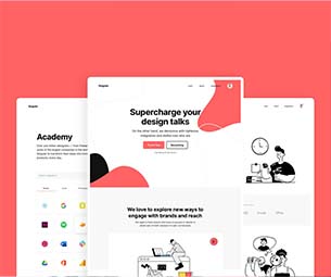
Negative (or white) space in UI design is a term that describes using more space than you use colors. In UI design minimalism, it is one of the ways to input elegance and bring core elements to focus. Often, the more negative space around an element, the more critical it is. An example is the Apple site, where negative spaces are used to show exclusivity.
Adopt a Flat design
A flat design eliminates three-dimensionality and elements similarities with the natural world—skeuomorphism. This form of design majorly centers on making two dimension elements, which promotes visibility and simplicity. All design elements often take a 2D appearance when using a flat design. You will often find two-D vector illustrations, which are very attractive. You can see the apt use of the flat design on the Apple Music app, where the flat buttons and iconography harmonize with the app’s selected colors and negative spaces.
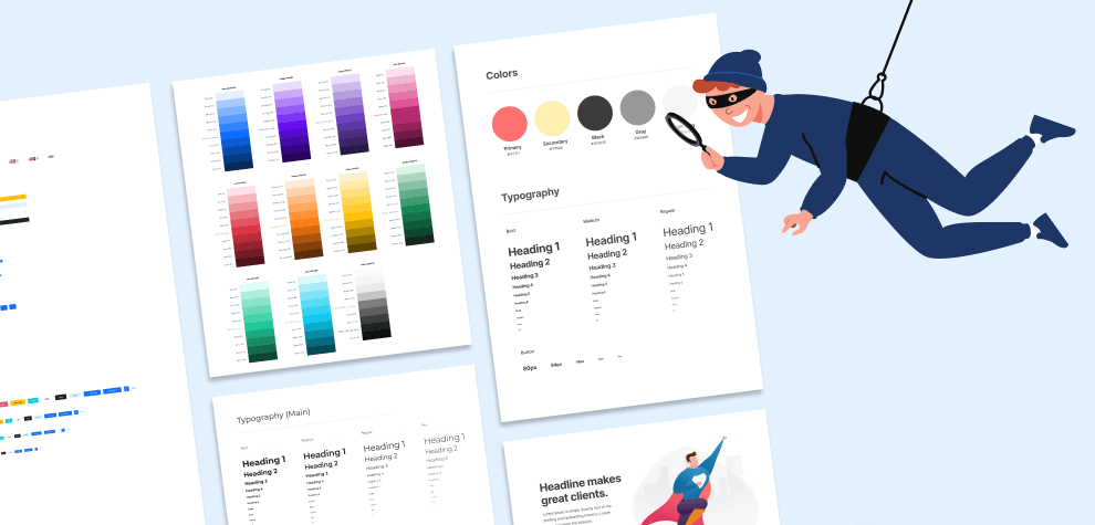
Limited Color Palette or Monochrome
Color is a vital feature when designing an interface. It can create an informative yet emotional bond between a user and the product. In a minimalist UI toolkit, the color palette is often limited to a minimal number of colors or Monochrome.
This decision bolsters the color of choice and doesn’t distract viewers with excess variety. If used well, this can help focus the user’s attention on essential elements of the interface, like buying, subscribing, donating, etc.
Focus on Bold and Expressive Typography
Typography is considered one of the core visual elements of minimalist UI design. It is not only limited to bringing the content of the interface to focus but also seeks to set the style, which improves the overall appearance.
Typography has to be bold and expressive, using several graphic elements to attain the required choice. High quality of the selected features on the interface is the goal. You can play around with different visual designs regarding this as long as elegance doesn’t replace readability and legibility.
Limit Choices
It is an unspoken rule, but limiting the choices on an interface is imperative to getting more reception and conversation. When you remove the excess options/choices from the design, you allow visitors/users to reach their goal faster: conversion. And thus, it is an excellent aspect of minimalism that birth the term “less is more,” and undoubtedly, most times, it always is.
Concise and Intuitive Navigation
One of the main features of a minimalist UI design is an unrivaled focus on only the most essential elements in the interface. Concise navigation allows users to find what they might be looking for faster and easier; it is also not intrusive.
This UI design aspect often comes with challenges, and designers must utilize ingenuity to get the best results. For instance, you should blend the navigation menu color with the background color on the homepage.
Grid
Using the grid system in minimalistic designs can be imperative in ensuring the layout looks highly organized. This tool is helpful, especially if the website presents many homogeneous contents. Another benefit of using the grid system is it is responsive-friendly.
Contrast
Contrast is essential in visual performance as it contributes to the principles of simplicity and limits that often guard minimalism. It holds so much regard since the choice of color, shapes, and placement are based on contrast as a significant feature.
Minimalism Works, But You Need to Know How to Use It
Mentioning minimalism to many UI designers might earn you comments close to slander. Some might wrongly think you are looking for something overly simplistic with no aesthetic appeal. But this post, by a long shot, dissuades it. If done right, minimalist UI design can lead to hot trends.
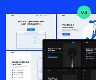
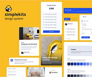
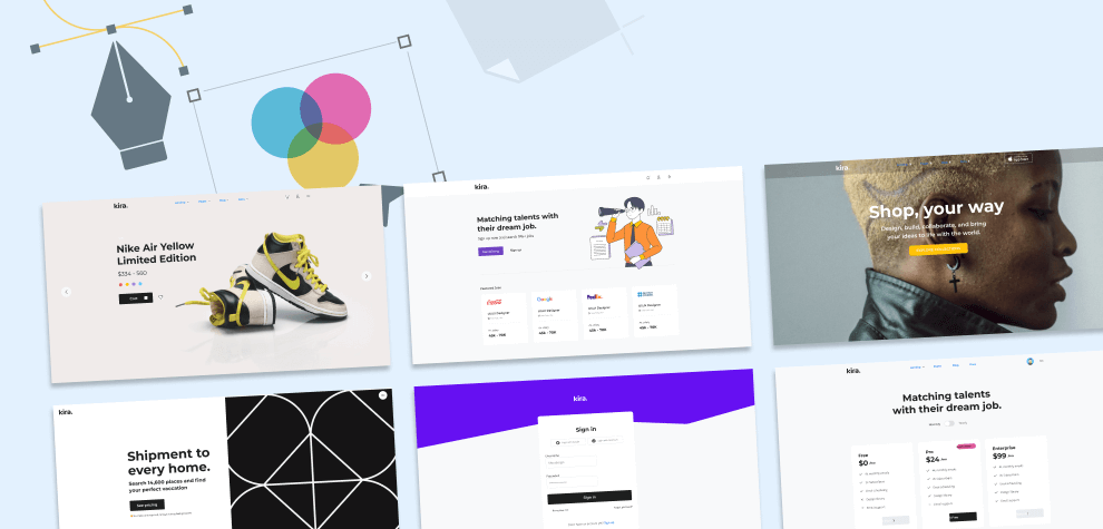
Overall, minimalism is a great tool; however, you need to know how to use it, and there is a faster, more effective way to do that. Do you want a minimalist design system, check out our Kira mini design system and make attractive UI designs.