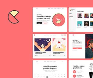
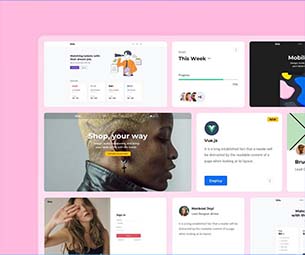
Icons have become one of the key communication tools in our digital landscape due to their ability to convey meaning instantly and make any web page come alive.
Designing the perfect icon is always a challenge. It should be simple enough for the user to understand yet still conveys meaning. There are many ways to approach this issue, from using color psychology (and getting users to see what they expect to see) to using symbolism or even futuristic typography in UI Kit Templates.
In this article, we’ll show you what matters in creating eye-catching, attention-grabbing icons that make a statement about your brand or product. The key is to get the details right, but first, let’s start with the basics :
Basic Of Icons
1. Size –
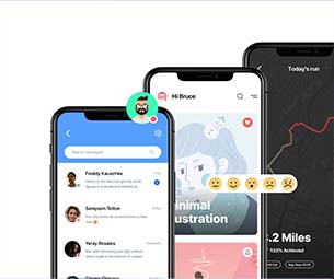
The first element of an icon is size. The size will determine the number of pixels needed for the image, so you must choose your size wisely. The most common sizes are 16px, 20px, 24px, and 32px. The icon size should be proportionate to the size of the text, the size of the text, or the button it represents. The sizes of icons are important because it clarifies that this particular icon will work with a certain range of sizes and weights. It also gives you an idea of how much space you need on your page to function correctly. Smaller icon sizes are less noticeable on mobile devices, so consider this when designing your icon set for mobile apps.
2. Color –
The color of an icon should match the brand colors of your app, website, or product. If you are creating an icon for an app that has a blue background color, then it is best to use blue as the primary color for your icon. If you are creating an icon for a website with white as its background color, then it would be best to use white as the primary color for your icon.
3. Grids –
The grid is a basic element that makes up the shape of an icon. It is a pattern used to create and maintain visual consistency in the design of an application or website. It consists of a set of vertical and horizontal lines, which are repeated throughout the design to help guide users through the layout of the content. The grid element can be simple or complex, depending on the needs of the user interface design. It helps define an icon’s shape, size, and placement. The grid elements are divided into four parts: horizontal, vertical, center, and corner grids.
4. Strokes and Fills –
Strokes and fills are the two most essential elements of an icon. Strokes are the lines that make up the shape of an icon. The stroke color, typeface, and width can give your icons a unique look and feel. Fills make an icon distinct from another one in the same set. Fills can be solid colors or transparent gradients.
Strokes and fills are used together to create a texture or pattern in an icon set. Each stroke is part of one pattern, repeated throughout the set to create a consistent visual language for your product.
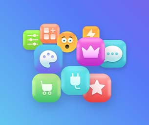
Types Of Icons
1. Colored Icons –
Colored icons are the most common type of icon. They’re easy to read, recognizable, and memorable. They also provide an intuitive visual hierarchy for your users, making them ideal for large-scale designs. They come in different colors, hues, and shades that help users identify the application’s theme without having to read any text or look at any labels. For example, a messenger app might have a red icon for its chat interface, whereas another app might have a blue icon for its calculator function.
2. Outlined Icons –
Outlined icons are similar to colored icons, but they have an outline around them instead of being filled with color. They may have a gradient fill or no fill at all. The outline makes them easier to recognize because it resembles their real-life counterparts more closely than colored ones.
They are trendy because they catch your attention faster than colored icons, and they help make your interface more visually appealing so that users will be more likely to interact with it than if you used plain text instead of highlighting something more important than other information on your page (like an item description).
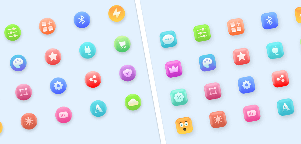
3. 3D Icons
3D icons are also one of the most popular types of icons. They look the most realistic amongst the other types with a depth effect. These are basically flat images that are scaled vertically/horizontally to create the illusion of depth.
The process of making a 3D icon is quite simple. The designer first creates a basic shape and then adds isometric perspective to it using special software that makes it into a 3D model. This type of icon is normally used for promotional campaigns, product launches and events.
Conclusion
Iconography is the design of graphical representations of concepts, people, places, and things. It is a visual language that helps people to understand what you are trying to say. The most common way to convey information is through icons. Icons are an easy way to communicate with your users because they are recognizable by viewers at a glance, which makes them faster and more efficient than text-based communication. They can also be used for navigation purposes, allowing users to quickly find the information they need by just looking at a picture of it. Icons come in many types, including flat icons, font icons, universal icons, and some other types, but the above discussed are widely used.
In the end, just remember icons aren’t just suitable for communicating; Designers can also use them to determine how a user should interact with the product or service.
For example, if you are building a web app, you must use suitable icons in your interface design as part of your UI kit so that users know how to use your application.
Icons present a clutterless and eye-catching solution to give the visual symbols of your website or mobile responsive web app.