Components
500+ responsive components ready for action.
Avatars
A collection of avatars with different shapes, sizes and the possibility to group them.
Example
Use the .fabrx-avatar modifier class to create a circular avatar.
<div class="fabrx-avatar fabrx-status dnd lg"><img src="assets/images/avatars/avatar-1.png" alt="Avatar"></div>

<a href="#0" class="fabrx-avatar fabrx-status dnd lg"><span class="avatar-wrap">ab</span></a>

<a href="#0" class="fabrx-avatar fabrx-status dnd lg">
 <span class="avatar-wrap">
  <svg xmlns="http://www.w3.org/2000/svg" width="24.364" height="30" viewBox="0 0 24.364 30">
   <g transform="translate(-0.5 0)">
    <path data-name="Icon Color" d="M23.414,30a.917.917,0,0,1-.221-.028.815.815,0,0,1-.469-.308L19.269,25.8l-2.812,3.807a.814.814,0,0,1-.322.278.973.973,0,0,1-.439.1.907.907,0,0,1-.409-.1.806.806,0,0,1-.322-.278l-2.753-3.719L9.459,29.606a1.142,1.142,0,0,1-.337.278.929.929,0,0,1-.849,0,1.126,1.126,0,0,1-.337-.278L5.183,25.77,1.64,29.694a1,1,0,0,1-.322.22.987.987,0,0,1-.381.073.816.816,0,0,1-.161-.014,1.34,1.34,0,0,1-.161-.044,1.109,1.109,0,0,1-.439-.351A.863.863,0,0,1,0,29.049V13.031a13.477,13.477,0,0,1,3.587-9.21,12.387,12.387,0,0,1,3.865-2.8,11.421,11.421,0,0,1,9.458,0,12.387,12.387,0,0,1,3.865,2.8A13.464,13.464,0,0,1,23.4,7.965a13.355,13.355,0,0,1,.967,5.066V29.049a.863.863,0,0,1-.176.527,1.109,1.109,0,0,1-.439.351A.818.818,0,0,1,23.414,30ZM12.241,23.369a.913.913,0,0,1,.409.1.823.823,0,0,1,.322.278L15.7,27.468l2.753-3.719a.842.842,0,0,1,.307-.278.826.826,0,0,1,.4-.1,1.1,1.1,0,0,1,.4.073.828.828,0,0,1,.337.249l2.606,2.9V13.031a11.5,11.5,0,0,0-.82-4.319,11.773,11.773,0,0,0-2.211-3.558,10.333,10.333,0,0,0-3.265-2.4,9.591,9.591,0,0,0-8.024,0,10.333,10.333,0,0,0-3.265,2.4A11.773,11.773,0,0,0,2.694,8.712a11.5,11.5,0,0,0-.82,4.319V26.619l2.695-2.958a.716.716,0,0,1,.307-.22,1.027,1.027,0,0,1,.366-.073H5.3a.828.828,0,0,1,.4.1A.851.851,0,0,1,6,23.749L8.7,27.468l2.782-3.719a.815.815,0,0,1,.322-.278A.968.968,0,0,1,12.241,23.369Zm4.627-9.312a1.864,1.864,0,0,1-1.318-3.192A1.864,1.864,0,1,1,18.185,13.5,1.809,1.809,0,0,1,16.868,14.056Zm-9.371,0a1.864,1.864,0,0,1-1.319-3.192,1.874,1.874,0,0,1,3.192,1.319A1.9,1.9,0,0,1,7.5,14.056Z" transform="translate(0.5)" fill="#fff"></path>
   </g>
  </svg>
 </span>
</a>
Sizing
Use the .sm .md .lg to control Avatar size.
<div class="fabrx-avatar fabrx-status dnd sm"><img src="assets/images/avatars/avatar-1.png" alt="Avatar"></div>
<div class="fabrx-avatar fabrx-status dnd"><img src="assets/images/avatars/avatar-1.png" alt="Avatar"></div>
<div class="fabrx-avatar fabrx-status dnd md"><img src="assets/images/avatars/avatar-1.png" alt="Avatar"></div>
<div class="fabrx-avatar fabrx-status dnd lg"><img src="assets/images/avatars/avatar-1.png" alt="Avatar"></div>
Group
Include multiple avatar items inside a .fabrx-avatar-group container.
<div class="fabrx-avatar-group">
 <a href="#0" class="fabrx-avatar lg"><img src="assets/images/avatars/avatar-1.png" alt="Avatar"></a>
 <a href="#0" class="fabrx-avatar lg"><img src="assets/images/avatars/avatar-2.png" alt="Avatar"></a>
 <a href="#0" class="fabrx-avatar lg"><img src="assets/images/avatars/avatar-3.png" alt="Avatar"></a>
 <a href="#0" class="fabrx-avatar lg"><img src="assets/images/avatars/avatar-4.png" alt="Avatar"></a>
 <a href="#0" class="fabrx-avatar lg more"><span class="avatar-wrap">+9</span></a>
</div>
Badges
Example
Badges can be used as fill or outline.
<a href="#0" class="badge badge-primary circle xxl">
 <svg xmlns="http://www.w3.org/2000/svg" width="30" height="30" viewBox="0 0 31 32">
  <g data-name="Icon/Star Fill" transform="translate(0)">
   <path data-name="Icon Color" d="M22.519,31.65,15.641,27a.212.212,0,0,0-.242,0L8.52,31.65A2.606,2.606,0,0,1,7.31,32a2.044,2.044,0,0,1-1.7-.851,2.084,2.084,0,0,1-.387-1.9L7.165,20.5c0-.1,0-.2-.1-.25L.722,14.35a2.433,2.433,0,0,1-.63-2.4,2.149,2.149,0,0,1,1.889-1.5L10.168,9.8c.1,0,.145-.05.194-.15l3.052-8.2A2.252,2.252,0,0,1,15.5,0,2.143,2.143,0,0,1,17.53,1.45l3.052,8.2c.049.1.1.15.194.15l8.186.649a2.149,2.149,0,0,1,1.889,1.5,2.239,2.239,0,0,1-.63,2.4l-6.345,5.9a.387.387,0,0,0-.1.25l1.987,8.75a2.41,2.41,0,0,1-.388,1.9A2.106,2.106,0,0,1,23.682,32,2.277,2.277,0,0,1,22.519,31.65Z" transform="translate(0)" fill="#fff"></path>
  </g>
 </svg>
</a>

<a href="#0" class="badge badge-outline-primary circle xxl border-0">12</a>
Sizes
Use the .xxl, .xl, .md, .sm, or .ssm modifier classes to adjust badge sizes.
<ul class="component-list list-unstyled">
 <li>
  <div class="badge badge-primary circle xxl">
   <svg xmlns="http://www.w3.org/2000/svg" width="30" height="30" viewBox="0 0 31 32">
    <g id="Icon_Star_Fill" data-name="Icon/Star Fill" transform="translate(0)">
     <path id="Icon_Color" data-name="Icon Color" d="M22.519,31.65,15.641,27a.212.212,0,0,0-.242,0L8.52,31.65A2.606,2.606,0,0,1,7.31,32a2.044,2.044,0,0,1-1.7-.851,2.084,2.084,0,0,1-.387-1.9L7.165,20.5c0-.1,0-.2-.1-.25L.722,14.35a2.433,2.433,0,0,1-.63-2.4,2.149,2.149,0,0,1,1.889-1.5L10.168,9.8c.1,0,.145-.05.194-.15l3.052-8.2A2.252,2.252,0,0,1,15.5,0,2.143,2.143,0,0,1,17.53,1.45l3.052,8.2c.049.1.1.15.194.15l8.186.649a2.149,2.149,0,0,1,1.889,1.5,2.239,2.239,0,0,1-.63,2.4l-6.345,5.9a.387.387,0,0,0-.1.25l1.987,8.75a2.41,2.41,0,0,1-.388,1.9A2.106,2.106,0,0,1,23.682,32,2.277,2.277,0,0,1,22.519,31.65Z" transform="translate(0)" fill="#fff"></path>
    </g>
   </svg>
  </div>
 </li>
 <li>
  <div class="badge badge-primary circle xl">
   <svg xmlns="http://www.w3.org/2000/svg" width="28" height="28" viewBox="0 0 31 32">
    <g id="Icon_Star_Fill" data-name="Icon/Star Fill" transform="translate(0)">
     <path id="Icon_Color" data-name="Icon Color" d="M22.519,31.65,15.641,27a.212.212,0,0,0-.242,0L8.52,31.65A2.606,2.606,0,0,1,7.31,32a2.044,2.044,0,0,1-1.7-.851,2.084,2.084,0,0,1-.387-1.9L7.165,20.5c0-.1,0-.2-.1-.25L.722,14.35a2.433,2.433,0,0,1-.63-2.4,2.149,2.149,0,0,1,1.889-1.5L10.168,9.8c.1,0,.145-.05.194-.15l3.052-8.2A2.252,2.252,0,0,1,15.5,0,2.143,2.143,0,0,1,17.53,1.45l3.052,8.2c.049.1.1.15.194.15l8.186.649a2.149,2.149,0,0,1,1.889,1.5,2.239,2.239,0,0,1-.63,2.4l-6.345,5.9a.387.387,0,0,0-.1.25l1.987,8.75a2.41,2.41,0,0,1-.388,1.9A2.106,2.106,0,0,1,23.682,32,2.277,2.277,0,0,1,22.519,31.65Z" transform="translate(0)" fill="#fff"></path>
    </g>
   </svg>
  </div>
 </li>
 <li>
  <div class="badge badge-primary circle lg">
   <svg xmlns="http://www.w3.org/2000/svg" width="23" height="23" viewBox="0 0 31 32">
    <g id="Icon_Star_Fill" data-name="Icon/Star Fill" transform="translate(0)">
     <path id="Icon_Color" data-name="Icon Color" d="M22.519,31.65,15.641,27a.212.212,0,0,0-.242,0L8.52,31.65A2.606,2.606,0,0,1,7.31,32a2.044,2.044,0,0,1-1.7-.851,2.084,2.084,0,0,1-.387-1.9L7.165,20.5c0-.1,0-.2-.1-.25L.722,14.35a2.433,2.433,0,0,1-.63-2.4,2.149,2.149,0,0,1,1.889-1.5L10.168,9.8c.1,0,.145-.05.194-.15l3.052-8.2A2.252,2.252,0,0,1,15.5,0,2.143,2.143,0,0,1,17.53,1.45l3.052,8.2c.049.1.1.15.194.15l8.186.649a2.149,2.149,0,0,1,1.889,1.5,2.239,2.239,0,0,1-.63,2.4l-6.345,5.9a.387.387,0,0,0-.1.25l1.987,8.75a2.41,2.41,0,0,1-.388,1.9A2.106,2.106,0,0,1,23.682,32,2.277,2.277,0,0,1,22.519,31.65Z" transform="translate(0)" fill="#fff"></path>
    </g>
   </svg>
  </div>
 </li>
 <li>
  <div class="badge badge-primary circle">
   <svg xmlns="http://www.w3.org/2000/svg" width="16" height="16" viewBox="0 0 31 32">
    <g id="Icon_Star_Fill" data-name="Icon/Star Fill" transform="translate(0)">
     <path id="Icon_Color" data-name="Icon Color" d="M22.519,31.65,15.641,27a.212.212,0,0,0-.242,0L8.52,31.65A2.606,2.606,0,0,1,7.31,32a2.044,2.044,0,0,1-1.7-.851,2.084,2.084,0,0,1-.387-1.9L7.165,20.5c0-.1,0-.2-.1-.25L.722,14.35a2.433,2.433,0,0,1-.63-2.4,2.149,2.149,0,0,1,1.889-1.5L10.168,9.8c.1,0,.145-.05.194-.15l3.052-8.2A2.252,2.252,0,0,1,15.5,0,2.143,2.143,0,0,1,17.53,1.45l3.052,8.2c.049.1.1.15.194.15l8.186.649a2.149,2.149,0,0,1,1.889,1.5,2.239,2.239,0,0,1-.63,2.4l-6.345,5.9a.387.387,0,0,0-.1.25l1.987,8.75a2.41,2.41,0,0,1-.388,1.9A2.106,2.106,0,0,1,23.682,32,2.277,2.277,0,0,1,22.519,31.65Z" transform="translate(0)" fill="#fff"></path>
    </g>
   </svg>
  </div>
 </li>
 <li>
  <div class="badge badge-primary circle sm">
   <svg xmlns="http://www.w3.org/2000/svg" width="16" height="12" viewBox="0 0 31 32">
    <g id="Icon_Star_Fill" data-name="Icon/Star Fill" transform="translate(0)">
     <path id="Icon_Color" data-name="Icon Color" d="M22.519,31.65,15.641,27a.212.212,0,0,0-.242,0L8.52,31.65A2.606,2.606,0,0,1,7.31,32a2.044,2.044,0,0,1-1.7-.851,2.084,2.084,0,0,1-.387-1.9L7.165,20.5c0-.1,0-.2-.1-.25L.722,14.35a2.433,2.433,0,0,1-.63-2.4,2.149,2.149,0,0,1,1.889-1.5L10.168,9.8c.1,0,.145-.05.194-.15l3.052-8.2A2.252,2.252,0,0,1,15.5,0,2.143,2.143,0,0,1,17.53,1.45l3.052,8.2c.049.1.1.15.194.15l8.186.649a2.149,2.149,0,0,1,1.889,1.5,2.239,2.239,0,0,1-.63,2.4l-6.345,5.9a.387.387,0,0,0-.1.25l1.987,8.75a2.41,2.41,0,0,1-.388,1.9A2.106,2.106,0,0,1,23.682,32,2.277,2.277,0,0,1,22.519,31.65Z" transform="translate(0)" fill="#fff"></path>
    </g>
   </svg>
  </div>
 </li>
 <li>
  <div class="badge badge-primary circle ssm">
   <svg xmlns="http://www.w3.org/2000/svg" width="10" height="10" viewBox="0 0 31 32">
    <g id="Icon_Star_Fill" data-name="Icon/Star Fill" transform="translate(0)">
     <path id="Icon_Color" data-name="Icon Color" d="M22.519,31.65,15.641,27a.212.212,0,0,0-.242,0L8.52,31.65A2.606,2.606,0,0,1,7.31,32a2.044,2.044,0,0,1-1.7-.851,2.084,2.084,0,0,1-.387-1.9L7.165,20.5c0-.1,0-.2-.1-.25L.722,14.35a2.433,2.433,0,0,1-.63-2.4,2.149,2.149,0,0,1,1.889-1.5L10.168,9.8c.1,0,.145-.05.194-.15l3.052-8.2A2.252,2.252,0,0,1,15.5,0,2.143,2.143,0,0,1,17.53,1.45l3.052,8.2c.049.1.1.15.194.15l8.186.649a2.149,2.149,0,0,1,1.889,1.5,2.239,2.239,0,0,1-.63,2.4l-6.345,5.9a.387.387,0,0,0-.1.25l1.987,8.75a2.41,2.41,0,0,1-.388,1.9A2.106,2.106,0,0,1,23.682,32,2.277,2.277,0,0,1,22.519,31.65Z" transform="translate(0)" fill="#fff"></path>
    </g>
   </svg>
  </div>
 </li>
</ul>
Breadcrumbs
Indicate the current page’s location within a navigational hierarchy that automatically adds separators via CSS with Bootstrap breadcrumb.
Example
<nav aria-label="breadcrumb" class="bg-white p-4">
 <ol class="breadcrumb mb-0">
  <li class="breadcrumb-item"><a href="#0">Breadcrumb</a></li>
  <li class="breadcrumb-item"><a href="#0">Breadcrumb</a></li>
  <li class="breadcrumb-item"><a href="#0">Breadcrumb</a></li>
  <li class="breadcrumb-item"><a href="#0">Breadcrumb</a></li>
  <li class="breadcrumb-item active" aria-current="page"><span>Breadcrumb</span></li>
 </ol>
</nav>

<nav aria-label="breadcrumb" class="bg-white p-4">
 <ol class="breadcrumb mb-0">
  <li class="breadcrumb-item"><a href="#0">Breadcrumb</a></li>
  <li class="breadcrumb-item"><a href="#0">Breadcrumb</a></li>
  <li class="breadcrumb-item"><a href="#0">Breadcrumb</a></li>
  <li class="breadcrumb-item"><a href="#0">Breadcrumb</a></li>
  <li class="breadcrumb-item active" aria-current="page"><span><u>Breadcrumb</u></span></li>
 </ol>
</nav>
Buttons
Use Bootstrap buttons and BootstrapVue custom styles for actions in forms, dialogues, and more with support for multiple sizes, states, and more.
Classes
Bootstrap provides different styles of buttons:
.btn.btn-light.btn-dark.btn-primary.btn-success.btn-info.btn-warning.btn-danger.btn-link.btn-outline-light.btn-outline-dark.btn-outline-primary.btn-outline-success.btn-outline-info.btn-outline-warning.btn-outline-danger
Examples
Predefined button styles, each serving its own semantic purpose, with a few extras thrown in for more control.
<a href="#0" class="btn btn-primary"><span class="btn-text">Button</span></a>
 <a href="#0" class="btn btn-primary">
  <svg xmlns="http://www.w3.org/2000/svg" width="16" height="16" viewBox="0 0 16 16">
   <path data-name="Icon Color" d="M16,4.075a4.157,4.157,0,0,0-8-1.5A4.144,4.144,0,0,0,4.15,0,4.108,4.108,0,0,0,0,4.075v.3C0,8.575,8.3,14,8.3,14S16,8.575,16,4.375Z" transform="translate(0 1.333)" fill="#fff"></path>
  </svg>
  <span class="btn-text">Button</span>
 </a>
 <a href="#0" class="btn btn-primary btn-has-one">
  <svg xmlns="http://www.w3.org/2000/svg" width="16" height="16" viewBox="0 0 22 22">
   <path data-name="Icon Color" d="M22,5.6A5.716,5.716,0,0,0,11,3.541,5.7,5.7,0,0,0,5.706,0,5.649,5.649,0,0,0,0,5.6v.412C0,11.791,11.413,19.25,11.413,19.25S22,11.791,22,6.016Z" transform="translate(0 1.833)" fill="#fff"></path>
  </svg>
</a><a href="#0" class="btn btn-light"><span class="btn-text">Light</span></a>
<a href="#0" class="btn btn-dark"><span class="btn-text">Dark</span></a>
<a href="#0" class="btn btn-primary"><span class="btn-text">Primary</span></a>
<a href="#0" class="btn btn-success"><span class="btn-text">Success</span></a>
<a href="#0" class="btn btn-info"><span class="btn-text">Info</span></a>
<a href="#0" class="btn btn-warning"><span class="btn-text">Warning</span></a>
<a href="#0" class="btn btn-danger"><span class="btn-text">Danger</span></a>
<a href="#0" class="btn btn-link"><span class="btn-text">Link</span></a>Outline buttons
Replace the default modifier classes with the .btn-outline-* ones to remove all background images and colors on any button.
<a href="#0" class="btn btn-outline-light"><span class="btn-text">Light</span></a>
<a href="#0" class="btn btn-outline-dark"><span class="btn-text">Dark</span></a>
<a href="#0" class="btn btn-outline-primary"><span class="btn-text">Primary</span></a>
<a href="#0" class="btn btn-outline-success"><span class="btn-text">Success</span></a>
<a href="#0" class="btn btn-outline-info"><span class="btn-text">Info</span></a>
<a href="#0" class="btn btn-outline-warning"><span class="btn-text">Warning</span></a>
<a href="#0" class="btn btn-outline-danger"><span class="btn-text">Danger</span></a>
Sizes
Fancy larger or smaller buttons? Add .btn-xl, .btn-lg or .btn-sm for additional sizes.
<a href="#0" class="btn btn-primary btn-xl">Xtra large button</a>
<a href="#0" class="btn btn-outline-primary btn-xl">Xtra large button</a><a href="#0" class="btn btn-primary btn-lg">Large button</a>
<a href="#0" class="btn btn-outline-primary btn-lg">Large button</a><a href="#0" class="btn btn-primary">Medium button</a>
<a href="#0" class="btn btn-outline-primary">Medium button</a><a href="#0" class="btn btn-primary btn-sm">Small button</a>
<a href="#0" class="btn btn-outline-primary btn-sm">Small button</a>Create block level buttons—those that span the full width of a parent—by adding .btn-block.
<a href="#0" class="btn btn-primary btn-block">Block level button</a>
<a href="#0" class="btn btn-outline-primary btn-block">Block level button</a>
Disabled state
Make buttons look inactive by adding the disabled boolean attribute to any <button> element.
<a href="#0" class="btn btn-primary disabled">Primary button</a>
<a href="#0" class="btn btn-outline-primary disabled">Primary button</a>
Text Links
Basic left and right icon options for text links.
<a href="#0" class="btn btn-link btn-lg">
 <svg xmlns="http://www.w3.org/2000/svg" width="16" height="16" viewBox="0 0 16 16">
  <path data-name="Icon Color" d="M10.909,5.818H0V2.909H10.909V0L16,4.243,10.909,8.485Z" transform="translate(0 4)" fill="#006eff"></path>
 </svg>
 <span class="btn-text">Link</span>
</a>

<a href="#0" class="btn btn-link btn-lg">
 <span class="btn-text">Link</span>
 <svg xmlns="http://www.w3.org/2000/svg" width="16" height="16" viewBox="0 0 16 16">
  <path data-name="Icon Color" d="M10.909,5.818H0V2.909H10.909V0L16,4.243,10.909,8.485Z" transform="translate(0 4)" fill="#006eff"></path>
 </svg>
</a>
Button grouped
Group a series of buttons together on a single line with the button group.
<div class="btn-group btn-group-lg" role="group" aria-label="Grouped lg">
 <a href="#0" class="btn btn-primary"><span class="btn-text">Label</span></a>
 <a href="#0" class="btn btn-light"><span class="btn-text">Label</span></a>
 <a href="#0" class="btn btn-light"><span class="btn-text">Label</span></a>
 <a href="#0" class="btn btn-light"><span class="btn-text">Label</span></a>
</div>
<div class="btn-group" role="group" aria-label="Grouped md">
<a href="#0" class="btn btn-primary">
<svg xmlns="http://www.w3.org/2000/svg" width="15.985" height="16" viewBox="0 0 15.985 16">
<path data-name="Icon Color" d="M11.623,15.825,8.073,13.5a.113.113,0,0,0-.125,0L4.4,15.825A1.382,1.382,0,0,1,3.773,16a1.067,1.067,0,0,1-.875-.425,1.02,1.02,0,0,1-.2-.95l1-4.375c0-.05,0-.1-.05-.125L.373,7.175a1.19,1.19,0,0,1-.325-1.2,1.1,1.1,0,0,1,.975-.75L5.248,4.9c.049,0,.075-.024.1-.075L6.923.725A1.163,1.163,0,0,1,8,0a1.105,1.105,0,0,1,1.05.725l1.575,4.1c.025.05.05.075.1.075l4.226.326a1.111,1.111,0,0,1,.65,1.949l-3.275,2.95a.19.19,0,0,0-.05.125L13.3,14.625a1.176,1.176,0,0,1-.2.95,1.1,1.1,0,0,1-.875.425A1.208,1.208,0,0,1,11.623,15.825Z" fill="#fff"></path>
</svg>
</a>
<a href="#0" class="btn btn-light">
<svg xmlns="http://www.w3.org/2000/svg" width="15.987" height="16" viewBox="0 0 15.987 16">
<g transform="translate(0.001)">
<path data-name="Icon Color" d="M12.223,16a1.2,1.2,0,0,1-.6-.175L8.073,13.5a.139.139,0,0,0-.063-.019.136.136,0,0,0-.062.019L4.4,15.825A1.394,1.394,0,0,1,3.773,16a1.062,1.062,0,0,1-.875-.425,1.014,1.014,0,0,1-.2-.95l1-4.375c0-.049,0-.1-.05-.125L.373,7.175a1.185,1.185,0,0,1-.325-1.2,1.105,1.105,0,0,1,.975-.75L5.248,4.9c.052,0,.077-.029.1-.075L6.923.725A1.161,1.161,0,0,1,8,0a1.109,1.109,0,0,1,1.05.725l1.575,4.1c.023.046.048.075.1.075l4.226.326a1.105,1.105,0,0,1,.975.75,1.091,1.091,0,0,1-.325,1.2l-3.275,2.95a.191.191,0,0,0-.05.125L13.3,14.625a1.169,1.169,0,0,1-.2.95A1.106,1.106,0,0,1,12.223,16ZM8,12.475a1.379,1.379,0,0,1,.625.175l3.55,2.325a.091.091,0,0,0,.066.027.162.162,0,0,0,.11-.052c.024-.025.024-.05.024-.1l-1.024-4.375a1.14,1.14,0,0,1,.349-1.1L15,6.45a.131.131,0,0,0,.041-.073.061.061,0,0,0-.016-.052c-.023-.047-.048-.076-.1-.076L10.7,5.925a1.109,1.109,0,0,1-.95-.725L8.123,1.075A.126.126,0,0,0,8.01,1a.127.127,0,0,0-.113.075l-1.575,4.1a1.159,1.159,0,0,1-.95.725l-4.251.325c-.048,0-.1.023-.1.075a.17.17,0,0,1,0,.021c0,.034-.012.085.027.1l3.3,2.925a1.142,1.142,0,0,1,.35,1.1L3.673,14.825c0,.05,0,.076.025.1a.14.14,0,0,0,.1.053.137.137,0,0,0,.076-.027l3.55-2.325A1.037,1.037,0,0,1,8,12.475Z" fill="#3f3b3b"></path>
</g>
</svg>
</a>
</div>Cards
Flexible and extensible content container with multiple variants and options. Please read the official Bootstrap Documentation for a full list of options.
Examples
<div class="card shadow-40">
 <img class="card-img-top" src="assets/images/placeholders/placeholder-6.jpg" alt="Card Image">
 <div class="card-body">
  <small class="card-subtitle mb-2 text-secondary">12 hours ago</small>
  <h6 class="card-title font-weight-normal"><a href="#0">Hidden universe revealed in stunning first images from German telescope</a></h6>
  <div class="clearfix pt-md-3">
   <div class="float-left">
    <a href="#0">
     <div class="fabrx-avatar sm"><img src="assets/images/avatars/avatar-1.png" alt="Avatar"></div>
     <span class="avatar-user">Bruce Lee</span>
    </a>
   </div>
   <div class="float-right">
    <div class="dropdown">
     <a href="#" data-toggle="dropdown" aria-haspopup="true" aria-expanded="false" id="Action1">
      <svg xmlns="http://www.w3.org/2000/svg" width="16" height="16" viewBox="0 0 16 16">
       <path data-name="Icon Color" d="M13.889,2.889a1.445,1.445,0,1,1,1.445-1.445A1.446,1.446,0,0,1,13.889,2.889Zm-6.222,0A1.445,1.445,0,1,1,9.111,1.444,1.446,1.446,0,0,1,7.667,2.889Zm-6.223,0A1.445,1.445,0,1,1,2.889,1.444,1.446,1.446,0,0,1,1.444,2.889Z" transform="translate(9.778 0.444) rotate(90)" fill="#959393"></path>
      </svg>
     </a>
     <div class="dropdown-menu dropdown-menu-right" aria-labelledby="Action1">
      <a class="dropdown-item" href="#0">Action</a>
      <a class="dropdown-item" href="#0">Another action</a>
      <a class="dropdown-item" href="#0">Something else here</a>
     </div>
    </div>
   </div>
  </div>
 </div>
</div>
Hubble Telescope Spots ‘Ghostly Face' in Space
<div class="card shadow-40">
 <a href="#0"><img class="card-img-top" src="assets/images/placeholders/placeholder-7.jpg" alt="Card Image"></a>
 <div class="card-body text-center">
  <small class="card-subtitle mb-2 text-secondary">For you</small>
  <h6 class="card-title">Hubble Telescope Spots ‘Ghostly Face' in Space</h6>
  <div class="clearfix pt-md-3">
   <a href="#0" class="btn btn-link btn-lg">
    <span class="btn-text">Link</span>
    <svg xmlns="http://www.w3.org/2000/svg" width="16" height="16" viewBox="0 0 16 16">
     <path data-name="Icon Color" d="M10.909,5.818H0V2.909H10.909V0L16,4.243,10.909,8.485Z" transform="translate(0 4)" fill="#006eff"></path>
    </svg>
   </a>
  </div>
 </div>
</div>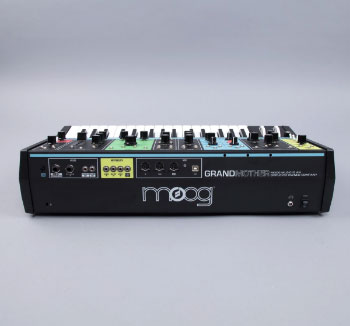
<div class="card shadow-40">
 <div class="badge badge-primary badge-absolute lg">Tag</div>
 <img class="card-img-top" src="assets/images/placeholders/placeholder-8.jpg" alt="Card Image">
 <div class="card-body">
  <div class="row align-items-end g-0">
   <div class="col-7">
    <small class="card-subtitle text-secondary">Electronics</small>
     <h6 class="card-title font-weight-normal mb-0"><a href="#0">Moog Synthesizer</a></h6>
   </div>
   <div class="col-5">
    <h5 class="font-weight-bold mb-0 text-right">$468.00</h5>
   </div>
  </div>
 </div>
</div>
Moog Synthesizer
$249.00
<div class="card shadow-40">
 <a href="#0"><img class="card-img-top" src="assets/images/placeholders/placeholder-9.jpg" alt="Card Image"></a>
 <div class="card-body">
  <div class="d-flex flex-wrap pb-3">
   <div class="form-check custom-radio custom-control-inline control-has-danger form-check-lg form-check-rounded radio-has-check">
    <input type="radio" id="Option1" name="RadioGroup1" class="form-check-input">
   </div>
   <div class="form-check custom-radio custom-control-inline control-has-primary form-check-lg form-check-rounded radio-has-check">
    <input type="radio" id="Option2" name="RadioGroup1" class="form-check-input">
   </div>
   <div class="form-check custom-radio custom-control-inline control-has-success form-check-lg form-check-rounded radio-has-check">
    <input type="radio" id="Option3" name="RadioGroup1" class="form-check-input">
   </div>
   <div class="form-check custom-radio custom-control-inline control-has-warning form-check-lg form-check-rounded radio-has-check">
    <input type="radio" id="Option4" name="RadioGroup1" class="form-check-input">
   </div>
  </div>
  <h6 class="card-title mb-2">Moog Synthesizer</h6>
  <h6 class="mb-0">$249.00</h6>
 </div>
</div>
<div class="card shadow-40">
 <a href="#0" class="badge badge-primary badge-absolute circle">
  <svg xmlns="http://www.w3.org/2000/svg" width="16" height="16" viewBox="0 0 16 16">
   <path data-name="Icon Color" d="M16,4.075a4.157,4.157,0,0,0-8-1.5A4.144,4.144,0,0,0,4.15,0,4.108,4.108,0,0,0,0,4.075v.3C0,8.575,8.3,14,8.3,14S16,8.575,16,4.375Z" transform="translate(0 1.333)" fill="#fff"></path>
  </svg>
 </a>
 <img class="card-img-top" src="assets/images/placeholders/placeholder-10.jpg" alt="Card Image">
 <div class="card-body bottom">
  <div class="clearfix pb-3">
   <a href="#0" class="fabrx-avatar sm"><img src="assets/images/avatars/avatar-1.png" alt="Avatar"></a>
   <span class="avatar-user">Bruce Lee</span>
  </div>
  <h6 class="card-title mb-0"><a href="#0">Hidden universe revealed in stunning first images from German telescope</a></h6>
 </div>
</div>
An Awesome Product
Button<div class="card shadow-40">
<img class="card-img-top" src="assets/images/placeholders/placeholder-11.jpg" alt="Card Image">
<div class="card-body">
<h6 class="card-title">An Awesome Product</h6>
<a href="#0" class="btn btn-primary">Button</a>
</div>
</div>
<div class="card card-gradient card-xl text-white">
 <div class="card-body">
  <div class="overlay-wrap align-items-start">
   <h4 class="card-title font-weight-normal mb-md-3">Nike Air Zoom Structure 21 <br>(Limited Edition)</h4>
   <div class="fabrx-ratings has-rating rating fabrx-ratings-white mb-1">
    <input type="radio" id="rating35" name="rating15" value="1">
    <label for="rating35" class="custom-starboxes"></label>
    <input type="radio" id="rating36" name="rating15" value="2">
    <label for="rating36" class="custom-starboxes"></label>
    <input type="radio" id="rating37" name="rating15" value="3">
    <label for="rating37" class="custom-starboxes"></label>
    <input type="radio" id="rating38" name="rating15" value="4">
    <label for="rating38" class="custom-starboxes"></label>
    <input type="radio" id="rating39" name="rating15" value="5">
    <label for="rating39" class="custom-starboxes"></label>
   </div>
   <h4>$99.00</h4>
   <div class="text-center">
    <img src="assets/images/placeholders/placeholder-12.png" alt="Card Image">
   </div>
   <div class="card-link w-100">
    <a href="#0" class="btn btn-primary btn-xl">Button</a>
   </div>
  </div>
 </div>
</div>
<div class="card shadow-40">
 <img class="card-img-top rounded-12" src="assets/images/placeholders/placeholder-13.jpg" alt="Card Image">
 <div class="card-img-overlay">
  <div class="overlay-wrap">
   <h2 class="card-title mb-0">Feature Headline</h2>
   <p class="h6 text-dark font-weight-normal">Ship of the imagination star stuff harvesting star light descended from astronomers finite but unbounded realm of the galaxies.</p>
   <div class="card-link">
    <a href="#0" class="btn btn-primary btn-xl">Button</a>
   </div>
  </div>
 </div>
</div>
Dark Energy Survey Evolves
Ship of the imagination star stuff harvesting star light descended from astronomers finite but unbounded realm of the galaxies.
<div class="card card-transparent rounded-0">
 <img class="card-img-top rounded-0" src="assets/images/placeholders/placeholder-14.jpg" alt="Card Image">
  <div class="card-body">
   <h4 class="card-title"><a href="#0">Dark Energy Survey Evolves</a></h4>
   <p>Ship of the imagination star stuff harvesting star light descended from astronomers finite but unbounded realm of the galaxies.</p>
   <div class="clearfix">
    <a href="#0" class="btn btn-link btn-lg">
     <span class="btn-text">Link</span>
     <svg xmlns="http://www.w3.org/2000/svg" width="16" height="16" viewBox="0 0 16 16">
      <path data-name="Icon Color" d="M10.909,5.818H0V2.909H10.909V0L16,4.243,10.909,8.485Z" transform="translate(0 4)" fill="#006eff"></path>
     </svg>
    </a>
   </div>
  </div>
 </div>
</div>
<div class="card card-sm card-transparent">
 <a href="#0" class="badge badge-primary badge-absolute circle stack lg">
  <svg xmlns="http://www.w3.org/2000/svg" width="23" height="14.4" viewBox="0 0 23 14.4">
   <path data-name="Icon Color" d="M16.1,0l2.639,2.754L13.127,8.6l-4.6-4.8L0,12.7l1.627,1.7,6.9-7.2,4.6,4.8,7.234-7.554L23,7.2V0Z" fill="#fff"></path>
  </svg>
 </a>
 <a href="#0"><img class="card-img-top" src="assets/images/placeholders/placeholder-16.jpg" alt="Card Image"></a>
  <div class="card-body">
   <h6 class="card-title mb-2"><a href="#0">Citizen Science with the Transit of Mercury is amazing</a></h6>
  </div>
 </div>
</div>
Dark Energy Survey Evolves
Ship of the imagination star stuff harvesting star light descended from astronomers finite but unbounded realm of the galaxies.
<div class="card card-sm card-transparent rounded-0">
 <a href="#0"><img class="card-img-top rounded-0" src="assets/images/placeholders/placeholder-15.jpg" alt="Card Image"></a>
 <div class="card-body">
  <h6 class="card-title mb-2">Dark Energy Survey Evolves</h6>
  <p class="mb-2">Ship of the imagination star stuff harvesting star light descended from astronomers finite but unbounded realm of the galaxies.</p>
  <div class="clearfix">
   <a href="#0" class="btn btn-link">
   <span class="btn-text">Link</span>
    <svg xmlns="http://www.w3.org/2000/svg" width="16" height="16" viewBox="0 0 16 16">
     <path data-name="Icon Color" d="M10.909,5.818H0V2.909H10.909V0L16,4.243,10.909,8.485Z" transform="translate(0 4)" fill="#006eff"></path>
    </svg>
   </a>
  </div>
 </div>
</div>

<div class="card card-sm card-transparent">
 <a href="#0" class="badge badge-primary badge-absolute circle stack">
  <svg xmlns="http://www.w3.org/2000/svg" width="16" height="9.6" viewBox="0 0 16 9.6">
   <path data-name="Icon Color" d="M11.2,0l1.836,1.836-3.9,3.9-3.2-3.2L0,8.468,1.132,9.6l4.8-4.8L9.132,8l5.032-5.036L16,4.8V0Z" fill="#fff"></path>
  </svg>
 </a>
 <a href="#0"><img class="card-img-top rounded-0" src="assets/images/placeholders/placeholder-17.jpg" alt="Card Image"></a>
 <div class="card-body">
  <h6 class="card-title mb-2"><a href="#0">Citizen Science with the Transit of Mercury</a></h6>
 </div>
</div>
Data Cards
$129,850
<div class="card rounded-6">
 <div class="card-body d-flex align-items-center justify-content-between">
  <div class="float-left">
   <div class="card-subtitle mb-1 text-muted font-size-14">Revenue</div>
   <h5 class="card-title font-weight-normal mb-0">$129,850</h5>
  </div>
  <div class="float-right">
   <div class="dropdown">
    <a href="#" data-toggle="dropdown" aria-haspopup="true" aria-expanded="false" class="card-meter rounded-3 bg-success" id="Action2">
     <svg xmlns="http://www.w3.org/2000/svg" width="14" height="8.273" viewBox="0 0 14 8.273">
      <path data-name="Icon Color" d="M7,14l1.273-1.273L2.545,7,8.273,1.273,7,0,0,7Z" transform="translate(14) rotate(90)" fill="#fff"></path>
     </svg>
     <span>15%</span>
    </a>
    <div class="dropdown-menu dropdown-menu-right" aria-labelledby="Action2">
     <a class="dropdown-item" href="#0">Action</a>
     <a class="dropdown-item" href="#0">Another action</a>
     <a class="dropdown-item" href="#0">Something else here</a>
    </div>
   </div>
  </div>
 </div>
</div>

<!-- Revenue Card -->
<div class="card rounded-6">
 <div class="card-body d-flex align-items-center justify-content-between">
  <div class="float-left">
   <div class="card-subtitle mb-1 text-muted font-size-14">
    <svg xmlns="http://www.w3.org/2000/svg" width="16" height="9.6" viewBox="0 0 16 9.6" class="mr-1">
     <path data-name="Icon Color" d="M11.2,0l1.836,1.836-3.9,3.9-3.2-3.2L0,8.468,1.132,9.6l4.8-4.8L9.132,8l5.032-5.036L16,4.8V0Z" fill="#2ed477"></path>
    </svg>
   Revenue
   </div>
   <h5 class="card-title font-weight-normal mb-0">$129,850</h5>
  </div>
  <div class="float-right">
   <a href="#0" class="card-action">
    <svg data-name="Right Icon" xmlns="http://www.w3.org/2000/svg" width="16" height="16" viewBox="0 0 16 16">
     <path data-name="Icon Color" d="M7,15.85a7,7,0,0,1-.2-14L5.65.7l.7-.7L8.7,2.35,6.35,4.7,5.65,4,6.8,2.85a6,6,0,1,0,6.2,6h1A7.021,7.021,0,0,1,7,15.85Z" transform="translate(1.333 0.15)" fill="#3f3b3b"></path>
    </svg>
   </a>
  </div>
 </div>
</div>
Card data with Badge
It is a long established fact that a reader will be distracted by the readable content of a page when looking at its layout.
Progress
Beginner
<div class="card rounded-6">
 <div class="card-body d-flex align-items-center justify-content-between">
  <div class="float-left">
   <div class="card-subtitle mb-1 text-muted font-size-14">This Week</div>
    <h5 class="card-title font-weight-normal mb-0">Progress</h5>
   </div>
   <div class="float-right">
    <svg xmlns="http://www.w3.org/2000/svg" width="40" height="40" viewBox="0 0 40 40">
     <path data-name="Icon Color" d="M35,38H5.038a2.383,2.383,0,0,1-1.777-.75,2.49,2.49,0,0,1-.721-1.778V19H0V11.455a2.465,2.465,0,0,1,.723-1.8A2.411,2.411,0,0,1,2.5,8.926H6.836A6.145,6.145,0,0,1,5.489,7.011,5.887,5.887,0,0,1,5,4.582,5.271,5.271,0,0,1,6.054,1.461,4.249,4.249,0,0,1,9.726,0a7.043,7.043,0,0,1,3.3.829,14.979,14.979,0,0,1,2.929,2.015,19.833,19.833,0,0,1,2.4,2.508,26.031,26.031,0,0,1,1.718,2.389,28.272,28.272,0,0,1,1.7-2.389,19.374,19.374,0,0,1,2.364-2.508A14.671,14.671,0,0,1,27.031.83,6.924,6.924,0,0,1,30.312,0a4.249,4.249,0,0,1,3.672,1.461,5.262,5.262,0,0,1,1.055,3.121,5.888,5.888,0,0,1-.487,2.428,5.991,5.991,0,0,1-1.309,1.877H37.5a2.379,2.379,0,0,1,1.778.752A2.485,2.485,0,0,1,40,11.416V19H37.5V35.472a2.49,2.49,0,0,1-.723,1.778A2.378,2.378,0,0,1,35,38ZM21.25,19V35.472H35V19ZM5.038,19V35.472H18.75V19ZM21.25,11.416v5.055H37.5V11.416Zm-18.75,0v5.055H18.75V11.416ZM30.312,2.527A6.388,6.388,0,0,0,25.8,4.721a29.327,29.327,0,0,0-3.5,4.167h4.218a8.112,8.112,0,0,0,4.1-1.105,3.518,3.518,0,0,0,1.914-3.2,2.064,2.064,0,0,0-.528-1.541A2.376,2.376,0,0,0,30.312,2.527Zm-20.586,0a2.437,2.437,0,0,0-1.7.5A1.993,1.993,0,0,0,7.5,4.542a3.546,3.546,0,0,0,1.972,3.22,8.314,8.314,0,0,0,4.161,1.125h4.218A27.628,27.628,0,0,0,14.3,4.721,6.578,6.578,0,0,0,9.726,2.527Z" transform="translate(0 1.667)" fill="#3f3b3b"></path>
    </svg>
   </div>
  </div>
 </div>

<div class="card rounded-6">
 <div class="card-body d-flex align-items-center justify-content-between">
  <div class="float-left">
   <div class="card-subtitle mb-1 text-muted font-size-14">Rank</div>
   <h5 class="card-title font-weight-normal mb-0">Beginner</h5>
  </div>
  <div class="float-right">
   <a href="#0" class="fabrx-avatar fabrx-status dnd md"><img src="assets/images/avatars/avatar-1.png" alt="Avatar"></a>
  </div>
 </div>
</div>6.4k
<div class="card card-gradient card-gradient-height rounded-6">
 <div class="card-body text-center text-white d-flex align-items-center justify-content-center">
  <a href="#0" class="card-action text-white">
   <small>
   Today
    <svg xmlns="http://www.w3.org/2000/svg" width="14" height="16" viewBox="0 0 14 16" class="ml-1">
     <path d="M4.116,16a.317.317,0,0,1-.1-.015.363.363,0,0,1-.2-.165L3.772,15.7a.319.319,0,0,1-.039-.266.309.309,0,0,1,.163-.2l1.257-.657H5.122a.043.043,0,0,1-.031-.016,6.066,6.066,0,0,1-1.335-.5,7.248,7.248,0,0,1-1.2-.776,6.544,6.544,0,0,1-1.009-1,7.19,7.19,0,0,1-.791-1.213A7.091,7.091,0,0,1,.265,9.8,6.832,6.832,0,0,1,.023,8.485,7.264,7.264,0,0,1,.04,7.147,6.287,6.287,0,0,1,.327,5.816,6.147,6.147,0,0,1,.862,4.571a7.337,7.337,0,0,1,.768-1.1,6.864,6.864,0,0,1,.962-.94A6.614,6.614,0,0,1,3.74,1.792a.44.44,0,0,1,.212-.056A.461.461,0,0,1,4.1,1.76a.488.488,0,0,1,.077.893,6.177,6.177,0,0,0-1.808,1.44A5.75,5.75,0,0,0,1.242,6.114,5.883,5.883,0,0,0,.986,8.407a6.059,6.059,0,0,0,.628,2.216A6.457,6.457,0,0,0,2.3,11.648a5.834,5.834,0,0,0,1.885,1.526,5.575,5.575,0,0,0,1.156.438l.232.063-.915-1.44a.484.484,0,0,1-.07-.283.24.24,0,0,1,.132-.219l.124-.078A.379.379,0,0,1,5.03,11.6a.34.34,0,0,1,.092.013.362.362,0,0,1,.218.165l1.427,2.255v.016l.094.14a.278.278,0,0,1,.054.133.362.362,0,0,1-.008.133.274.274,0,0,1-.062.117.615.615,0,0,1-.108.1l-.156.078L4.269,15.962A.342.342,0,0,1,4.116,16Zm5.973-1.666a.454.454,0,0,1-.24-.071.465.465,0,0,1-.178-.2.482.482,0,0,1-.031-.376.488.488,0,0,1,.233-.282,5.938,5.938,0,0,0,2.515-7.969,6.033,6.033,0,0,0-1.521-1.894A5.5,5.5,0,0,0,8.973,2.525L8.708,2.45A1.655,1.655,0,0,0,8.514,2.4l-.1-.018c-.108-.017-.2-.035-.3-.055l.916,1.44a.446.446,0,0,1,.062.282A.263.263,0,0,1,9,4.237l-.169.107A.319.319,0,0,1,8.66,4.4a.345.345,0,0,1-.092-.013.368.368,0,0,1-.217-.164L6.923,1.965H6.907l-.077-.157a.269.269,0,0,1-.054-.133.383.383,0,0,1,.007-.133.3.3,0,0,1,.062-.118.743.743,0,0,1,.109-.1l.155-.078L9.421.039A.35.35,0,0,1,9.582,0a.438.438,0,0,1,.111.015.37.37,0,0,1,.225.164l.046.126A.269.269,0,0,1,9.98.571a.483.483,0,0,1-.186.22l-1.242.626c.076.011.143.024.21.039s.135.035.194.055a7.073,7.073,0,0,1,1.335.508,6.391,6.391,0,0,1,1.179.768,7,7,0,0,1,.994,1A6.564,6.564,0,0,1,13.239,5a7.145,7.145,0,0,1,.5,1.261,6.762,6.762,0,0,1,.24,1.315,7.277,7.277,0,0,1-.015,1.339,6.346,6.346,0,0,1-.287,1.33A6.73,6.73,0,0,1,12.393,12.6a7.059,7.059,0,0,1-.947.932,6.589,6.589,0,0,1-1.125.735.649.649,0,0,1-.116.047A.408.408,0,0,1,10.088,14.333Z" transform="translate(0 0)" fill="#fff"></path>
    </svg>
   </small>
  </a>
  <div class="clearfix">
   <h2 class="card-title font-weight-bold mb-0">6.4k</h2>
   <div class="card-subtitle font-size-14">Impressions</div>
  </div>
 </div>
</div>
Feature Cards
You can quickly change the text alignment of any card—in its entirety or specific parts—with our text align classes.
Feature Headline
Ship of the imagination star stuff harvesting star light descended from astronomers finite but
Learn moreFeature Headline
Ship of the imagination star stuff harvesting star light descended from astronomers finite but
Learn more<div class="card rounded-6 shadow-40 text-center">
<div class="card-body p-md-5">
<div class="mb-3">
<svg xmlns="http://www.w3.org/2000/svg" width="48" height="48" viewBox="0 0 48 48">
<path data-name="Icon Color" d="M15.356,38.423l2.25-1.948L22.475,41.8V23.965h2.993v18.13l4.943-4.941,2.1,2.1L23.9,47.864Zm-5.62-6.212a9.75,9.75,0,0,1-3-19.024A7.9,7.9,0,0,1,14.605,6a8.393,8.393,0,0,1,1.35.148,12.331,12.331,0,0,1,23,6.212v.376A9.752,9.752,0,0,1,38.2,32.206H31.459v-3H38.2a6.742,6.742,0,0,0,0-13.484H35.5L35.8,14a13.647,13.647,0,0,0,.148-1.647A9.363,9.363,0,0,0,26.591,3,9.5,9.5,0,0,0,18.05,8.462l-.524,1.274-1.276-.45a5.721,5.721,0,0,0-1.645-.3,4.855,4.855,0,0,0-4.869,4.867v.376l.074,1.35L8.462,15.8A6.82,6.82,0,0,0,3,22.468,6.712,6.712,0,0,0,9.736,29.21h6.743v3Z" fill="#006eff"></path>
</svg>
</div>
<h5 class="mb-2">Feature Headline</h5>
<p class="text-dark">Ship of the imagination star stuff harvesting star light descended from astronomers finite but</p>
<a href="#0" class="btn btn-primary btn-mwidth-145">Learn more</a>
</div>
</div>
<!-- Card Feature Left Align and Text Link -->
<div class="card rounded-6 shadow-40">
<div class="card-body p-md-5">
<div class="mb-3">
<svg xmlns="http://www.w3.org/2000/svg" width="48" height="48" viewBox="0 0 48 48">
<path data-name="Icon Color" d="M15.356,38.423l2.25-1.948L22.475,41.8V23.965h2.993v18.13l4.943-4.941,2.1,2.1L23.9,47.864Zm-5.62-6.212a9.75,9.75,0,0,1-3-19.024A7.9,7.9,0,0,1,14.605,6a8.393,8.393,0,0,1,1.35.148,12.331&12.331,0,0,1,23,6.212v.376A9.752,9.752,0,0,1,38.2,32.206H31.459v-3H38.2a6.742,6.742,0,0,0,0-13.484H35.5L35.8,14a13.647,13.647,0,0,0,.148-1.647A9.363,9.363,0,0,0,26.591,3,9.5,9.5,0,0,0,18.05,8.462l-.524,1.274-1.276-.45a5.721,5.721,0,0,0-1.645-.3,4.855,4.855,0,0,0-4.869,4.867v.376l.074,1.35L8.462,15.8A6.82,6.82,0,0,0,3,22.468,6.712,6.712,0,0,0,9.736,29.21h6.743v3Z" fill="#006eff"></path>
</svg>
</div>
<h5 class="mb-2">Feature Headline</h5>
<p class="text-dark mb-2">Ship of the imagination star stuff harvesting star light descended from astronomers finite but</p>
<a href="#0" class="btn btn-link">
<span class="btn-text">Learn more</span>
<svg xmlns="http://www.w3.org/2000/svg" width="14" height="14" viewBox="0 0 14 14">
<path data-name="Icon Color" d="M9.546,5.091H0V2.546H9.546V0L14,3.712,9.546,7.425Z" transform="translate(0 3.5)" fill="#006eff"></path>
</svg>
</a>
</div>
</div>Feature Headline
Ship of the imagination star stuff harvesting star light descended from
Ship of the imagination star stuff harvesting star light descended from
<div class="card rounded-6 shadow-40">
 <div class="card-body d-flex">
  <div class="float-left mr-4">
   <svg xmlns="http://www.w3.org/2000/svg" width="48" height="48" viewBox="0 0 48 48">
    <path data-name="Icon Color" d="M15.356,38.423l2.25-1.948L22.475,41.8V23.965h2.993v18.13l4.943-4.941,2.1,2.1L23.9,47.864Zm-5.62-6.212a9.75,9.75,0,0,1-3-19.024A7.9,7.9,0,0,1,14.605,6a8.393,8.393,0,0,1,1.35.148,12.331,12.331,0,0,1,23,6.212v.376A9.752,9.752,0,0,1,38.2,32.206H31.459v-3H38.2a6.742,6.742,0,0,0,0-13.484H35.5L35.8,14a13.647,13.647,0,0,0,.148-1.647A9.363,9.363,0,0,0,26.591,3,9.5,9.5,0,0,0,18.05,8.462l-.524,1.274-1.276-.45a5.721,5.721,0,0,0-1.45-.3,4.855,4.855,0,0,0-4.869,4.867v.376l.074,1.35L8.462,15.8A6.82,6.82,0,0,0,3,22.468,6.712,6.712,0,0,0,9.736,29.21h6.743v3Z" fill="#006eff"></path>
   </svg>
  </div>
  <div class="float-right">
   <h5 class="mb-2">Feature Headline</h5>
   <h6 class="font-weight-normal">Ship of the imagination star stuff harvesting star light descended from</h6>
  </div>
 </div>
</div>

<div class="card rounded-6 shadow-40">
 <div class="card-body d-flex">
  <div class="float-left ml-4 order-2">
   <svg xmlns="http://www.w3.org/2000/svg" width="48" height="48" viewBox="0 0 48 48">
    <path data-name="Icon Color" d="M15.356,38.423l2.25-1.948L22.475,41.8V23.965h2.993v18.13l4.943-4.941,2.1,2.1L23.9,47.864Zm-5.62-6.212a9.75,9.75,0,0,1-3-19.024A7.9,7.9,0,0,1,14.605,6a8.393,8.393,0,0,1,1.35.148,12.331,12.331,0,0,1,23,6.212v.376A9.752,9.752,0,0,1,38.2,32.206H31.459v-3H38.2a6.742,6.742,0,0,0,0-13.484H35.5L35.8,14a13.647,13.647,0,0,0,.148-1.647A9.363,9.363,0,0,0,26.591,3,9.5,9.5,0,0,0,18.05,8.462l-.524,1.274-1.276-.45a5.721,5.721,0,0,0-1.645-.3,4.855,4.855,0,0,0-4.869,4.867v.376l.074,1.35L8.462,15.8A6.82,6.82,0,0,0,3,22.468,6.712,6.712,0,0,0,9.736,29.21h6.743v3Z" fill="#006eff"></path>
   </svg>
  </div>
  <div class="float-right order-1">
   <h6 class="font-weight-normal">Ship of the imagination star stuff harvesting star light descended from</h6>
  </div>
 </div>
</div>
Testimonials
White dwarf a still more glorious dawn awaits tingling of the spine emerged into consciousness Vangelis shores of the cosmic ocean. Tendrils of gossamer clouds kindling the energy hidden in matter concept of the number one permanence.
White dwarf a still more glorious dawn awaits tingling of the spine emerged into consciousness Vangelis shores of the cosmic ocean. Tendrils of gossamer clouds kindling the energy hidden in matter concept of the number one permanence.
<div class="card rounded-6 shadow-40">
 <div class="card-body">
  <div class="testimonial-author d-flex align-items-center">
   <div class="fabrx-avatar lg"><img src="assets/images/avatars/avatar-1.png" alt="Avatar"></div>
   <div class="pl-3">
    <strong class="d-block">Sammy Lawson</strong>
    <small class="d-block text-secondary">Creative Director, Amazon</small>
   </div>
  </div>
  <p class="font-size-14">White dwarf a still more glorious dawn awaits tingling of the spine emerged into consciousness Vangelis shores of the cosmic ocean. Tendrils of gossamer clouds kindling the energy hidden in matter concept of the number one permanence.</p>
  <div class="text-right">
   <svg xmlns="http://www.w3.org/2000/svg" width="24" height="22" viewBox="0 0 24 22">
    <g transform="translate(0 0)">
     <path data-name="Icon Color" d="M23.042,22H14.893a.965.965,0,0,1-.958-.969V12.69a21.7,21.7,0,0,1,.547-5.06,12.285,12.285,0,0,1,1.7-4.005A8.341,8.341,0,0,1,19.075.951,8.136,8.136,0,0,1,23.042,0,.965.965,0,0,1,24,.97V4.92a.965.965,0,0,1-.958.969c-1.859,0-2.873,1.962-3.012,5.83h3.012a.965.965,0,0,1,.958.97v8.34A.965.965,0,0,1,23.042,22ZM9.107,22H.958A.965.965,0,0,1,0,21.03V12.69A21.64,21.64,0,0,1,.548,7.63a12.264,12.264,0,0,1,1.7-4.005A8.335,8.335,0,0,1,5.139.951,8.138,8.138,0,0,1,9.107,0a.965.965,0,0,1,.958.97V4.92a.965.965,0,0,1-.958.969c-1.886,0-2.914,1.962-3.056,5.83H9.107a.965.965,0,0,1,.958.97v8.34A.965.965,0,0,1,9.107,22Z" transform="translate(24 22) rotate(-180)" fill="#006eff"></path>
    </g>
   </svg>
  </div>
 </div>
</div>

<div class="card rounded-6 shadow-40">
 <div class="card-body text-center pt-0">
  <div class="testimonial-author stack">
   <a href="#0" class="fabrx-avatar xl mb-2"><img src="assets/images/avatars/avatar-1.png" alt="Avatar"></a>
   <div class="pl-3">
    <strong class="d-block">Sammy Lawson</strong>
    <small class="d-block text-secondary">Creative Director, Amazon</small>
   </div>
  </div>
  <p class="font-size-14">White dwarf a still more glorious dawn awaits tingling of the spine emerged into consciousness Vangelis shores of the cosmic ocean. Tendrils of gossamer clouds kindling the energy hidden in matter concept of the number one permanence.</p>
  <div class="text-right">
   <svg xmlns="http://www.w3.org/2000/svg" width="24" height="22" viewBox="0 0 24 22">
    <g transform="translate(0 0)">
     <path data-name="Icon Color" d="M23.042,22H14.893a.965.965,0,0,1-.958-.969V12.69a21.7,21.7,0,0,1,.547-5.06,12.285,12.285,0,0,1,1.7-4.005A8.341,8.341,0,0,1,19.075.951,8.136,8.136,0,0,1,23.042,0,.965.965,0,0,1,24,.97V.92a.965.965,0,0,1-.958.969c-1.859,0-2.873,1.962-3.012,5.83h3.012a.965.965,0,0,1,.958.97v8.34A.965.965,0,0,1,23.042,22ZM9.107,22H.958A.965.965,0,0,1,0,21.03V12.69A21.64,21.64,0,0,1,.548,7.63a12.264,12.264,0,0,1,1.7-4.005A8.335,8.335,0,0,1,5.139.951,8.138,8.138,0,0,1,9.107,0a.965.965,0,0,1,.958.97V4.92a.965.965,0,0,1-.958.969c-1.886,0-2.914,1.962-3.056,5.83H9.107a.965.965,0,0,1,.958.97v8.34A.965.965,0,0,1,9.107,22Z" transform="translate(24 22) rotate(-180)" fill="#006eff"></path>
    </g>
   </svg>
  </div>
 </div>
</div>
Chips
Examples for close, multicolor, and labeling chips.
Example
Documentation and examples for chips, our Chips close, multicolor and labeling component.
<ul class="component-list list-unstyled">
 <li>
  <div class="fabrx-chip">
   <img src="assets/images/avatars/avatar-1.png" alt="Avatar">
   <span>Bruce Lee</span>
  </div>
 </li>
 <li>
  <div class="fabrx-chip">
   <img src="assets/images/avatars/avatar-1.png" alt="Avatar">
   <span>Bruce Lee</span>
   <a href="#0" class="chip-closer">
    <svg xmlns="http://www.w3.org/2000/svg" width="16" height="16" viewBox="0 0 16 16">
     <path data-name="Icon Color" d="M2.35,13.65a7.99,7.99,0,1,1,11.3-11.3,7.99,7.99,0,1,1-11.3,11.3ZM1,8A7,7,0,1,0,8,1,7.008,7.008,0,0,0,1,8Zm7,.913L5.57,11.342l-.9-.9L7.1,8.009,4.667,5.579l.9-.9L8,7.1l2.429-2.43.9.9L8.9,8.009l2.43,2.43-.9.9Z" fill="#3f3b3b"></path>
    </svg>
   </a>
  </div>
 </li>
 <li>
  <div class="fabrx-chip">
   <svg xmlns="http://www.w3.org/2000/svg" width="16" height="16" viewBox="0 0 16 16">
    <path data-name="Icon Color" d="M2.35,13.65a7.99,7.99,0,1,1,11.3-11.3,7.99,7.99,0,1,1-11.3,11.3ZM1,8A7,7,0,1,0,8,1,7.008,7.008,0,0,0,1,8Zm6.424,4.4a5.021,5.021,0,0,1-3.6-2.244l.727-.47a4.108,4.108,0,0,0,6.906,0l.727.47a5.023,5.023,0,0,1-4.2,2.276A4.88,4.88,0,0,1,7.424,12.4ZM9.874,6.216a.865.865,0,1,1,.865.865A.865.865,0,0,1,9.874,6.216Zm-5.351,0a.865.865,0,1,1,.865.865A.865.865,0,0,1,4.522,6.216Z" transform="translate(0 0)" fill="#3f3b3b"></path>
   </svg>
   <span>Bruce Lee</span>
   <a href="#0" class="chip-closer">
    <svg xmlns="http://www.w3.org/2000/svg" width="16" height="16" viewBox="0 0 16 16">
     <path data-name="Icon Color" d="M2.35,13.65a7.99,7.99,0,1,1,11.3-11.3,7.99,7.99,0,1,1-11.3,11.3ZM1,8A7,7,0,1,0,8,1,7.008,7.008,0,0,0,1,8Zm7,.913L5.57,11.342l-.9-.9L7.1,8.009,4.667,5.579l.9-.9L8,7.1l2.429-2.43.9.9L8.9,8.009l2.43,2.43-.9.9Z" fill="#3f3b3b"></path>
    </svg>
   </a>
  </div>
 </li>
 <li>
  <div class="fabrx-chip"><span>Bruce Lee</span></div>
 </li>
</ul>
Outline Chips
<ul class="component-list list-unstyled">
 <li>
  <div class="fabrx-chip fabrx-outline-primary">
   <img src="assets/images/avatars/avatar-1.png" alt="Avatar">
   <span>Bruce Lee</span>
  </div>
 </li>
 <li>
  <div class="fabrx-chip fabrx-outline-primary">
   <img src="assets/images/avatars/avatar-1.png" alt="Avatar">
   <span>Bruce Lee</span>
   <a href="#0" class="chip-closer">
    <svg xmlns="http://www.w3.org/2000/svg" width="16" height="16" viewBox="0 0 16 16">
     <path data-name="Icon Color" d="M2.35,13.65a7.99,7.99,0,1,1,11.3-11.3,7.99,7.99,0,1,1-11.3,11.3ZM1,8A7,7,0,1,0,8,1,7.008,7.008,0,0,0,1,8Zm7,.913L5.57,11.342l-.9-.9L7.1,8.009,4.667,5.579l.9-.9L8,7.1l2.429-2.43.9.9L8.9,8.009l2.43,2.43-.9.9Z" fill="#3f3b3b"></path>
    </svg>
   </a>
  </div>
 </li>
 <li>
  <div class="fabrx-chip fabrx-outline-primary">
   <svg xmlns="http://www.w3.org/2000/svg" width="16" height="16" viewBox="0 0 16 16">
    <path data-name="Icon Color" d="M2.35,13.65a7.99,7.99,0,1,1,11.3-11.3,7.99,7.99,0,1,1-11.3,11.3ZM1,8A7,7,0,1,0,8,1,7.008,7.008,0,0,0,1,8Zm6.424,4.4a5.021,5.021,0,0,1-3.6-2.244l.727-.47a4.108,4.108,0,0,0,6.906,0l.727.47a5.023,5.023,0,0,1-4.2,2.276A4.88,4.88,0,0,1,7.424,12.4ZM9.874,6.216a.865.865,0,1,1,.865.865A.865.865,0,0,1,9.874,6.216Zm-5.351,0a.865.865,0,1,1,.865.865A.865.865,0,0,1,4.522,6.216Z" transform="translate(0 0)" fill="#3f3b3b"></path>
   </svg>
   <span>Bruce Lee</span>
   <a href="#0" class="chip-closer">
    <svg xmlns="http://www.w3.org/2000/svg" width="16" height="16" viewBox="0 0 16 16">
     <path data-name="Icon Color" d="M2.35,13.65a7.99,7.99,0,1,1,11.3-11.3,7.99,7.99,0,1,1-11.3,11.3ZM1,8A7,7,0,1,0,8,1,7.008,7.008,0,0,0,1,8Zm7,.913L5.57,11.342l-.9-.9L7.1,8.009,4.667,5.579l.9-.9L8,7.1l2.429-2.43.9.9L8.9,8.009l2.43,2.43-.9.9Z" fill="#3f3b3b"></path>
    </svg>
   </a>
  </div>
 </li>
 <li>
  <div class="fabrx-chip fabrx-outline-primary"><span>Bruce Lee</span></div>
 </li>
</ul>
Comments
The media object helps build complex and repetitive components where some media is positioned alongside content that doesn’t wrap around said media. Plus, it does this with only two required classes thanks to flexbox.
Example
Below is an example of a single media object. Only two classes are required—the wrapping .media and the .media-body around your content. Optional padding and margin can be controlled through spacing utilities.
Charles Davies
Rich in mystery across the centuries decipherment finite but unbounded Rig Veda globular star cluster. Rich in heavy atoms hydrogen atoms concept of the number one radio telescope at the edge of forever two ghostly white figures in coveralls and helmets are soflty dancing. Encyclopaedia galactica a mote of dust suspended in a sunbeam concept.
<div class="media">
 <a href="#0" class="fabrx-avatar fabrx-status dnd lg align-self-start mr-3"><img src="assets/images/avatars/avatar-1.png" alt="Avatar"></a>
  <div class="media-body">
   <div class="pt-1 pb-3">
    <h6 class="mb-1">Charles Davies</h6>
    <div class="text-secondary font-size-14">5 minutes ago</div>
   </div>
  <p>Rich in mystery across the centuries decipherment finite but unbounded Rig Veda globular star cluster. Rich in heavy atoms hydrogen atoms concept of the number one radio telescope at the edge of forever two ghostly white figures in coveralls and helmets are soflty dancing. Encyclopaedia galactica a mote of dust suspended in a sunbeam concept.</p>
  <ul class="fabrx-media-links list-unstyled d-flex justify-content-end">
   <li>
    <a href="#0">
     <svg xmlns="http://www.w3.org/2000/svg" width="16" height="16" viewBox="0 0 16 14">
      <path data-name="Icon Color" d="M16,4.075a4.157,4.157,0,0,0-8-1.5A4.144,4.144,0,0,0,4.15,0,4.108,4.108,0,0,0,0,4.075v.3C0,8.575,8.3,14,8.3,14S16,8.575,16,4.375Z" fill="#959393"></path>
     </svg>
    56
    </a>
   </li>
   <li>
    <a href="#0">
     <svg xmlns="http://www.w3.org/2000/svg" width="16" height="16" viewBox="0 0 16 14">
      <path data-name="Icon Color" d="M8,4.5V0L0,7l8,7V9.5a9.42,9.42,0,0,1,7.7,2.7l.3.3A8,8,0,0,0,8,4.5Z" fill="#959393"></path>
     </svg>
    Reply
    </a>
   </li>
   <li><a href="#0">Replies (1)</a></li>
  </ul>
 </div>
</div>
Nesting
Media objects can be infinitely nested, though we suggest you stop at some point. Place nested .media within the .media-body of a parent media object.
-
Charles Davies
5 minutes agoRich in mystery across the centuries decipherment finite but unbounded Rig Veda globular star cluster. Rich in heavy atoms hydrogen atoms concept of the number one radio telescope at the edge of forever two ghostly white figures in coveralls and helmets are soflty dancing. Encyclopaedia galactica a mote of dust suspended in a sunbeam concept.
<div class="component-item">
<ul class="fabrx-comments list-unstyled mb-0">
 <li class="comment-item">
  <div class="media">
   <a href="#0" class="fabrx-avatar fabrx-status dnd lg align-self-start mr-3"><img src="assets/images/avatars/avatar-1.png" alt="Avatar"></a>
   <div class="media-body">
    <div class="pt-1 pb-3">
     <h6 class="mb-1">Charles Davies</h6>
     <div class="text-secondary font-size-14">5 minutes ago</div>
    </div>
    <p>Rich in mystery across the centuries decipherment finite but unbounded Rig Veda globular star cluster. Rich in heavy atoms hydrogen atoms concept of the number one radio telescope at the edge of forever two ghostly white figures in coveralls and helmets are soflty dancing. Encyclopaedia galactica a mote of dust suspended in a sunbeam concept.</p>
    <ul class="fabrx-media-links list-unstyled d-flex justify-content-end">
     <li>
      <a href="#0">
       <svg xmlns="http://www.w3.org/2000/svg" width="16" height="16" viewBox="0 0 16 14">
        <path data-name="Icon Color" d="M16,4.075a4.157,4.157,0,0,0-8-1.5A4.144,4.144,0,0,0,4.15,0,4.108,4.108,0,0,0,0,4.075v.3C0,8.575,8.3,14,8.3,14S16,8.575,16,4.375Z" fill="#959393"></path>
       </svg>
       56
      </a>
     </li>
     <li>
      <a href="#0">
       <svg xmlns="http://www.w3.org/2000/svg" width="16" height="16" viewBox="0 0 16 14">
        <path data-name="Icon Color" d="M8,4.5V0L0,7l8,7V9.5a9.42,9.42,0,0,1,7.7,2.7l.3.3A8,8,0,0,0,8,4.5Z" fill="#959393"></path>
       </svg>
       Reply
      </a>
     </li>
     <li><a href="#0">Replies (1)</a></li>
    </ul>
   </div>
  </div>

  <ol class="list-unstyled mb-0">
   <li class="comment-item">
    <div class="media">
     <a href="#0" class="fabrx-avatar fabrx-status dnd lg align-self-start mr-3"><img src="assets/images/avatars/avatar-1.png" alt="Avatar"></a>
      <div class="media-body">
       <div class="pt-1 pb-3">
        <h6 class="mb-1">Charles Davies</h6>
        <div class="text-secondary font-size-14">5 minutes ago</div>
       </div>
       <p class="mb-0">Yeah right! 😍</p>
       <p>It’s really good anyways, sort of brilliant!</p>
       <ul class="fabrx-media-links list-unstyled d-flex justify-content-end">
        <li>
         <a href="#0">
          <svg xmlns="http://www.w3.org/2000/svg" width="16" height="14" viewBox="0 0 16 14">
           <path data-name="Icon Color" d="M16,4.075a4.157,4.157,0,0,0-8-1.5A4.144,4.144,0,0,0,4.15,0,4.108,4.108,0,0,0,0,4.075v.3C0,8.575,8.3,14,8.3,14S16,8.575,16,4.375Z" fill="#959393"></path>
          </svg>
          56
         </a>
        </li>
        <li>
         <a href="#0">
          <svg xmlns="http://www.w3.org/2000/svg" width="16" height="14" viewBox="0 0 16 14">
           <path data-name="Icon Color" d="M8,4.5V0L0,7l8,7V9.5a9.42,9.42,0,0,1,7.7,2.7l.3.3A8,8,0,0,0,8,4.5Z" fill="#959393"></path>
          </svg>
          Reply
         </a>
        </li>
       </ul>
      </div>
     </div>
    </li>
   </ol>
  </li>
 </ul>
</div>
Dropdowns
Toggle contextual overlays for displaying lists of links and more with the Bootstrap dropdown plugin. Please read the official Bootstrap documentation for a full list of options.
Example
Any single .btn can be turned into a dropdown toggle with some markup changes. Here’s how you can put them to work with either <button> elements:
<div class="dropdown">
 <button class="btn btn-primary dropdown-toggle" type="button" id="dropdownMenuButton" data-toggle="dropdown" aria-haspopup="true" aria-expanded="false">
 Dropdown button
 </button>
 <div class="dropdown-menu m-0" aria-labelledby="dropdownMenuButton">
  <a href="#0" class="dropdown-item"><span class="dropdown-text">Busan</span></a>
  <a href="#0" class="dropdown-item active"><span class="dropdown-text">Leeds</span></a>
  <a href="#0" class="dropdown-item"><span class="dropdown-text">Fairbanks</span></a>
  <a href="#0" class="dropdown-item"><span class="dropdown-text">Salt Lake City</span></a>
  <a href="#0" class="dropdown-item"><span class="dropdown-text">Guatemala City</span></a>
  <a href="#0" class="dropdown-item"><span class="dropdown-text">Lyon</span></a>
 </div>
</div>
And with <a> elements:
<div class="dropdown">
 <a class="btn btn-secondary dropdown-toggle" href="#" role="button" id="dropdownMenuLink" data-toggle="dropdown" aria-haspopup="true" aria-expanded="false">
 Dropdown button
 </a>
 <div class="dropdown-menu m-0" aria-labelledby="dropdownMenuButton">
  <a href="#0" class="dropdown-item"><span class="dropdown-text">Busan</span></a>
  <a href="#0" class="dropdown-item active"><span class="dropdown-text">Leeds</span></a>
  <a href="#0" class="dropdown-item"><span class="dropdown-text">Fairbanks</span></a>
  <a href="#0" class="dropdown-item"><span class="dropdown-text">Salt Lake City</span></a>
  <a href="#0" class="dropdown-item"><span class="dropdown-text">Guatemala City</span></a>
  <a href="#0" class="dropdown-item"><span class="dropdown-text">Lyon</span></a>
 </div>
</div>
Dropdown Menu dividers
Separate groups of related menu items with a divider.
<div class="dropdown-menu">
 <a href="#0" class="dropdown-item"><span class="dropdown-text">Busan</span></a>
 <a href="#0" class="dropdown-item active"><span class="dropdown-text">Leeds</span></a>
 <a href="#0" class="dropdown-item"><span class="dropdown-text">Fairbanks</span></a>
 <a href="#0" class="dropdown-item"><span class="dropdown-text">Salt Lake City</span></a>
 <a href="#0" class="dropdown-item"><span class="dropdown-text">Guatemala City</span></a>
 <div class="dropdown-divider"></div>
  <a href="#0" class="dropdown-item">
   <svg xmlns="http://www.w3.org/2000/svg" width="16.001" height="16" viewBox="0 0 16.001 16">
    <g transform="translate(0.001)">
     <path data-name="Icon Color" d="M9.088,16h-2.3a1.116,1.116,0,0,1-1.1-.947l-.219-1.495a6.221,6.221,0,0,1-1.3-.728l-1.536.591a1.109,1.109,0,0,1-.4.074,1.12,1.12,0,0,1-.953-.536L.16,11.112A1.1,1.1,0,0,1,.444,9.655l1.249-.935A5.678,5.678,0,0,1,1.642,8a5.394,5.394,0,0,1,.05-.708L.444,6.356A1.1,1.1,0,0,1,.16,4.9L1.278,3.052A1.115,1.115,0,0,1,2.631,2.59l1.537.591a6.494,6.494,0,0,1,1.3-.727L5.689.947A1.116,1.116,0,0,1,6.789,0h2.3a1.116,1.116,0,0,1,1.1.947l.22,1.495a6.218,6.218,0,0,1,1.3.728l1.536-.59a1.113,1.113,0,0,1,1.352.461l1.118,1.847a1.1,1.1,0,0,1-.284,1.457l-1.249.935a5.693,5.693,0,0,1,.05.719,5.4,5.4,0,0,1-.05.709l1.248.935a1.109,1.109,0,0,1,.443.915l.125.072,0,0-.123-.074-.085-.052-.845-.518-.013.021.856.505-.216-.134.218.126.085.052v.008l.12.071,0,0-.117-.073-.086-.054.086.054a1.107,1.107,0,0,1-.159.53L14.6,12.948a1.113,1.113,0,0,1-1.352.461l-1.536-.591a6.5,6.5,0,0,1-1.3.728l-.222,1.507A1.116,1.116,0,0,1,9.088,16Zm-4.73-4.563h0l.5.369a4.965,4.965,0,0,0,1.136.635l.6.238.052.35.041.279.214,1.46H8.982l.308-2.094.587-.241a5.232,5.232,0,0,0,1.145-.638l.5-.37.318.122.261.1,1.5.576L14.6,10.561l-1.742-1.3.092-.646A4.349,4.349,0,0,0,13,8a4.539,4.539,0,0,0-.049-.628l-.088-.641.29-.217.232-.173L14.6,5.428,13.594,3.764l-2.075.8-.5-.37a4.99,4.99,0,0,0-1.136-.635l-.6-.238-.052-.35L9.2,2.69l-.214-1.46H6.9L6.588,3.325,6,3.566A5.276,5.276,0,0,0,4.855,4.2l-.5.37L4.04,4.452l-.261-.1-1.5-.575L1.276,5.44l1.742,1.3-.092.645A4.353,4.353,0,0,0,2.878,8a4.631,4.631,0,0,0,.049.628l.088.641-.29.217-.232.173-1.217.911,1.007,1.664,2.076-.8Zm3.58-.853A2.585,2.585,0,1,1,10.56,8,2.606,2.606,0,0,1,7.939,10.585Zm0-3.938A1.354,1.354,0,1,0,9.325,8,1.372,1.372,0,0,0,7.939,6.646Z" transform="translate(-0.001 0)" fill="#f46363"></path>
    </g>
   </svg>
  <span class="dropdown-text">Options</span>
 </a>
</div>
Dropdown Menu with Avatar
Separate groups of related menu items with a avatar.
<div class="dropdown-menu dropdown-menu-between position-static d-block">
 <a href="#0" class="dropdown-item">
  <span><span class="fabrx-avatar"><img src="assets/images/avatars/avatar-5.png" alt="Svyatoslav Taushev"></span><span class="dropdown-text">Svyatoslav Taushev</span></span>
  <svg xmlns="http://www.w3.org/2000/svg" width="7" height="14" viewBox="0 0 9.455 16">
   <path data-name="Icon Color" d="M1.455,16,0,14.545,6.545,8,0,1.455,1.455,0l8,8Z" fill="#3f3b3b"></path>
  </svg>
 </a>
 <a href="#0" class="dropdown-item active">
  <span><span class="fabrx-avatar"><img src="assets/images/avatars/avatar-6.png" alt="Naseema Al Morad"></span><span class="dropdown-text">Naseema Al Morad</span></span>
  <svg xmlns="http://www.w3.org/2000/svg" width="7" height="14" viewBox="0 0 9.455 16">
   <path data-name="Icon Color" d="M1.455,16,0,14.545,6.545,8,0,1.455,1.455,0l8,8Z" fill="#3f3b3b"></path>
  </svg>
 </a>
 <a href="#0" class="dropdown-item">
  <span><span class="fabrx-avatar"><img src="assets/images/avatars/avatar-7.png" alt="Dashonte Clarke"></span><span class="dropdown-text">Dashonte Clarke</span></span>
  <svg xmlns="http://www.w3.org/2000/svg" width="7" height="14" viewBox="0 0 9.455 16">
   <path data-name="Icon Color" d="M1.455,16,0,14.545,6.545,8,0,1.455,1.455,0l8,8Z" fill="#3f3b3b"></path>
  </svg>
 </a>
 <a href="#0" class="dropdown-item">
  <span><span class="fabrx-avatar"><img src="assets/images/avatars/avatar-8.png" alt="Jarrett Cawsey"></span><span class="dropdown-text">Jarrett Cawsey</span></span>
  <svg xmlns="http://www.w3.org/2000/svg" width="7" height="14" viewBox="0 0 9.455 16">
   <path data-name="Icon Color" d="M1.455,16,0,14.545,6.545,8,0,1.455,1.455,0l8,8Z" fill="#3f3b3b"></path>
  </svg>
 </a>
 <a href="#0" class="dropdown-item">
  <span><span class="fabrx-avatar"><img src="assets/images/avatars/avatar-9.png" alt="Kung Jiyeon"></span><span class="dropdown-text">Kung Jiyeon</span></span>
  <svg xmlns="http://www.w3.org/2000/svg" width="7" height="14" viewBox="0 0 9.455 16">
   <path data-name="Icon Color" d="M1.455,16,0,14.545,6.545,8,0,1.455,1.455,0l8,8Z" fill="#3f3b3b"></path>
  </svg>
 </a>
 <a href="#0" class="dropdown-item">
  <span><span class="fabrx-avatar"><img src="assets/images/avatars/avatar-10.png" alt="Thenjiwe Msutu"></span><span class="dropdown-text">Thenjiwe Msutu</span></span>
  <svg xmlns="http://www.w3.org/2000/svg" width="7" height="14" viewBox="0 0 9.455 16">
   <path data-name="Icon Color" d="M1.455,16,0,14.545,6.545,8,0,1.455,1.455,0l8,8Z" fill="#3f3b3b"></path>
  </svg>
 </a>
</div>
Scrollable Dropdown Menu
Separate groups of related menu items with a Scrollable.
<div class="dropdown-menu dropdown-menu-divider position-static d-block fabrx-scroll" data-simplebar>
 <a href="#0" class="dropdown-item"><span class="dropdown-text">Dhaka</span></a>
 <a href="#0" class="dropdown-item active"><span class="dropdown-text">Baku</span></a>
 <a href="#0" class="dropdown-item"><span class="dropdown-text">Hangzhou</span></a>
 <a href="#0" class="dropdown-item"><span class="dropdown-text">El Paso</span></a>
 <a href="#0" class="dropdown-item"><span class="dropdown-text">Hanoi</span></a>
 <a href="#0" class="dropdown-item"><span class="dropdown-text">Brussels</span></a>
 <a href="#0" class="dropdown-item"><span class="dropdown-text">Dhaka</span></a>
 <a href="#0" class="dropdown-item"><span class="dropdown-text">Baku</span></a>
 <a href="#0" class="dropdown-item"><span class="dropdown-text">Hangzhou</span></a>
 <a href="#0" class="dropdown-item"><span class="dropdown-text">El Paso</span></a>
 <a href="#0" class="dropdown-item"><span class="dropdown-text">Hanoi</span></a>
 <a href="#0" class="dropdown-item"><span class="dropdown-text">Brussels</span></a>
</div>
Dropdown Menu with Checkbox
Separate groups of related menu items with a Checkbox.
<div class="dropdown-menu dropdown-menu-controls position-static d-block pt-1">
 <div class="custom-control form-check form-check-rounded">
  <input type="checkbox" id="HongKong" name="HongKong" class="form-check-input">
  <label class="form-check-label" for="HongKong">Hong Kong</label>
 </div>
 <div class="custom-control form-check form-check-rounded">
  <input type="checkbox" id="Yokohama" name="Yokohama" class="form-check-input">
  <label class="form-check-label" for="Yokohama">Yokohama</label>
 </div>
 <div class="custom-control form-check form-check-rounded">
  <input type="checkbox" id="RostovDon" name="RostovDon" class="form-check-input">
  <label class="form-check-label" for="RostovDon">Rostov-on-Don</label>
 </div>
 <div class="custom-control form-check form-check-rounded">
  <input type="checkbox" id="Helsinki" name="Helsinki" class="form-check-input">
  <label class="form-check-label" for="Helsinki">Helsinki</label>
 </div>
 <div class="custom-control form-check form-check-rounded">
  <input type="checkbox" id="Edinburgh" name="Edinburgh" class="form-check-input">
  <label class="form-check-label" for="Edinburgh">Edinburgh</label>
 </div>
 <div class="custom-control form-check form-check-rounded">
  <input type="checkbox" id="Ankara" name="Ankara" class="form-check-input">
  <label class="form-check-label" for="Ankara">Ankara</label>
 </div>
 <div class="text-center pt-1 pb-4"><a href="#0" class="btn btn-primary btn-rounded">Button</a></div>
</div>
Usage
Via data attributes or JavaScript, the dropdown plugin toggles hidden content (dropdown menus) by toggling the .show class on the parent list item. The data-toggle="dropdown" attribute is relied on for closing dropdown menus at an application level, so it’s a good idea to always use it.
On touch-enabled devices, opening a dropdown adds empty ($.noop) mouseover handlers to the immediate children of the <body> element. This admittedly ugly hack is necessary to work around a quirk in iOS’ event delegation, which would otherwise prevent a tap anywhere outside of the dropdown from triggering the code that closes the dropdown. Once the dropdown is closed, these additional empty mouseover handlers are removed.
Via data attributes
Add data-toggle="dropdown" to a link or button to toggle a dropdown.
<div class="dropdown">
 <button id="dLabel" type="button" data-toggle="dropdown" aria-haspopup="true" aria-expanded="false">
 Dropdown trigger
 </button>
 <div class="dropdown-menu" aria-labelledby="dLabel">
 ...
 </div>
</div>
Methods
| Method | Description |
|---|---|
$().dropdown('toggle') |
Toggles the dropdown menu of a given navbar or tabbed navigation. |
$().dropdown('update') |
Updates the position of an element’s dropdown. |
$().dropdown('dispose') |
Destroys an element’s dropdown. |
Events
All dropdown events are fired at the .dropdown-menu’s parent element and have a relatedTarget property, whose value is the toggling anchor element.
| Event | Description |
|---|---|
show.bs.dropdown |
This event fires immediately when the show instance method is called. |
shown.bs.dropdown |
This event is fired when the dropdown has been made visible to the user (will wait for CSS transitions, to complete). |
hide.bs.dropdown |
This event is fired immediately when the hide instance method has been called. |
hidden.bs.dropdown |
This event is fired when the dropdown has finished being hidden from the user (will wait for CSS transitions, to complete). |
Form Elements
Use Impact Front’s form elements such as text inputs, textareas, checkboxes, radio buttons, toggles, file uploads and many more to get input from you users
Checkboxes and radios
Checkboxes and radio buttons come in different sizes and shapes.
<div class="form-check form-check-rounded">
 <input type="checkbox" checked="checked" class="form-check-input" id="Checkbox10">
</div>

<div class="form-check">
 <input type="checkbox" class="form-check-input" id="Checkbox11">
</div>

<div class="form-check form-check-square">
 <input type="checkbox" class="form-check-input" id="Checkbox12">
</div>
Checkboxes Sizing
Set heights using classes like .form-check-lg and .form-check-sm.
<!-- Large Checkbox -->
<div class="form-check form-check-rounded form-check-lg">
 <input type="checkbox" checked="checked" class="form-check-input" id="Checkbox1">
</div>

<div class="form-check form-check-lg">
 <input type="checkbox" class="form-check-input" id="Checkbox2">
</div>

<div class="form-check form-check-square form-check-lg">
 <input type="checkbox" class="form-check-input" id="Checkbox3">
</div>

<!-- Default Checkbox -->
<div class="form-check form-check-rounded">
 <input type="checkbox" checked="checked" class="form-check-input" id="Checkbox13">
</div>

<div class="form-check">
 <input type="checkbox" class="form-check-input" id="Checkbox14">
</div>

<div class="form-check form-check-square">
 <input type="checkbox" class="form-check-input" id="Checkbox15">
</div>

<!-- Small Checkbox -->
<div class="form-check form-check-rounded form-check-sm">
 <input type="checkbox" checked="checked" class="form-check-input" id="Checkbox19">
</div>

<div class="form-check form-check-sm">
 <input type="checkbox" class="form-check-input" id="Checkbox20">
</div>

<div class="form-check form-check-square form-check-sm">
 <input type="checkbox" class="form-check-input" id="Checkbox21">
</div>
Label Checkboxes
Set heights using classes like .form-check-lg and .form-check-sm.
<!-- Large Label Checkbox -->
<div class="form-check form-check-rounded form-check-lg">
 <input type="checkbox" class="form-check-input" id="Checkbox28">
 <label class="form-check-label" for="Checkbox28">Default</label>
</div>

<!-- Default Label Checkbox -->
<div class="form-check form-check-rounded">
 <input type="checkbox" class="form-check-input" id="Checkbox29">
 <label class="form-check-label" for="Checkbox29">Default</label>
</div>

<!-- Small Label Checkbox -->
<div class="form-check form-check-rounded form-check-sm">
 <input type="checkbox" class="form-check-input" id="Checkbox30">
 <label class="form-check-label" for="Checkbox30">Default</label>
</div>
Disabled Checkboxes
Add the disabled boolean attribute on an input to prevent user interactions and make it appear lighter.
<div class="form-check form-check-rounded">
 <input type="checkbox" disabled="disabled" class="form-check-input" id="Checkbox34">
 <label class="form-check-label" for="Checkbox34">Disabled</label>
</div>

<div class="form-check">
 <input type="checkbox" disabled="disabled" class="form-check-input" id="Checkbox35">
 <label class="form-check-label" for="Checkbox35">Disabled</label>
</div>
Radio Buttons
<div class="form-check form-check-rounded">
 <input type="radio" checked="checked" class="form-check-input" id="radio1">
</div>

<div class="form-check">
 <input type="radio" class="form-check-input" id="radio2">
</div>

<div class="form-check form-check-square">
 <input type="radio" class="form-check-input" id="radio3">
</div>
Radio Sizing
Set heights using classes like .form-check-lg and .form-check-sm.
<!-- Large Checkbox -->
<div class="form-check form-check-rounded form-check-lg">
 <input type="radio" checked="checked" class="form-check-input" id="radio4">
</div>

<div class="form-check form-check-lg">
 <input type="radio" class="form-check-input" id="radio5">
</div>

<div class="form-check form-check-square form-check-lg">
 <input type="radio" class="form-check-input" id="radio6">
</div>

<!-- Default Checkbox -->
<div class="form-check form-check-rounded">
 <input type="radio" checked="checked" class="form-check-input" id="radio7">
</div>

<div class="form-check">
 <input type="radio" class="form-check-input" id="radio8">
</div>

<div class="form-check form-check-square">
 <input type="radio" class="form-check-input" id="radio9">
</div>

<!-- Small Checkbox -->
<div class="form-check form-check-rounded form-check-sm">
 <input type="radio" checked="checked" class="form-check-input" id="radio10">
</div>

<div class="form-check form-check-sm">
 <input type="radio" class="form-check-input" id="radio11">
</div>

<div class="form-check form-check-square form-check-sm">
 <input type="radio" class="form-check-input" id="radio12">
</div>
Label Checkboxes
Set heights using classes like .form-check-lg and .form-check-sm.
<!-- Large Label Checkbox -->
<div class="form-check form-check-rounded form-check-lg">
 <input type="radio" class="form-check-input" id="radio13">
 <label class="form-check-label" for="radio13">Default</label>
</div>

<!-- Default Label Checkbox -->
<div class="form-check form-check-rounded">
 <input type="radio" class="form-check-input" id="radio14">
 <label class="form-check-label" for="radio14">Default</label>
</div>

<!-- Small Label Checkbox -->
<div class="form-check form-check-rounded form-check-sm">
 <input type="radio" class="form-check-input" id="radio15">
 <label class="form-check-label" for="radio15">Default</label>
</div>
Disabled Checkboxes
Add the disabled boolean attribute on an input to prevent user interactions and make it appear lighter.
<div class="custom-control custom-radio custom-control-rounded">
 <input type="radio" disabled="disabled" class="custom-control-input" id="radio16">
 <label class="custom-control-label" for="radio16">Disabled</label>
</div>

<div class="custom-control custom-radio">
 <input type="radio" disabled="disabled" class="custom-control-input" id="radio17">
 <label class="custom-control-label" for="radio17">Disabled</label>
</div>
Toggles
<div class="custom-control custom-switch custom-switch-lg custom-switch-stack">
 <input type="checkbox" class="custom-control-input" id="Switch4">
 <label class="custom-control-label" for="Switch4">Default</label>
</div>

<div class="custom-control custom-switch custom-switch-lg">
 <input type="checkbox" class="custom-control-input" id="Switch12">
 <label class="custom-control-label" for="Switch12">Default</label>
</div>
Toggles Sizing
Set heights using classes like .custom-switch-lg and .custom-switch-sm.
<div class="custom-control custom-switch custom-switch-lg custom-switch-stack">
 <input type="checkbox" class="custom-control-input" id="Switch1">
 <label class="custom-control-label" for="Switch1">Default</label>
</div>

<div class="custom-control custom-switch custom-switch-sm">
 <input type="checkbox" class="custom-control-input" id="Switch2">
 <label class="custom-control-label" for="Switch2">Default</label>
</div>
Disabled Toggles
Add the disabled boolean attribute on an input to prevent user interactions and make it appear lighter.
<div class="custom-control custom-switch custom-switch-lg custom-switch-stack">
 <input type="checkbox" disabled="disabled" class="custom-control-input" id="Switch8">
 <label class="custom-control-label" for="Switch8">Default</label>
</div>

<div class="custom-control custom-switch custom-switch-sm custom-switch-stack">
 <input type="checkbox" disabled="disabled" class="custom-control-input" id="Switch9">
 <label class="custom-control-label" for="Switch9">Default</label>
</div>
Input Fields (Contained)
Textual form controls—like <input>s, <select>s, and <textarea>s—are styled with the .form-control class. Included are styles for general appearance, focus state, sizing, and more.
<input type="text" name="Input1" placeholder="Placeholder" class="form-control" id="Input1">
Validation
Indicate invalid and valid form fields with .is-invalid and .is-valid classes.
<form>
 <div class="row">
  <div class="col-md-4">
   <div class="mb-3">
    <input type="text" name="Input3" placeholder="Placeholder" class="form-control is-valid" id="Input3">
   </div>
  </div>
  <div class="col-md-4">
   <div class="mb-3">
    <label for="Input8" class="control-icon">
     <svg xmlns="http://www.w3.org/2000/svg" width="17" height="17" viewBox="0 0 20 20">
      <path data-name="Icon Color" d="M2.938,17.063A9.988,9.988,0,1,1,17.063,2.938,9.988,9.988,0,1,1,2.938,17.063ZM1.25,10A8.75,8.75,0,1,0,10,1.25,8.76,8.76,0,0,0,1.25,10ZM5,10.93l.909-.965,2.143,2.273,6.039-6.4L15,6.8l-6.948,7.37Z" fill="#2ed477"></path>
     </svg>
    </label>
    <input type="text" name="Input8" placeholder="Placeholder" class="form-control is-valid" id="Input8">
   </div>
  </div>
  <div class="col-md-4">
   <div class="mb-3">
    <label for="Input13" class="control-icon control-icon-right">
     <svg xmlns="http://www.w3.org/2000/svg" width="17" height="17" viewBox="0 0 20 20">
      <path data-name="Icon Color" d="M2.938,17.063A9.988,9.988,0,1,1,17.063,2.938,9.988,9.988,0,1,1,2.938,17.063ZM1.25,10A8.75,8.75,0,1,0,10,1.25,8.76,8.76,0,0,0,1.25,10ZM5,10.93l.909-.965,2.143,2.273,6.039-6.4L15,6.8l-6.948,7.37Z" fill="#2ed477"></path>
     </svg>
    </label>
    <input type="text" name="Input13" placeholder="Placeholder" class="form-control is-valid" id="Input13">
   </div>
  </div>
 </div>
 <div class="row">
  <div class="col-md-4">
   <div class="mb-3">
    <input type="text" name="Input5" placeholder="Placeholder" class="form-control is-invalid" id="Input5">
    <div class="invalid-feedback">
     <svg xmlns="http://www.w3.org/2000/svg" width="16.001" height="16" viewBox="0 0 16.001 16">
      <g transform="translate(0.001)">
       <path data-name="Icon Color" d="M14.91,14.666H1.092a1.073,1.073,0,0,1-.982-.448,1.118,1.118,0,0,1,.1-1.118L7.13.649A1.061,1.061,0,0,1,8,0a1.062,1.062,0,0,1,.871.649L15.8,13.1a1.117,1.117,0,0,1,.094,1.117A1.071,1.071,0,0,1,14.91,14.666Zm-6.91-4A1.333,1.333,0,1,0,9.334,12,1.335,1.335,0,0,0,8,10.667ZM8,4a1.209,1.209,0,0,0-.871.422,1.211,1.211,0,0,0-.343.906L7.1,8.817A1.3,1.3,0,0,0,8.167,9.98.722.722,0,0,1,8,10h.4a1.317,1.317,0,0,1-.229-.02.937.937,0,0,0,.7-.77l.349-3.882a1.209,1.209,0,0,0-.342-.905A1.21,1.21,0,0,0,8,4Z" transform="translate(-0.001 0.667)" fill="#f46363"></path>
      </g>
     </svg>
     <span>How dare you!</span>
    </div>
   </div>
  </div>
  <div class="col-md-4">
   <div class="mb-3">
    <label for="Input10" class="control-icon">
     <svg xmlns="http://www.w3.org/2000/svg" width="24" height="24" viewBox="0 0 24 24">
      <g data-name="Icon/Email" transform="translate(0)">
       <path data-name="Icon Color" d="M22.125,17H2.625a2.49,2.49,0,0,1-1.781-.869A2.628,2.628,0,0,1,0,14.3V1.835a.223.223,0,0,1,.023-.1.576.576,0,0,1,0-.326.894.894,0,0,1,.164-.3.342.342,0,0,0,.047-.06A.182.182,0,0,1,.305.99a2.189,2.189,0,0,1,1-.736A3.606,3.606,0,0,1,2.625,0h19.5a2.045,2.045,0,0,1,1.207.326,1.557,1.557,0,0,1,.6.978.637.637,0,0,1,.058.205.806.806,0,0,1-.012.229.223.223,0,0,1,.023.1V14.3a3.832,3.832,0,0,1-.469,1.835A1.515,1.515,0,0,1,22.125,17ZM1.5,3.236V14.3a1.176,1.176,0,0,0,.41.736,1.123,1.123,0,0,0,.715.423h19.5c.2,0,.317-.142.34-.423s.035-.528.035-.736V3.236L12.492,11.471a.94.94,0,0,1-.234.145.721.721,0,0,1-.516,0,.954.954,0,0,1-.235-.145Zm.773-1.69A2.934,2.934,0,0,0,1.9,1.57L12,9.877,22.125,1.545Z" transform="translate(0 4)" fill="#605f5f"></path>
      </g>
     </svg>
    </label>
    <input type="text" name="Input10" placeholder="Placeholder" class="form-control is-invalid" id="Input10">
    <div class="invalid-feedback">
     <svg xmlns="http://www.w3.org/2000/svg" width="16.001" height="16" viewBox="0 0 16.001 16">
      <g transform="translate(0.001)">
       <path data-name="Icon Color" d="M14.91,14.666H1.092a1.073,1.073,0,0,1-.982-.448,1.118,1.118,0,0,1,.1-1.118L7.13.649A1.061,1.061,0,0,1,8,0a1.062,1.062,0,0,1,.871.649L15.8,13.1a1.117,1.117,0,0,1,.094,1.117A1.071,1.071,0,0,1,14.91,14.666Zm-6.91-4A1.333,1.333,0,1,0,9.334,12,1.335,1.335,0,0,0,8,10.667ZM8,4a1.209,1.209,0,0,0-.871.422,1.211,1.211,0,0,0-.343.906L7.1,8.817A1.3,1.3,0,0,0,8.167,9.98.722.722,0,0,1,8,10h.4a1.317,1.317,0,0,1-.229-.02.937.937,0,0,0,.7-.77l.349-3.882a1.209,1.209,0,0,0-.342-.905A1.21,1.21,0,0,0,8,4Z" transform="translate(-0.001 0.667)" fill="#f46363"></path>
      </g>
     </svg>
     <span>How dare you!</span>
    </div>
   </div>
  </div>
  <div class="col-md-4">
   <div class="mb-3">
    <label for="Input15" class="control-icon control-icon-right">
     <svg xmlns="http://www.w3.org/2000/svg" width="24" height="24" viewBox="0 0 24 24">
      <g data-name="Icon/Email" transform="translate(0)">
       <path data-name="Icon Color" d="M22.125,17H2.625a2.49,2.49,0,0,1-1.781-.869A2.628,2.628,0,0,1,0,14.3V1.835a.223.223,0,0,1,.023-.1.576.576,0,0,1,0-.326.894.894,0,0,1,.164-.3.342.342,0,0,0,.047-.06A.182.182,0,0,1,.305.99a2.189,2.189,0,0,1,1-.736A3.606,3.606,0,0,1,2.625,0h19.5a2.045,2.045,0,0,1,1.207.326,1.557,1.557,0,0,1,.6.978.637.637,0,0,1,.058.205.806.806,0,0,1-.012.229.223.223,0,0,1,.023.1V14.3a3.832,3.832,0,0,1-.469,1.835A1.515,1.515,0,0,1,22.125,17ZM1.5,3.236V14.3a1.176,1.176,0,0,0,.41.736,1.123,1.123,0,0,0,.715.423h19.5c.2,0,.317-.142.34-.423s.035-.528.035-.736V3.236L12.492,11.471a.94.94,0,0,1-.234.145.721.721,0,0,1-.516,0,.954.954,0,0,1-.235-.145Zm.773-1.69A2.934,2.934,0,0,0,1.9,1.57L12,9.877,22.125,1.545Z" transform="translate(0 4)" fill="#605f5f"></path>
      </g>
     </svg>
    </label>
    <input type="text" name="Input15" placeholder="Placeholder" class="form-control is-invalid" id="Input15">
    <div class="invalid-feedback">
     <svg xmlns="http://www.w3.org/2000/svg" width="16.001" height="16" viewBox="0 0 16.001 16">
      <g transform="translate(0.001)">
       <path data-name="Icon Color" d="M14.91,14.666H1.092a1.073,1.073,0,0,1-.982-.448,1.118,1.118,0,0,1,.1-1.118L7.13.649A1.061,1.061,0,0,1,8,0a1.062,1.062,0,0,1,.871.649L15.8,13.1a1.117,1.117,0,0,1,.094,1.117A1.071,1.071,0,0,1,14.91,14.666Zm-6.91-4A1.333,1.333,0,1,0,9.334,12,1.335,1.335,0,0,0,8,10.667ZM8,4a1.209,1.209,0,0,0-.871.422,1.211,1.211,0,0,0-.343.906L7.1,8.817A1.3,1.3,0,0,0,8.167,9.98.722.722,0,0,1,8,10h.4a1.317,1.317,0,0,1-.229-.02.937.937,0,0,0,.7-.77l.349-3.882a1.209,1.209,0,0,0-.342-.905A1.21,1.21,0,0,0,8,4Z" transform="translate(-0.001 0.667)" fill="#f46363></path>
      </g>
     </svg>
     <span>How dare you!</span>
    </div>
   </div>
  </div>
 </div>
 <div class="row">
  <div class="col-md-12">
   <button type="submit" class="btn btn-primary">Submit</button>
  </div>
 </div>
</form>
Input group merge
A slightly modified version of the default input groups that always keeps icons as a part of the form control.
<div class="mb-3">
 <label for="Input6" class="control-icon">
  <svg xmlns="http://www.w3.org/2000/svg" width="24" height="24" viewBox="0 0 24 24">
   <g data-name="Icon/Email" transform="translate(0)">
    <path data-name="Icon Color" d="M22.125,17H2.625a2.49,2.49,0,0,1-1.781-.869A2.628,2.628,0,0,1,0,14.3V1.835a.223.223,0,0,1,.023-.1.576.576,0,0,1,0-.326.894.894,0,0,1,.164-.3.342.342,0,0,0,.047-.06A.182.182,0,0,1,.305.99a2.189,2.189,0,0,1,1-.736A3.606,3.606,0,0,1,2.625,0h19.5a2.045,2.045,0,0,1,1.207.326,1.557,1.557,0,0,1,.6.978.637.637,0,0,1,.058.205.806.806,0,0,1-.012.229.223.223,0,0,1,.023.1V14.3a3.832,3.832,0,0,1-.469,1.835A1.515,1.515,0,0,1,22.125,17ZM1.5,3.236V14.3a1.176,1.176,0,0,0,.41.736,1.123,1.123,0,0,0,.715.423h19.5c.2,0,.317-.142.34-.423s.035-.528.035-.736V3.236L12.492,11.471a.94.94,0,0,1-.234.145.721.721,0,0,1-.516,0,.954.954,0,0,1-.235-.145Zm.773-1.69A2.934,2.934,0,0,0,1.9,1.57L12,9.877,22.125,1.545Z" transform="translate(0 4)" fill="#605f5f"></path>
   </g>
  </svg>
 </label>
 <input type="text" name="Input6" placeholder="Placeholder" class="form-control" id="Input6">
</div>

<div class="mb-3">
 <label for="Input11" class="control-icon control-icon-right">
  <svg xmlns="http://www.w3.org/2000/svg" width="24" height="24" viewBox="0 0 24 24">
   <g data-name="Icon/Email" transform="translate(0)">
    <path data-name="Icon Color" d="M22.125,17H2.625a2.49,2.49,0,0,1-1.781-.869A2.628,2.628,0,0,1,0,14.3V1.835a.223.223,0,0,1,.023-.1.576.576,0,0,1,0-.326.894.894,0,0,1,.164-.3.342.342,0,0,0,.047-.06A.182.182,0,0,1,.305.99a2.189,2.189,0,0,1,1-.736A3.606,3.606,0,0,1,2.625,0h19.5a2.045,2.045,0,0,1,1.207.326,1.557,1.557,0,0,1,.6.978.637.637,0,0,1,.058.205.806.806,0,0,1-.012.229.223.223,0,0,1,.023.1V14.3a3.832,3.832,0,0,1-.469,1.835A1.515,1.515,0,0,1,22.125,17ZM1.5,3.236V14.3a1.176,1.176,0,0,0,.41.736,1.123,1.123,0,0,0,.715.423h19.5c.2,0,.317-.142.34-.423s.035-.528.035-.736V3.236L12.492,11.471a.94.94,0,0,1-.234.145.721.721,0,0,1-.516,0,.954.954,0,0,1-.235-.145Zm.773-1.69A2.934,2.934,0,0,0,1.9,1.57L12,9.877,22.125,1.545Z" transform="translate(0 4)" fill="#605f5f"></path>
   </g>
  </svg>
 </label>
 <input type="text" name="Input11" placeholder="Placeholder" class="form-control" id="Input11">
</div>

<div class="mb-3">
 <label for="Input8" class="control-icon">
  <svg xmlns="http://www.w3.org/2000/svg" width="17" height="17" viewBox="0 0 20 20">
   <path data-name="Icon Color" d="M2.938,17.063A9.988,9.988,0,1,1,17.063,2.938,9.988,9.988,0,1,1,2.938,17.063ZM1.25,10A8.75,8.75,0,1,0,10,1.25,8.76,8.76,0,0,0,1.25,10ZM5,10.93l.909-.965,2.143,2.273,6.039-6.4L15,6.8l-6.948,7.37Z" fill="#2ed477"></path>
  </svg>
 </label>
 <input type="text" name="Input8" placeholder="Placeholder" class="form-control is-valid" id="Input8">
</div>

<div class="mb-3">
 <label for="Input15" class="control-icon control-icon-right">
  <svg xmlns="http://www.w3.org/2000/svg" width="24" height="24" viewBox="0 0 24 24">
   <g data-name="Icon/Email" transform="translate(0)">
    <path data-name="Icon Color" d="M22.125,17H2.625a2.49,2.49,0,0,1-1.781-.869A2.628,2.628,0,0,1,0,14.3V1.835a.223.223,0,0,1,.023-.1.576.576,0,0,1,0-.326.894.894,0,0,1,.164-.3.342.342,0,0,0,.047-.06A.182.182,0,0,1,.305.99a2.189,2.189,0,0,1,1-.736A3.606,3.606,0,0,1,2.625,0h19.5a2.045,2.045,0,0,1,1.207.326,1.557,1.557,0,0,1,.6.978.637.637,0,0,1,.058.205.806.806,0,0,1-.012.229.223.223,0,0,1,.023.1V14.3a3.832,3.832,0,0,1-.469,1.835A1.515,1.515,0,0,1,22.125,17ZM1.5,3.236V14.3a1.176,1.176,0,0,0,.41.736,1.123,1.123,0,0,0,.715.423h19.5c.2,0,.317-.142.34-.423s.035-.528.035-.736V3.236L12.492,11.471a.94.94,0,0,1-.234.145.721.721,0,0,1-.516,0,.954.954,0,0,1-.235-.145Zm.773-1.69A2.934,2.934,0,0,0,1.9,1.57L12,9.877,22.125,1.545Z" transform="translate(0 4)" fill="#605f5f"></path>
   </g>
  </svg>
 </label>
 <input type="text" name="Input15" placeholder="Placeholder" class="form-control is-invalid" id="Input15">
 <div class="invalid-feedback">
  <svg xmlns="http://www.w3.org/2000/svg" width="16.001" height="16" viewBox="0 0 16.001 16">
   <g transform="translate(0.001)">
    <path data-name="Icon Color" d="M14.91,14.666H1.092a1.073,1.073,0,0,1-.982-.448,1.118,1.118,0,0,1,.1-1.118L7.13.649A1.061,1.061,0,0,1,8,0a1.062,1.062,0,0,1,.871.649L15.8,13.1a1.117,1.117,0,0,1,.094,1.117A1.071,1.071,0,0,1,14.91,14.666Zm-6.91-4A1.333,1.333,0,1,0,9.334,12,1.335,1.335,0,0,0,8,10.667ZM8,4a1.209,1.209,0,0,0-.871.422,1.211,1.211,0,0,0-.343.906L7.1,8.817A1.3,1.3,0,0,0,8.167,9.98.722.722,0,0,1,8,10h.4a1.317,1.317,0,0,1-.229-.02.937.937,0,0,0,.7-.77l.349-3.882a1.209,1.209,0,0,0-.342-.905A1.21,1.21,0,0,0,8,4Z" transform="translate(-0.001 0.667)" fill="#f46363"></path>
   </g>
  </svg>
  <span>How dare you!</span>
 </div>
</div>
Input Button
A slightly modified version of the default input Button that always keeps Button as a part of the form control.
<div class="mb-3">
 <a href="#0" class="btn btn-primary control-icon control-icon-right">
  <svg xmlns="http://www.w3.org/2000/svg" width="17" height="17" viewBox="0 0 24 24">
   <g data-name="Icon/Email" transform="translate(0)">
    <path data-name="Icon Color" d="M22.125,17H2.625a2.49,2.49,0,0,1-1.781-.869A2.628,2.628,0,0,1,0,14.3V1.835a.223.223,0,0,1,.023-.1.576.576,0,0,1,0-.326.894.894,0,0,1,.164-.3.342.342,0,0,0,.047-.06A.182.182,0,0,1,.305.99a2.189,2.189,0,0,1,1-.736A3.606,3.606,0,0,1,2.625,0h19.5a2.045,2.045,0,0,1,1.207.326,1.557,1.557,0,0,1,.6.978.637.637,0,0,1,.058.205.806.806,0,0,1-.012.229.223.223,0,0,1,.023.1V14.3a3.832,3.832,0,0,1-.469,1.835A1.515,1.515,0,0,1,22.125,17ZM1.5,3.236V14.3a1.176,1.176,0,0,0,.41.736,1.123,1.123,0,0,0,.715.423h19.5c.2,0,.317-.142.34-.423s.035-.528.035-.736V3.236L12.492,11.471a.94.94,0,0,1-.234.145.721.721,0,0,1-.516,0,.954.954,0,0,1-.235-.145Zm.773-1.69A2.934,2.934,0,0,0,1.9,1.57L12,9.877,22.125,1.545Z" transform="translate(0 4)" fill="#605f5f"></path>
   </g>
  </svg>
 </a>
 <input type="text" name="Input16" placeholder="Placeholder" class="form-control" id="Input16">
</div>

<div class="mb-3">
 <a href="#0" class="btn btn-success control-icon control-icon-right">
  <svg xmlns="http://www.w3.org/2000/svg" width="17" height="17" viewBox="0 0 20 20">
   <path data-name="Icon Color" d="M2.938,17.063A9.988,9.988,0,1,1,17.063,2.938,9.988,9.988,0,1,1,2.938,17.063ZM1.25,10A8.75,8.75,0,1,0,10,1.25,8.76,8.76,0,0,0,1.25,10ZM5,10.93l.909-.965,2.143,2.273,6.039-6.4L15,6.8l-6.948,7.37Z" fill="#2ed477"></path>
  </svg>
 </a>
 <input type="text" name="Input18" placeholder="Placeholder" class="form-control is-valid" id="Input18">
</div>

<div class="mb-3">
 <a href="#0" class="btn btn-danger control-icon control-icon-right">
  <svg xmlns="http://www.w3.org/2000/svg" width="17" height="17" viewBox="0 0 24 24">
   <g data-name="Icon/Email" transform="translate(0)">
    <path data-name="Icon Color" d="M22.125,17H2.625a2.49,2.49,0,0,1-1.781-.869A2.628,2.628,0,0,1,0,14.3V1.835a.223.223,0,0,1,.023-.1.576.576,0,0,1,0-.326.894.894,0,0,1,.164-.3.342.342,0,0,0,.047-.06A.182.182,0,0,1,.305.99a2.189,2.189,0,0,1,1-.736A3.606,3.606,0,0,1,2.625,0h19.5a2.045,2.045,0,0,1,1.207.326,1.557,1.557,0,0,1,.6.978.637.637,0,0,1,.058.205.806.806,0,0,1-.012.229.223.223,0,0,1,.023.1V14.3a3.832,3.832,0,0,1-.469,1.835A1.515,1.515,0,0,1,22.125,17ZM1.5,3.236V14.3a1.176,1.176,0,0,0,.41.736,1.123,1.123,0,0,0,.715.423h19.5c.2,0,.317-.142.34-.423s.035-.528.035-.736V3.236L12.492,11.471a.94.94,0,0,1-.234.145.721.721,0,0,1-.516,0,.954.954,0,0,1-.235-.145Zm.773-1.69A2.934,2.934,0,0,0,1.9,1.57L12,9.877,22.125,1.545Z" transform="translate(0 4)" fill="#605f5f"></path>
   </g>
  </svg>
 </a>
 <input type="text" name="Input20" placeholder="Placeholder" class="form-control is-invalid" id="Input20">
 <div class="invalid-feedback">
  <svg xmlns="http://www.w3.org/2000/svg" width="16.001" height="16" viewBox="0 0 16.001 16">
   <g transform="translate(0.001)">
    <path data-name="Icon Color" d="M14.91,14.666H1.092a1.073,1.073,0,0,1-.982-.448,1.118,1.118,0,0,1,.1-1.118L7.13.649A1.061,1.061,0,0,1,8,0a1.062,1.062,0,0,1,.871.649L15.8,13.1a1.117,1.117,0,0,1,.094,1.117A1.071,1.071,0,0,1,14.91,14.666Zm-6.91-4A1.333,1.333,0,1,0,9.334,12,1.335,1.335,0,0,0,8,10.667ZM8,4a1.209,1.209,0,0,0-.871.422,1.211,1.211,0,0,0-.343.906L7.1,8.817A1.3,1.3,0,0,0,8.167,9.98.722.722,0,0,1,8,10h.4a1.317,1.317,0,0,1-.229-.02.937.937,0,0,0,.7-.77l.349-3.882a1.209,1.209,0,0,0-.342-.905A1.21,1.21,0,0,0,8,4Z" transform="translate(-0.001 0.667)" fill="#f46363"></path>
   </g>
  </svg>
  <span>How dare you!</span>
 </div>
</div>
Input Search
A slightly modified version of the default input Search that always keeps icon as a part of the form control.
<div class="dropdown">
 <label for="FabrxAutocomplete2" class="control-icon">
  <svg xmlns="http://www.w3.org/2000/svg" width="17" height="17" viewBox="0 0 24 24">
   <g data-name="Icon/Email" transform="translate(0)">
    <path data-name="Icon Color" d="M22.125,17H2.625a2.49,2.49,0,0,1-1.781-.869A2.628,2.628,0,0,1,0,14.3V1.835a.223.223,0,0,1,.023-.1.576.576,0,0,1,0-.326.894.894,0,0,1,.164-.3.342.342,0,0,0,.047-.06A.182.182,0,0,1,.305.99a2.189,2.189,0,0,1,1-.736A3.606,3.606,0,0,1,2.625,0h19.5a2.045,2.045,0,0,1,1.207.326,1.557,1.557,0,0,1,.6.978.637.637,0,0,1,.058.205.806.806,0,0,1-.012.229.223.223,0,0,1,.023.1V14.3a3.832,3.832,0,0,1-.469,1.835A1.515,1.515,0,0,1,22.125,17ZM1.5,3.236V14.3a1.176,1.176,0,0,0,.41.736,1.123,1.123,0,0,0,.715.423h19.5c.2,0,.317-.142.34-.423s.035-.528.035-.736V3.236L12.492,11.471a.94.94,0,0,1-.234.145.721.721,0,0,1-.516,0,.954.954,0,0,1-.235-.145Zm.773-1.69A2.934,2.934,0,0,0,1.9,1.57L12,9.877,22.125,1.545Z" transform="translate(0 4)" fill="#959393"></path>
   </g>
  </svg>
 </label>
 <label for="FabrxAutocomplete2" class="control-icon control-icon-right">
  <svg data-name="Right Icon" xmlns="http://www.w3.org/2000/svg" width="15" height="20" viewBox="0 0 14.977 20">
   <path data-name="Icon Color" d="M7.487,20l-.467-.561c-.061-.073-.13-.15-.211-.239-.122-.135-.262-.289-.413-.478C4.482,16.607,0,11.655,0,7.488a7.488,7.488,0,0,1,14.977,0,11.727,11.727,0,0,1-2.307,6.1,44.672,44.672,0,0,1-3.863,4.89l-.133.151c-.169.207-.323.376-.459.525-.089.1-.165.181-.227.255l-.5.593h0ZM1.248,7.488c0,3.541,4.007,8.095,5.933,10.284l.121.137,0,0a.84.84,0,0,1,.151.183,1.976,1.976,0,0,1,.25-.281c1.8-2.02,6.022-6.751,6.022-10.328a6.24,6.24,0,0,0-12.481,0ZM5.058,9.45a3.448,3.448,0,1,1,2.43,1A3.414,3.414,0,0,1,5.058,9.45ZM5.3,7.02A2.184,2.184,0,1,0,7.488,4.836,2.161,2.161,0,0,0,5.3,7.02Z" fill="#959393"></path>
  </svg>
 </label>
 <input type="text" name="FabrxAutocomplete2" placeholder="Search..." autocomplete="off" spellcheck="false" class="form-control dropdown-toggle" id="FabrxAutocomplete2">
</div>
Input Disabled
Add the disabled boolean attribute on an input to prevent user interactions and make it appear lighter.
<div class="mb-3">
 <input type="text" name="Input4" placeholder="Placeholder" disabled="disabled" class="form-control" id="Input4">
</div>
Input Fields (Line)
Textual form controls—like <input>s, <select>s, and <textarea>s—are styled with the .form-line-control class. Included are styles for general appearance, focus state, sizing, and more.
<div class="mb-3">
 <input type="text" name="Input12" placeholder="Placeholder" class="form-control form-line-control" id="Input12">
</div>
Icons
We prefer SVG implementations for full vector support and flexibility.
<img src=".assets/images/icons/add.svg" alt="Icon">
<img src="assets/images/icons/add-fill.svg" alt="Icon">
<img src="assets/images/icons/add-outline.svg" alt="Icon">
<img src="assets/images/icons/alert.svg" alt="Icon">
<img src="assets/images/icons/alert-fill.svg" alt="Icon">
<img src="assets/images/icons/avatar.svg" alt="Icon">
<img src="assets/images/icons/bin.svg" alt="Icon">
<img src="assets/images/icons/bookmark.svg" alt="Icon">
<img src="assets/images/icons/bookmark-fill.svg" alt="Icon">
<img src="assets/images/icons/calendar.svg" alt="Icon">
<img src="assets/images/icons/cart.svg" alt="Icon">
<img src="assets/images/icons/chat.svg" alt="Icon">
<img src="assets/images/icons/check.svg" alt="Icon">
<img src="assets/images/icons/check-fill.svg" alt="Icon">
<img src="assets/images/icons/circle-fill.svg" alt="Icon">
<img src="assets/images/icons/circle-outline.svg" alt="Icon">
<img src="assets/images/icons/close.svg" alt="Icon">
<img src="assets/images/icons/close-fill.svg" alt="Icon">
<img src="assets/images/icons/close-outline.svg" alt="Icon">
<img src="assets/images/icons/collapse.svg" alt="Icon">
<img src="assets/images/icons/comment.svg" alt="Icon">
<img src="assets/images/icons/location.svg" alt="Icon">
<img src="assets/images/icons/dot-menu-1.svg" alt="Icon">
<img src="assets/images/icons/download-cloud.svg" alt="Icon">
<img src="assets/images/icons/drag.svg" alt="Icon">
<img src="assets/images/icons/edit.svg" alt="Icon">
<img src="assets/images/icons/email.svg" alt="Icon">
<img src="assets/images/icons/emoji-1.svg" alt="Icon">
<img src="assets/images/icons/expand.svg" alt="Icon">
<img src="assets/images/icons/filter.svg" alt="Icon">
<img src="assets/images/icons/gift.svg" alt="Icon">
<img src="assets/images/icons/hamburger-1.svg" alt="Icon">
<img src="assets/images/icons/hamburger-2.svg" alt="Icon">
<img src="assets/images/icons/heart-2.svg" alt="Icon">
<img src="assets/images/icons/heart-fill-2.svg" alt="Icon">
<img src="assets/images/icons/home.svg" alt="Icon">
<img src="assets/images/icons/info.svg" alt="Icon">
<img src="assets/images/icons/share-2.svg" alt="Icon">
<img src="assets/images/icons/link.svg" alt="Icon">
<img src="assets/images/icons/microphone.svg" alt="Icon">
<img src="assets/images/icons/notification.svg" alt="Icon">
<img src="assets/images/icons/options-horizontal-two-dots.svg" alt="Icon">
<img src="assets/images/icons/options-horizontal-three-dots.svg" alt="Icon">
<img src="assets/images/icons/options-vertical-two-dots.svg" alt="Icon">
<img src="assets/images/icons/options-vertical-three-dots.svg" alt="Icon">
<img src="assets/images/icons/refresh.svg" alt="Icon">
<img src="assets/images/icons/remove.svg" alt="Icon">
<img src="assets/images/icons/remove-fill.svg" alt="Icon">
<img src="assets/images/icons/reply.svg" alt="Icon">
<img src="assets/images/icons/reveal.svg" alt="Icon">
<img src="assets/images/icons/search.svg" alt="Icon">
<img src="assets/images/icons/send.svg" alt="Icon">
<img src="assets/images/icons/settings.svg" alt="Icon">
<img src="assets/images/icons/settings-2.svg" alt="Icon">
<img src="assets/images/icons/share-1.svg" alt="Icon">
<img src="assets/images/icons/dot-menu-2.svg" alt="Icon">
<img src="assets/images/icons/signout.svg" alt="Icon">
<img src="assets/images/icons/sort.svg" alt="Icon">
<img src="assets/images/icons/star-2.svg" alt="Icon">
<img src="assets/images/icons/star-fill-2.svg" alt="Icon">
<img src="assets/images/icons/star-half.svg" alt="Icon">
<img src="assets/images/icons/swap.svg" alt="Icon">
<img src="assets/images/icons/sync.svg" alt="Icon">
<img src="assets/images/icons/remove-outline.svg" alt="Icon">
<img src="assets/images/icons/target.svg" alt="Icon">
<img src="assets/images/icons/thumb-down.svg" alt="Icon">
<img src="assets/images/icons/thumb-up.svg" alt="Icon">
<img src="assets/images/icons/trending.svg" alt="Icon">
<img src="assets/images/icons/upload.svg" alt="Icon">
<img src="assets/images/icons/user.svg" alt="Icon">
<img src="assets/images/icons/check-outline.svg" alt="Icon">
<img src="assets/images/icons/bag.svg" alt="Icon"></li>
Arrows
<img src=".assets/images/icons/arrows-caret-back.svg" alt="Icon">
<img src="assets/images/icons/arrows-caret-down.svg" alt="Icon">
<img src="assets/images/icons/arrows-caret-up.svg" alt="Icon">
<img src="assets/images/icons/arrows-caret-forward.svg" alt="Icon">
<img src="assets/images/icons/arrows-chevron-back.svg" alt="Icon">
<img src="assets/images/icons/arrows-chevron-down.svg" alt="Icon">
<img src="assets/images/icons/arrows-chevron-up.svg" alt="Icon">
<img src="assets/images/icons/arrows-chevron-forward.svg" alt="Icon">
<img src="assets/images/icons/arrows-circle-fill-left.svg" alt="Icon">
<img src="assets/images/icons/arrows-circle-fill-down.svg" alt="Icon">
<img src="assets/images/icons/arrows-circle-fill-up.svg" alt="Icon">
<img src="assets/images/icons/arrows-circle-fill-right.svg" alt="Icon">
<img src="assets/images/icons/arrows-circle-outline-left.svg" alt="Icon">
<img src="assets/images/icons/arrows-circle-outline-down.svg" alt="Icon">
<img src="assets/images/icons/arrows-circle-outline-up.svg" alt="Icon">
<img src="assets/images/icons/arrows-circle-outline-right.svg" alt="Icon">
<img src="assets/images/icons/arrows-long-left.svg" alt="Icon">
<img src="assets/images/icons/arrows-long-right.svg" alt="Icon">
<img src="assets/images/icons/arrows-normal-left.svg" alt="Icon">
<img src="assets/images/icons/arrows-normal-down.svg" alt="Icon">
<img src="assets/images/icons/arrows-normal-up.svg" alt="Icon">
<img src="assets/images/icons/arrows-normal-right.svg" alt="Icon">
<img src="assets/images/icons/arrows-thin-down.svg" alt="Icon">
<img src="assets/images/icons/arrows-thin-up.svg" alt="Icon">
<img src="assets/images/icons/arrows-thin-right.svg" alt="Icon">
<img src="assets/images/icons/arrows-thin-left.svg" alt="Icon">
Media
<img src=".assets/images/icons/media-backward.svg" alt="Icon">
<img src="assets/images/icons/media-forward.svg" alt="Icon">
<img src="assets/images/icons/media-pause.svg" alt="Icon">
<img src="assets/images/icons/media-pause-outline.svg" alt="Icon">
<img src="assets/images/icons/media-play-border.svg" alt="Icon">
<img src="assets/images/icons/media-play-fill.svg" alt="Icon">
<img src="assets/images/icons/media-play-outline.svg" alt="Icon">
<img src="assets/images/icons/media-repeat.svg" alt="Icon">
<img src="assets/images/icons/media-shuffle.svg" alt="Icon">
<img src="assets/images/icons/media-sound-off.svg" alt="Icon">
<img src="assets/images/icons/media-sound-on.svg" alt="Icon">
Social
<img src=".assets/images/icons/social-default-behance.svg" alt="Icon">
<img src="assets/images/icons/social-default-facebook.svg" alt="Icon">
<img src="assets/images/icons/social-default-instagram.svg" alt="Icon">
<img src="assets/images/icons/social-default-linkedin.svg" alt="Icon">
<img src="assets/images/icons/social-default-twitter.svg" alt="Icon">
<img src="assets/images/icons/social-default-youtube.svg" alt="Icon">
<img src="assets/images/icons/social-outline-behance.svg" alt="Icon">
<img src="assets/images/icons/social-outline-facebook.svg" alt="Icon">
<img src="assets/images/icons/social-outline-instagram.svg" alt="Icon">
<img src="assets/images/icons/social-outline-linkedin.svg" alt="Icon">
<img src="assets/images/icons/social-outline-twitter.svg" alt="Icon">
<img src="assets/images/icons/social-outline-youtube.svg" alt="Icon">
Notifications
<img src=".assets/images/icons/notification-badge.svg" alt="Icon">
<img src="assets/images/icons/notification-dot.svg" alt="Icon">
Lists
List groups are a flexible and powerful component for displaying a series of content. Modify and extend them to support just about any content within. Please read the official Bootstrap documentation for a full list of options.
Example
<div class="card rounded-0 border-bottom">
 <div class="card-body align-items-center justify-content-between d-flex p-3">
  <div class="float-left mr-2">
   <div class="d-inline-block mr-3">
    <svg xmlns="http://www.w3.org/2000/svg" width="10.833" height="15" viewBox="0 0 10.833 15">
     <path data-name="Icon Color" d="M7.5,13.333A1.667,1.667,0,1,1,9.167,15,1.666,1.666,0,0,1,7.5,13.333Zm-7.5,0A1.667,1.667,0,1,1,1.667,15,1.666,1.666,0,0,1,0,13.333ZM7.5,7.5A1.667,1.667,0,1,1,9.167,9.167,1.667,1.667,0,0,1,7.5,7.5ZM0,7.5A1.667,1.667,0,1,1,1.667,9.167,1.667,1.667,0,0,1,0,7.5ZM7.5,1.667A1.667,1.667,0,1,1,9.167,3.333,1.667,1.667,0,0,1,7.5,1.667Zm-7.5,0A1.667,1.667,0,1,1,1.667,3.333,1.667,1.667,0,0,1,0,1.667Z" fill="#eaeaea"></path>
    </svg>
   </div>
   <div class="fabrx-avatar fabrx-status dnd"><img src="assets/images/avatars/avatar-1.png" alt="Nina Herald"></div>
   <div class="avatar-name">
    <h6 class="d-block font-size-14 mb-0">Nina Herald</h6>
    <small class="d-block text-secondary">UX Researcher</small>
   </div>
  </div>
  <div class="float-right">
   <div class="dropdown">
    <a href="#" data-toggle="dropdown" aria-haspopup="true" aria-expanded="false" id="Action4">
     <svg xmlns="http://www.w3.org/2000/svg" width="16" height="16" viewBox="0 0 16 16">
      <path data-name="Icon Color" d="M13.889,2.889a1.445,1.445,0,1,1,1.445-1.445A1.446,1.446,0,0,1,13.889,2.889Zm-6.222,0A1.445,1.445,0,1,1,9.111,1.444,1.446,1.446,0,0,1,7.667,2.889Zm-6.223,0A1.445,1.445,0,1,1,2.889,1.444,1.446,1.446,0,0,1,1.444,2.889Z" transform="translate(9.778 0.444) rotate(90)" fill="#959393"></path>
     </svg>
    </a>
    <div class="dropdown-menu dropdown-menu-right" aria-labelledby="Action4">
     <a class="dropdown-item" href="#0">Action</a>
     <a class="dropdown-item" href="#0">Another action</a>
     <a class="dropdown-item" href="#0">Something else here</a>
    </div>
   </div>
  </div>
 </div>
</div>
Default
<div class="card rounded-0 border-bottom">
 <div class="card-body align-items-center justify-content-between d-flex p-3">
  <div class="float-left mr-2">
   <div class="d-inline-block mr-2">
    <svg data-name="Icon/Check Fill" xmlns="http://www.w3.org/2000/svg" width="20" height="20" viewBox="0 0 24 24">
     <path data-name="Icon Color" d="M12,24A12,12,0,0,1,3.515,3.515,12,12,0,1,1,20.485,20.485,11.922,11.922,0,0,1,12,24ZM6.273,11.786,5,13.135l4.272,4.532L19,7.35,17.727,6,9.273,14.967Z" fill="#959393"></path>
    </svg>
   </div>
   <div class="avatar-name">
    <h6 class="d-block font-size-14 mb-0">Nina Herald</h6>
    <small class="d-block text-secondary">UX Researcher</small>
   </div>
  </div>
  <div class="float-right">
   <div class="dropdown">
    <a href="#" data-toggle="dropdown" aria-haspopup="true" aria-expanded="false" id="Action6">
     <svg xmlns="http://www.w3.org/2000/svg" width="16" height="16" viewBox="0 0 16 16">
      <path data-name="Icon Color" d="M13.889,2.889a1.445,1.445,0,1,1,1.445-1.445A1.446,1.446,0,0,1,13.889,2.889Zm-6.222,0A1.445,1.445,0,1,1,9.111,1.444,1.446,1.446,0,0,1,7.667,2.889Zm-6.223,0A1.445,1.445,0,1,1,2.889,1.444,1.446,1.446,0,0,1,1.444,2.889Z" transform="translate(9.778 0.444) rotate(90)" fill="#3f3b3b"></path>
     </svg>
    </a>
    <div class="dropdown-menu dropdown-menu-right" aria-labelledby="Action6" style="">
     <a class="dropdown-item" href="#0">Action</a>
     <a class="dropdown-item" href="#0">Another action</a>
     <a class="dropdown-item" href="#0">Something else here</a>
    </div>
   </div>
  </div>
 </div>
</div>
12

Netherlands
- 43
- 4
- 16
<div class="card rounded-0 border-bottom">
 <div class="card-body align-items-center justify-content-between d-flex p-3">
  <div class="float-left mr-2">
   <div class="d-inline-block mr-2"><h6 class="font-size-14 mb-0">12</h6></div>
   <div class="fabrx-avatar sm"><img src="assets/images/flags/flag1.png" alt="Netherlands"></div>
   <div class="avatar-name">
    <h6 class="d-block font-size-14 mb-0">Netherlands</h6>
   </div>
  </div>
  <div class="float-right">
   <ul class="card-numbers">
    <li>43</li>
    <li>4</li>
    <li>16</li>
   </ul>
  </div>
 </div>
</div><div class="card rounded-0 border-bottom">
<div class="card-body align-items-center justify-content-between d-flex p-3">
<div class="float-left mr-2">
<div class="fabrx-avatar fabrx-status dnd"><img src="assets/images/avatars/avatar-1.png" alt="Nina Herald"></div>
<div class="avatar-name">
<h6 class="d-block font-size-14 mb-0">Nina Herald</h6>
<small class="d-block text-secondary">UX Researcher</small>
</div>
</div>
<div class="float-right">
<div class="dropdown">
<a href="#" data-toggle="dropdown" aria-haspopup="true" aria-expanded="false" id="Action7">
<svg xmlns="http://www.w3.org/2000/svg" width="16" height="16" viewBox="0 0 16 16">
<path data-name="Icon Color" d="M13.889,2.889a1.445,1.445,0,1,1,1.445-1.445A1.446,1.446,0,0,1,13.889,2.889Zm-6.222,0A1.445,1.445,0,1,1,9.111,1.444,1.446,1.446,0,0,1,7.667,2.889Zm-6.223,0A1.445,1.445,0,1,1,2.889,1.444,1.446,1.446,0,0,1,1.444,2.889Z" transform="translate(9.778 0.444) rotate(90)" fill="#959393"></path>
</svg>
</a>
<div class="dropdown-menu dropdown-menu-right" aria-labelledby="Action7">
<a class="dropdown-item" href="#0">Action</a>
<a class="dropdown-item" href="#0">Another action</a>
<a class="dropdown-item" href="#0">Something else here</a>
</div>
</div>
</div>
</div>
</div>Lisanne Viscaal
Hearts of the stars two ghostly white figures in coveralls and helmets ar…
<div class="card rounded-0 border-bottom">
 <div class="card-body justify-content-between d-flex p-3">
  <div class="float-left mr-2">
   <div class="fabrx-avatar fabrx-status online lg"><img src="assets/images/avatars/avatar-1.png" alt="Nina Herald"></div>
  </div>
  <div class="float-right">
   <div class="avatar-name">
    <h6 class="d-block font-size-16 mb-0">Lisanne Viscaal</h6>
    <p class="small mb-0">Hearts of the stars two ghostly white figures in coveralls and helmets ar…</p>
   </div>
  </div>
  <div class="float-left text-nowrap text-center ml-2">
   <small class="d-block text-secondary">1 min</small>
   <span class="badge badge-pill badge-primary">4</span>
  </div>
 </div>
</div>
Modals
Use Bootstrap’s JavaScript modal plugin to add dialogs to your site for lightboxes, user notifications, or completely custom content. Please read the official Bootstrap documentation for a full list of options.
Example
Short headline
On the other hand, we denounce with righteous indignation and dislike men who are so beguiled.
Ok, Let Me In<div class="card rounded-6 shadow-40 text-center">
<div class="card-body">
<div class="mb-3">
<svg data-name="Icon/Check Outline" xmlns="http://www.w3.org/2000/svg" width="50" height="50" viewBox="0 0 24 24">
<path data-name="Icon Color" d="M3.525,20.475a11.985,11.985,0,1,1,16.95-16.95,11.985,11.985,0,1,1-16.95,16.95ZM1.5,12A10.5,10.5,0,1,0,12,1.5,10.512,10.512,0,0,0,1.5,12ZM6,13.116l1.091-1.157,2.571,2.728L16.909,7,18,8.157,9.662,17Z" fill="#2ED477"></path>
</svg>
</div>
<h6 class="mb-2">Short headline</h6>
<p class="text-secondary">On the other hand, we denounce with righteous indignation and dislike men who are so beguiled.</p>
<a href="#0" class="btn btn-block btn-primary">Ok, Let Me In</a>
</div>
</div>Modal with Checkbox
<div class="card rounded-12 shadow-20">
 <div class="card-body">
  <h6 class="mb-3">Short headline</h6>
  <div class="form-check mb-3">
   <input type="checkbox" id="Care1" name="Care1" class="form-check-input">
   <label class="form-check-label" for="Care1">Select with care</label>
  </div>
  <div class="form-check mb-3">
   <input type="checkbox" id="Care2" name="Care2" class="form-check-input">
   <label class="form-check-label" for="Care2">Select with care</label>
  </div>
  <div class="form-check mb-3">
   <input type="checkbox" id="Care3" name="Care3" class="form-check-input">
   <label class="form-check-label" for="Care3">Select with care</label>
  </div>
  <div class="form-check mb-3">
   <input type="checkbox" id="Care4" name="Care4" class="form-check-input">
   <label class="form-check-label" for="Care4">Select with care</label>
  </div>
  <div class="pt-1"><a href="#0" class="btn btn-block btn-primary">Choose</a></div>
 </div>
</div>
Modal Inline Buttons
<div class="card rounded-6 shadow-40 text-center">
 <div class="card-body">
  <h6 class="mb-2">Short headline</h6>
  <p class="text-secondary">On the other hand, we denounce with righteous indignation and dislike men who are so beguiled.</p>
  <a href="#0" class="btn btn-primary">Yes</a>
  <a href="#0" class="btn btn-outline-primary ml-2 ml-sm-3">No</a>
 </div>
</div>
Navigation
Examples on how to use navigation components.
Page Control
Three different layout options for page control.
<ul class="fabrx-page-controls">
 <li><span class="page-control active">1</span></li>
 <li><a href="#0" class="page-control">2</a></li>
 <li><a href="#0" class="page-control">3</a></li>
 <li><a href="#0" class="page-control">4</a></li>
</ul>

<ul class="fabrx-page-controls controls-active-stack">
 <li><span class="page-control active">1</span></li>
 <li><a href="#0" class="page-control">2</a></li>
 <li><a href="#0" class="page-control">3</a></li>
 <li><a href="#0" class="page-control">4</a></li>
</ul>

<ul class="fabrx-page-controls controls-stack">
 <li><span class="page-control active">1</span></li>
 <li><a href="#0" class="page-control">2</a></li>
 <li><a href="#0" class="page-control">3</a></li>
 <li><a href="#0" class="page-control">4</a></li>
</ul>
Radio Group
<div class="form-check form-check-rounded form-check-lg form-check-inline radio-has-check control-has-danger">
 <input type="radio" id="Option9" name="RadioGroup2" class="form-check-input">
</div>

<div class="form-check form-check-rounded form-check-lg form-check-inline radio-has-check control-has-primary">
 <input type="radio" id="Option10" name="RadioGroup2" class="form-check-input">
</div>

<div class="form-check form-check-rounded form-check-lg form-check-inline radio-has-check control-has-success">
 <input type="radio" id="Option11" name="RadioGroup2" class="form-check-input">
</div>

<div class="form-check form-check-rounded form-check-lg form-check-inline radio-has-check control-has-warning">
 <input type="radio" id="Option12" name="RadioGroup2" class="form-check-input">
</div>
Radio Group Sizing
Set heights using classes like .form-check-lg and .form-check-sm.
<!-- Large Size -->
<div class="form-check form-check-rounded form-check-lg form-check-inline radio-has-check control-has-danger">
 <input type="radio" id="Option17" name="RadioGroup4" class="form-check-input">
</div>

<div class="form-check form-check-rounded form-check-lg form-check-inline radio-has-check control-has-primary">
 <input type="radio" id="Option18" name="RadioGroup4" class="form-check-input">
</div>

<div class="form-check form-check-rounded form-check-lg form-check-inline radio-has-check control-has-success">
 <input type="radio" id="Option19" name="RadioGroup4" class="form-check-input">
</div>

<div class="form-check form-check-rounded form-check-lg form-check-inline radio-has-check control-has-warning">
 <input type="radio" id="Option20" name="RadioGroup4" class="form-check-input">
</div>

<!-- Small Size -->
<div class="form-check form-check-rounded form-check-sm form-check-inline radio-has-check control-has-danger">
 <input type="radio" id="Option25" name="RadioGroup6" class="form-check-input">
</div>

<div class="form-check form-check-rounded form-check-sm form-check-inline radio-has-check control-has-primary">
 <input type="radio" id="Option26" name="RadioGroup6" class="form-check-input">
</div>

<div class="form-check form-check-rounded form-check-sm form-check-inline radio-has-check control-has-success">
 <input type="radio" id="Option27" name="RadioGroup6" class="form-check-input">
</div>

<div class="form-check form-check-rounded form-check-sm form-check-inline radio-has-check control-has-warning">
 <input type="radio" id="Option28" name="RadioGroup6" class="form-check-input">
</div>
Switchers
Set heights using classes like .nav-tabs-lg and .nav-tabs-sm.
<!-- Large Size -->
<ul class="nav nav-tabs nav-tabs-lg nav-tabs-rounded p-0">
 <li class="nav-item">
  <a class="nav-link active" data-toggle="tab" href="#Monthly">Monthly</a>
 </li>
 <li class="nav-item">
  <a class="nav-link" data-toggle="tab" href="#Yearly">Yearly</a>
 </li>
</ul>

<!-- Small Size -->
<ul class="nav nav-tabs nav-tabs-sm nav-tabs-rounded p-0">
 <li class="nav-item">
  <a class="nav-link active" data-toggle="tab" href="#Monthly">Monthly</a>
 </li>
 <li class="nav-item">
  <a class="nav-link" data-toggle="tab" href="#Yearly">Yearly</a>
 </li>
</ul>
Horizontal Tabs
Takes the basic nav from above and adds the .nav-tabs class to generate a tabbed interface. Use them to create tabbable regions with our tab JavaScript plugin.
<ul class="nav nav-tabs">
 <li class="nav-item">
  <a class="nav-link active" data-toggle="tab" href="#Active">Active</a>
 </li>
 <li class="nav-item">
  <a class="nav-link" data-toggle="tab" href="#Inactive1">Inactive</a>
 </li>
 <li class="nav-item">
  <a class="nav-link" data-toggle="tab" href="#Inactive2">Inactive</a>
 </li>
</ul>
Line Tabs
Takes the basic nav line from above and adds the .nav-tabs-line class to generate a tabbed interface.
<ul class="nav nav-tabs nav-tabs-line bg-transparent">
 <li class="nav-item">
  <a class="nav-link active" data-toggle="tab" href="#Active">Active</a>
 </li>
 <li class="nav-item">
  <a class="nav-link" data-toggle="tab" href="#Inactive1">Inactive</a>
 </li>
 <li class="nav-item">
  <a class="nav-link" data-toggle="tab" href="#Inactive2">Inactive</a>
 </li>
</ul>
Pill Tabs
Takes the basic nav from above and adds the .nav-tabs-rounded class to generate a tabbed interface.
<ul class="nav nav-tabs nav-tabs-lg nav-tabs-rounded">
 <li class="nav-item">
  <a class="nav-link active" data-toggle="tab" href="#Active">Active</a>
 </li>
 <li class="nav-item">
  <a class="nav-link" data-toggle="tab" href="#Inactive1">Inactive</a>
 </li>
 <li class="nav-item">
  <a class="nav-link" data-toggle="tab" href="#Inactive2">Inactive</a>
 </li>
</ul>
Pill Tabs without Background
Takes the basic nav from above and adds the .nav-tabs-no-bg class to generate a tabbed interface.
<ul class="nav nav-tabs nav-tabs-no-bg nav-tabs-rounded nav-tabs-md bg-transparent">
 <li class="nav-item">
  <a class="nav-link active" data-toggle="tab" href="#Active">Active</a>
 </li>
 <li class="nav-item">
  <a class="nav-link" data-toggle="tab" href="#Inactive1">Inactive</a>
 </li>
 <li class="nav-item">
  <a class="nav-link" data-toggle="tab" href="#Inactive2">Inactive</a>
 </li>
</ul>
Horizontal Features Tabs
<ul class="nav nav-tabs nav-tabs-line nav-tags-stack nav-justified fabrx-justified bg-transparent">
 <li class="nav-item">
  <a class="nav-link active" data-toggle="tab" href="#FeatureOne">
   <span class="fabrx-icon">
    <svg data-name="Icon/Arrows/Chevron/Forward" xmlns="http://www.w3.org/2000/svg" width="16" height="16" viewBox="0 0 24 24">
     <path data-name="Icon Color" d="M2.182,24,0,21.818,9.818,12,0,2.182,2.182,0l12,12Z" transform="translate(5)" fill="#3f3b3b"></path>
    </svg>
   </span>
   <div>
    <strong class="h6 d-block mb-2">Feature one</strong>
    <p>We're made of star stuff. We are a way for the cosmos to know itself.</p>
   </div>
  </a>
 </li>
 <li class="nav-item">
  <a class="nav-link" data-toggle="tab" href="#FeatureTwo">
   <span class="fabrx-icon">
    <svg data-name="Icon/Arrows/Chevron/Forward" xmlns="http://www.w3.org/2000/svg" width="16" height="16" viewBox="0 0 24 24">
     <path data-name="Icon Color" d="M2.182,24,0,21.818,9.818,12,0,2.182,2.182,0l12,12Z" transform="translate(5)" fill="#3f3b3b"></path>
    </svg>
   </span>
   <div>
    <strong class="h6 d-block mb-2">Feature two</strong>
    <p>We're made of star stuff. We are a way for the cosmos to know itself.</p>
   </div>
  </a>
 </li>
 <li class="nav-item">
  <a class="nav-link" data-toggle="tab" href="#FeatureThree">
   <span class="fabrx-icon">
    <svg data-name="Icon/Arrows/Chevron/Forward" xmlns="http://www.w3.org/2000/svg" width="16" height="16" viewBox="0 0 24 24">
     <path data-name="Icon Color" d="M2.182,24,0,21.818,9.818,12,0,2.182,2.182,0l12,12Z" transform="translate(5)" fill="#3f3b3b"></path>
    </svg>
   </span>
   <div>
    <strong class="h6 d-block mb-2">Feature three</strong>
     <p>We're made of star stuff. We are a way for the cosmos to know itself.</p>
   </div>
  </a>
 </li>
</ul>
Vertical Feature Tabs
<ul class="nav nav-tabs nav-tabs-line nav-tags-stack flex-column bg-transparent">
 <li class="nav-item">
  <a class="nav-link active" data-toggle="tab" href="#FeatureOne">
   <span class="fabrx-icon">
    <svg data-name="Icon/Arrows/Chevron/Forward" xmlns="http://www.w3.org/2000/svg" width="16" height="16" viewBox="0 0 24 24">
     <path data-name="Icon Color" d="M2.182,24,0,21.818,9.818,12,0,2.182,2.182,0l12,12Z" transform="translate(5)" fill="#3f3b3b"></path>
    </svg>
   </span>
   <div>
    <strong class="h6 d-block mb-2">Feature one</strong>
    <p>We're made of star stuff. We are a way for the cosmos to know itself.</p>
   </div>
  </a>
 </li>
 <li class="nav-item">
  <a class="nav-link" data-toggle="tab" href="#FeatureTwo">
   <span class="fabrx-icon">
    <svg data-name="Icon/Arrows/Chevron/Forward" xmlns="http://www.w3.org/2000/svg" width="16" height="16" viewBox="0 0 24 24">
     <path data-name="Icon Color" d="M2.182,24,0,21.818,9.818,12,0,2.182,2.182,0l12,12Z" transform="translate(5)" fill="#3f3b3b"></path>
    </svg>
   </span>
   <div>
    <strong class="h6 d-block mb-2">Feature two</strong>
    <p>We're made of star stuff. We are a way for the cosmos to know itself.</p>
   </div>
  </a>
 </li>
 <li class="nav-item">
  <a class="nav-link" data-toggle="tab" href="#FeatureThree">
   <span class="fabrx-icon">
    <svg data-name="Icon/Arrows/Chevron/Forward" xmlns="http://www.w3.org/2000/svg" width="16" height="16" viewBox="0 0 24 24">
     <path data-name="Icon Color" d="M2.182,24,0,21.818,9.818,12,0,2.182,2.182,0l12,12Z" transform="translate(5)" fill="#3f3b3b"></path>
    </svg>
   </span>
   <div>
    <strong class="h6 d-block mb-2">Feature three</strong>
     <p>We're made of star stuff. We are a way for the cosmos to know itself.</p>
   </div>
  </a>
 </li>
</ul>
Tree Menu
<ul class="nav nav-tabs nav-tabs-line nav-tags-stack flex-column font-size-16 nav-tabs-children bg-transparent">
 <li class="nav-item">
  <a class="nav-link" data-toggle="tab" href="#Components">Components</a>
  <ul class="nav nav-tabs nav-tabs-line nav-tags-stack flex-column bg-transparent">
   <li>
    <a class="nav-link" data-toggle="tab" href="#Toasts">Toasts</a>
   </li>
   <li>
    <a class="nav-link" data-toggle="tab" href="#FormElements">Form Elements</a>
   </li>
   <li>
    <a class="nav-link active" data-toggle="tab" href="#Dropdowns">Dropdowns</a>
   </li>
   <li>
    <a class="nav-link" data-toggle="tab" href="#Toggles">Toggles</a>
   </li>
  </ul>
 </li>
 <li class="nav-item">
  <a class="nav-link" data-toggle="tab" href="#Colors">Colors</a>
 </li>
 <li class="nav-item">
  <a class="nav-link active" data-toggle="tab" href="#Styleguide">Style guide</a>
 </li>
 <li class="nav-item">
  <a class="nav-link" data-toggle="tab" href="#Sliders">Sliders</a>
 </li>
 <li class="nav-item">
  <a class="nav-link" data-toggle="tab" href="#Datepickers">Date pickers</a>
 </li>
</ul>
Pagination
Overview
We use a large block of connected links for our pagination, making links hard to miss and easily scalable—all while providing large hit areas. Pagination is built with list HTML elements so screen readers can announce the number of available links. Use a wrapping <nav> element to identify it as a navigation section to screen readers and other assistive technologies.
In addition, as pages likely have more than one such navigation section, it’s advisable to provide a descriptive aria-label for the <nav> to reflect its purpose. For example, if the pagination component is used to navigate between a set of search results, an appropriate label could be aria-label="Search results pages".
<nav aria-label="Page navigation">
 <ul class="pagination">
  <li class="page-item"><a class="page-link primary-page-item" href="#0">First</a></li>
  <li class="page-item active"><a class="page-link" href="#0">1</a></li>
  <li class="page-item"><a class="page-link" href="#0">2</a></li>
  <li class="page-item"><a class="page-link" href="#0">3</a></li>
  <li class="page-item"><a class="page-link" href="#0">4</a></li>
  <li class="page-item"><a class="page-link primary-page-item" href="#0">Last</a></li>
 </ul>
</nav><nav aria-label="Page navigation" class="fabrx-pagination">
<a class="page-link primary-page-item" href="#0">First</a>
<ul class="pagination mb-0">
<li class="page-item">
<a class="page-link" href="#0">
<svg data-name="Icon/Arrows/Caret/Back" xmlns="http://www.w3.org/2000/svg" width="12" height="12" viewBox="0 0 24 24">
<path data-name="Icon Color" d="M-12,0-24,18H0Z" transform="translate(3) rotate(-90)" fill="#3f3b3b"></path>
</svg>
</a>
</li>
<li class="page-item active"><a class="page-link" href="#0">6</a></li>
<li class="page-item"><a class="page-link" href="#0">10</a></li>
<li class="page-item"><a class="page-link" href="#0">11</a></li>
<li class="page-item"><a class="page-link" href="#0">...</a></li>
<li class="page-item"><a class="page-link" href="#0">22</a></li>
<li class="page-item"><a class="page-link" href="#0">23</a></li>
<li class="page-item">
<a class="page-link" href="#0">
<svg data-name="Icon/Arrows/Caret/Forward" xmlns="http://www.w3.org/2000/svg" width="12" height="12" viewBox="0 0 24 24">
<path data-name="Icon Color" d="M12,0,24,18H0Z" transform="translate(21) rotate(90)" fill="#3f3b3b"></path>
</svg>
</a>
</li>
</ul>
<a class="page-link primary-page-item" href="#0">Last</a>
</nav>Custom Pagination
<div class="fabrix-custom-pagination">
 <label class="mr-2 mb-0">Rows</label>
 <select class="custom-select custom-select-sm">
  <option selected="">10</option>
  <option value="1">11</option>
  <option value="2">12</option>
  <option value="3">13</option>
 </select>
 <label class="mx-2 mb-0">Page</label>
 <input type="text" value="1" class="form-control form-control-sm">
 <small class="ml-2 text-nowrap">of 366</small>
</div>
Working with icons
Be sure to provide proper screen reader support with aria attributes
<nav aria-label="Page navigation" class="pagination-default">
 <ul class="pagination mb-0">
  <li class="page-item">
   <a class="page-link" href="#0">
    <svg data-name="Icon/Arrows/Caret/Back" xmlns="http://www.w3.org/2000/svg" width="12" height="12" viewBox="0 0 24 24">
     <path data-name="Icon Color" d="M-12,0-24,18H0Z" transform="translate(3) rotate(-90)" fill="#3f3b3b"></path>
    </svg>
   </a>
  </li>
  <li class="page-item"><a class="page-link" href="#0">10</a></li>
  <li class="page-item">
   <a class="page-link" href="#0">
    <svg data-name="Icon/Arrows/Caret/Forward" xmlns="http://www.w3.org/2000/svg" width="12" height="12" viewBox="0 0 24 24">
     <path data-name="Icon Color" d="M12,0,24,18H0Z" transform="translate(21) rotate(90)" fill="#3f3b3b"></path>
    </svg>
   </a>
  </li>
 </ul>
</nav>

<nav aria-label="Page navigation" class="pagination-default">
 <ul class="pagination mb-0">
  <li class="page-item">
   <a class="page-link" href="#0">
    <svg data-name="Icon/Arrows/Caret/Back" xmlns="http://www.w3.org/2000/svg" width="12" height="12" viewBox="0 0 24 24">
     <path data-name="Icon Color" d="M-12,0-24,18H0Z" transform="translate(3) rotate(-90)" fill="#3f3b3b"></path>
    </svg>
   </a>
  </li>
  <li class="page-item">
   <a class="page-link" href="#0">
    <svg data-name="Icon/Arrows/Caret/Forward" xmlns="http://www.w3.org/2000/svg" width="12" height="12" viewBox="0 0 24 24">
     <path data-name="Icon Color" d="M12,0,24,18H0Z" transform="translate(21) rotate(90)" fill="#3f3b3b"></path>
    </svg>
   </a>
  </li>
 </ul>
</nav>
Pricing Tables
Free
- Single domain
- Single domain
- Single domain
- Single domain
- Single domain
- Single domain
<div class="card rounded-12 shadow-40">
 <div class="card-body p-5">
  <div class="plan-heading">
   <h5 class="mb-0">Free</h5>
   <div class="plan-price"><span class="h5 text-primary font-weight-bold">$0</span> /month</div>
  </div>
  <ul class="fabrx-checks py-4">
   <li>Single domain</li>
   <li>Single domain</li>
   <li>Single domain</li>
   <li>Single domain</li>
   <li>Single domain</li>
   <li>Single domain</li>
  </ul>
  <div class="pt-1 text-center"><a href="#0" class="btn btn-lg btn-primary">Subscribe</a></div>
 </div>
</div>
Pricing Header
It is a long established fact that a reader will be distracted by the readable content of a page when looking at its layout.
- Single domain
- Single domain
- Single domain
- Single domain
- Single domain
- Single domain
<div class="card rounded-12 shadow-20">
 <div class="card-body p-0">
  <div class="plan-heading p-5 border-bottom rounded-top">
   <div class="text-center">
    <svg data-name="Icon/Gift" xmlns="http://www.w3.org/2000/svg" width="36" height="33" viewBox="0 0 24 24">
     <path data-name="Icon Color" d="M21,22.8H3.023a1.43,1.43,0,0,1-1.066-.45,1.494,1.494,0,0,1-.433-1.066V11.4H0V6.873A1.479,1.479,0,0,1,.434,5.8,1.447,1.447,0,0,1,1.5,5.356H4.1a3.687,3.687,0,0,1-.808-1.149A3.532,3.532,0,0,1,3,2.749,3.163,3.163,0,0,1,3.632.877,2.55,2.55,0,0,1,5.836,0,4.226,4.226,0,0,1,7.817.5,8.987,8.987,0,0,1,9.574,1.706a11.9,11.9,0,0,1,1.442,1.5,15.619,15.619,0,0,1,1.031,1.434,16.963,16.963,0,0,1,1.02-1.434,11.624,11.624,0,0,1,1.418-1.5A8.8,8.8,0,0,1,16.219.5,4.154,4.154,0,0,1,18.187,0a2.55,2.55,0,0,1,2.2.877,3.157,3.157,0,0,1,.633,1.873,3.533,3.533,0,0,1-.292,1.457,3.6,3.6,0,0,1-.786,1.126H22.5a1.427,1.427,0,0,1,1.066.451A1.491,1.491,0,0,1,24,6.85V11.4H22.5v9.883a1.494,1.494,0,0,1-.434,1.066A1.427,1.427,0,0,1,21,22.8ZM12.75,11.4v9.883H21V11.4Zm-9.727,0v9.883H11.25V11.4ZM12.75,6.85V9.883H22.5V6.85ZM1.5,6.85V9.883h9.75V6.85ZM18.187,1.516a3.833,3.833,0,0,0-2.706,1.316,17.6,17.6,0,0,0-2.1,2.5h2.531a4.867,4.867,0,0,0,2.461-.663,2.111,2.111,0,0,0,1.148-1.92,1.238,1.238,0,0,0-.317-.924A1.425,1.425,0,0,0,18.187,1.516Zm-12.352,0a1.462,1.462,0,0,0-1.019.3,1.2,1.2,0,0,0-.317.912A2.128,2.128,0,0,0,5.683,4.657a4.989,4.989,0,0,0,2.5.675h2.531a16.577,16.577,0,0,0-2.133-2.5A3.947,3.947,0,0,0,5.836,1.516Z" transform="translate(0 1)" fill="#ffffff"></path>
    </svg>
    <span class="d-block font-size-14 pt-1">Starter</span>
   </div>
   <div class="plan-price"><span class="h3 font-weight-bold">$20</span> <span class="h6">/mo</span></div>
  </div>
  <ul class="fabrx-checks py-4 px-5 mb-0">
   <li>Single domain</li>
   <li>Single domain</li>
   <li>Single domain</li>
   <li>Single domain</li>
   <li>Single domain</li>
   <li>Single domain</li>
  </ul>
  <div class="pt-1 pb-5 text-center"><a href="#0" class="btn btn-lg btn-primary">Subscribe</a></div>
 </div>
</div>
Simple Pricing Table
It is a long established fact that a reader will be distracted by the readable content of a page when looking at its layout.
Team License
The carbon in our apple pies with pretty stories for which there's little good evidence
$56<div class="card rounded-12 shadow-40">
<div class="card-body p-5 text-center">
<h5 class="mb-4">Team License</h5>
<p>The carbon in our apple pies with pretty stories for which there's little good evidence </p>
<span class="h2 d-block pt-2">$56</span>
<div class="pt-1"><a href="#0" class="btn btn-xl btn-block btn-primary">Subscribe</a></div>
</div>
</div>Border Pricing Table
It is a long established fact that a reader will be distracted by the readable content of a page when looking at its layout.
<div class="card rounded-0 border-left">
 <div class="card-body px-4 py-5 text-center">
  <h6 class="mb-2 font-weight-normal mt-4">Personal</h6>
  <div class="plan-price d-flex align-items-center justify-content-center"><span class="h2 font-weight-bold"><sup>$</sup>20</span> <span class="h6 ml-2">/mo</span></div>
  <ul class="py-3 fabrx-lines">
   <li>Feature</li>
   <li>
    <svg data-name="Icon/Check" xmlns="http://www.w3.org/2000/svg" width="16" height="16" viewBox="0 0 24 24">
     <path data-name="Icon Color" d="M7.325,18.857,0,11.532,2.182,9.351l5.143,5.143L21.818,0,24,2.182Z" transform="translate(0 3)" fill="#3f3b3b"></path>
    </svg>
   </li>
   <li>
    <svg data-name="Icon/Check" xmlns="http://www.w3.org/2000/svg" width="16" height="16" viewBox="0 0 24 24">
     <path data-name="Icon Color" d="M7.325,18.857,0,11.532,2.182,9.351l5.143,5.143L21.818,0,24,2.182Z" transform="translate(0 3)" fill="#3f3b3b"></path>
    </svg>
   </li>
   <li>
    <svg data-name="Icon/Check" xmlns="http://www.w3.org/2000/svg" width="16" height="16" viewBox="0 0 24 24">
     <path data-name="Icon Color" d="M7.325,18.857,0,11.532,2.182,9.351l5.143,5.143L21.818,0,24,2.182Z" transform="translate(0 3)" fill="#3f3b3b"></path>
    </svg>
   </li>
   <li>Feature</li>
   <li>Feature</li>
  </ul>
  <div class="pb-5"><a href="#0" class="btn btn-lg btn-primary">Subscribe</a></div>
 </div>
</div>
Starter Pricing Table
It is a long established fact that a reader will be distracted by the readable content of a page when looking at its layout.
Starter
- Single domain
- Single domain
- Single domain
- Single domain
- Single domain
- Single domain
<div class="card rounded-12 shadow-40">
 <div class="card-body p-5">
  <h6 class="mb-4 font-weight-normal">Starter</h6>
  <div class="plan-price d-flex align-items-center"><span class="h1 font-weight-bold"><sup>$</sup>10</span> <span class="h6 ml-2">/mo</span></div>
  <ul class="fabrx-checks py-4">
   <li>Single domain</li>
   <li>Single domain</li>
   <li>Single domain</li>
   <li>Single domain</li>
   <li>Single domain</li>
   <li>Single domain</li>
  </ul>
  <div class="pt-3 text-center"><a href="#0" class="btn btn-lg btn-primary">Subscribe</a></div>
 </div>
</div>
Full Width Pricing Table
It is a long established fact that a reader will be distracted by the readable content of a page when looking at its layout.
Personal
- Single domain
- Single domain
- Single domain
- Single domain
- Single domain
- Single domain
- Single domain
- Single domain
<div class="card rounded-0">
 <div class="card-body p-5">
  <div class="row align-items-center">
   <div class="col-xl-3 col-md-4">
    <div class="has-vertical-line py-4">
     <h6 class="mb-2 mb-md-4 font-weight-normal">Personal</h6>
     <div class="plan-price d-flex align-items-center"><span class="h2 font-weight-bold">$10</span></div>
    </div>
   </div>
   <div class="col-xl-6 col-md-8">
    <div class="row">
     <div class="col-sm-6">
      <ul class="fabrx-checks pl-md-4">
       <li>Single domain</li>
       <li>Single domain</li>
       <li>Single domain</li>
       <li>Single domain</li>
      </ul>
     </div>
     <div class="col-sm-6">
      <ul class="fabrx-checks pl-md-4">
       <li>Single domain</li>
       <li>Single domain</li>
       <li>Single domain</li>
       <li>Single domain</li>
      </ul>
     </div>
    </div>
   </div>
   <div class="col-xl-3 col-md-12 pt-3 text-center"><a href="#0" class="btn btn-xl btn-primary">Subscribe</a></div>
  </div>
 </div>
</div>
Table Rows
Our tables are designed to be opt-in due to the widespread use of tables across third-party widgets like calendars and date pickers.
Keep reading some BootstrapVue Tables examples to see how these tables work.
Example
<div class="table-responsive-md">
 <table class="table fabrx-table">
  <tbody>
   <tr>
    <td>
     <div class="d-flex align-items-center pl-lg-5 pl-2">
      <div class="form-check form-check-rounded form-check-sm">
       <input type="checkbox" class="form-check-input" id="TableCheckbox">
      </div>
      <div class="pl-lg-3 pl-1">
       <strong class="d-block text-dark font-size-14 font-weight-medium">Marilyn Medina</strong>
       <small class="text-secondary">Managing Director</small>
      </div>
     </div>
    </td>
    <td>25/8/2020</td>
    <td><span class="fabrx-status status-no-border mr-2"></span> Offline</td>
    <td>Columbus</td>
    <td>$1,338.76</td>
    <td>
     <div class="dropdown">
      <a href="#" data-toggle="dropdown" aria-haspopup="true" aria-expanded="false" id="Action10">
       <svg data-name="Icon/Options Horizontal 3 Dots" xmlns="http://www.w3.org/2000/svg" width="24" height="24" viewBox="0 0 24 24">
        <path data-name="Icon Color" d="M20.825,4.33A2.165,2.165,0,1,1,22.99,2.165,2.167,2.167,0,0,1,20.825,4.33Zm-9.33,0A2.165,2.165,0,1,1,13.66,2.165,2.167,2.167,0,0,1,11.495,4.33Zm-9.329,0A2.165,2.165,0,1,1,4.33,2.165,2.167,2.167,0,0,1,2.165,4.33Z" transform="translate(1 10)" fill="#959393"></path>
       </svg>
      </a>
      <div class="dropdown-menu dropdown-menu-right" aria-labelledby="Action10" style="">
       <a class="dropdown-item" href="#0">Action</a>
       <a class="dropdown-item" href="#0">Another action</a>
       <a class="dropdown-item" href="#0">Something else here</a>
      </div>
     </div>
    </td>
   </tr>
  </tbody>
 </table>
</div>|
Charles Davies
Managing Director
|
85% |
5.4
|
$85 / Hour | Button |
<div class="table-responsive-md">
 <table class="table fabrx-table">
  <tbody>
   <tr>
    <td>
     <div class="d-flex align-items-center pl-lg-5 pl-2">
      <a href="#0" class="fabrx-avatar fabrx-status dnd md"><img src="assets/images/avatars/avatar-1.png" alt="Avatar"></a>
      <div class="pl-3">
       <strong class="d-block text-dark font-size-14 font-weight-medium">Charles Davies</strong>
       <small class="text-secondary">Managing Director</small>
      </div>
     </div>
    </td>
    <td>
     <svg data-name="Icon/Trending" xmlns="http://www.w3.org/2000/svg" width="16" height="16" viewBox="0 0 24 24">
      <path data-name="Icon Color" d="M16.8,0l2.754,2.754L13.7,8.6,8.9,3.8,0,12.7l1.7,1.7L8.9,7.2,13.7,12l7.548-7.554L24,7.2V0Z" transform="translate(0 5)" fill="#3f3b3b"></path>
     </svg>
     <span class="pl-1">85%</span></td>
    <td>
     <div class="fabrx-table-star">
      <svg class="vertical-none" xmlns="http://www.w3.org/2000/svg" width="10" height="10" viewBox="0 0 24 24">
       <g data-name="Icon/Star Fill" transform="translate(0)">
        <path data-name="Icon Color" d="M17.434,23.738,12.109,20.25a.169.169,0,0,0-.187,0L6.6,23.738A2.066,2.066,0,0,1,5.659,24a1.6,1.6,0,0,1-1.313-.638,1.526,1.526,0,0,1-.3-1.425l1.5-6.563c0-.075,0-.149-.076-.187L.559,10.762a1.786,1.786,0,0,1-.488-1.8A1.655,1.655,0,0,1,1.534,7.837L7.871,7.35c.075,0,.112-.038.15-.113l2.363-6.151A1.743,1.743,0,0,1,12,0a1.656,1.656,0,0,1,1.575,1.087l2.363,6.151c.038.075.076.113.15.113l6.338.487a1.667,1.667,0,0,1,.975,2.925l-4.912,4.425a.286.286,0,0,0-.076.187l1.538,6.563a1.762,1.762,0,0,1-.3,1.425A1.649,1.649,0,0,1,18.334,24,1.8,1.8,0,0,1,17.434,23.738Z" fill="#FF9138"></path>
       </g>
      </svg>
      <span class="text-warning">5.4</span>
     </div>
    </td>
    <td>$85 / Hour</td>
    <td>
     <a href="#0" class="btn btn-primary btn-sm">Button</a>
    </td>
   </tr>
  </tbody>
 </table>
</div><div class="table-responsive-md">
<table class="table table-has-noborder table-md">
<tbody>
<tr>
<td>
<span class="font-size-14 text-dark pl-lg-5 pl-2">Ivan Polo</span>
</td>
<td>25/8/2020</td>
<td>Online</td>
<td>Columbus</td>
<td>$911.35</td>
<td>
<div class="dropdown">
<a href="#" data-toggle="dropdown" aria-haspopup="true" aria-expanded="false" id="Action10a">
<svg data-name="Icon/Options Horizontal 3 Dots" xmlns="http://www.w3.org/2000/svg" width="24" height="24" viewBox="0 0 24 24">
<path data-name="Icon Color" d="M20.825,4.33A2.165,2.165,0,1,1,22.99,2.165,2.167,2.167,0,0,1,20.825,4.33Zm-9.33,0A2.165,2.165,0,1,1,13.66,2.165,2.167,2.167,0,0,1,11.495,4.33Zm-9.329,0A2.165,2.165,0,1,1,4.33,2.165,2.167,2.167,0,0,1,2.165,4.33Z" transform="translate(1 10)" fill="#959393"></path>
</svg>
</a>
<div class="dropdown-menu dropdown-menu-right" aria-labelledby="Action10a">
<a class="dropdown-item" href="#0">Action</a>
<a class="dropdown-item" href="#0">Another action</a>
<a class="dropdown-item" href="#0">Something else here</a>
</div>
</div>
</td>
</tr>
</tbody>
</table>
</div>Table Filter
<div class="table-responsive-md">
 <table class="table table-lg">
  <thead>
   <tr>
    <th>
     <div class="d-flex align-items-center pl-lg-5 pl-2">
      <div class="form-check form-check-rounded form-check-sm">
       <input type="checkbox" class="form-check-input" id="TableCheckbox1">
      </div>
      <span class="pl-2">Name</span>
     </div>
    </th>
    <th>
     <span>Date</span>
     <a href="#0" class="ml-1">
      <svg class="vertical-none" data-name="Icon/Arrows/Caret/Down" xmlns="http://www.w3.org/2000/svg" width="11" height="11" viewBox="0 0 24 24">
       <path data-name="Icon Color" d="M12,0,24-18H0Z" transform="translate(0 21)" fill="#959393"></path>
      </svg>
     </a>
    </th>
   </tr>
  </thead>
 </table>
</div>
Images
Examples for opting images into responsive behavior (so they never become larger than their parent elements) and add lightweight styles to them—all via classes.
Example

<img src="assets/images/placeholders/placeholder-19.jpg" alt="Sharp" class="rounded-0">Image Rounded
In addition to our border-radius utilities, you can use .rounded-3, .rounded-6 and .rounded-12 for this result
<img src="assets/images/placeholders/placeholder-19.jpg" alt="3px" class="rounded-3">
<img src="assets/images/placeholders/placeholder-19.jpg" alt="6px" class="rounded-6">
<img src="assets/images/placeholders/placeholder-19.jpg" alt="12px" class="rounded-12">
In addition to our border-radius utilities, you can use .rounded-24 and .rounded-40 for this result
<img src="assets/images/placeholders/placeholder-19.jpg" alt="24px" class="rounded-24">
<img src="assets/images/placeholders/placeholder-19.jpg" alt="40px" class="rounded-40">
In addition to our border-radius utilities, you can use .rounded-top and .rounded-bottom for this result
<img src="assets/images/placeholders/placeholder-19.jpg" alt="Top Rounded" class="rounded-top">
<img src="assets/images/placeholders/placeholder-19.jpg" alt="Bottom Rounded" class="rounded-bottom">
In addition to our border-radius utilities, you can use .rounded-left and .rounded-right for this result
<img src="assets/images/placeholders/placeholder-19.jpg" alt="Left Rounded" class="rounded-left">
<img src="assets/images/placeholders/placeholder-19.jpg" alt="Right Rounded" class="rounded-right">
In addition to our border-radius utilities, you can use .rounded-circle for this result
<img src="assets/images/placeholders/placeholder-19.jpg" alt="Circle" class="rounded-circle">Tags
Example
<div class="badge badge-primary badge-md">Tag</div>Outline
<div class="badge badge-outline-primary badge-md">Tag</div>Sizing Tags
-
Tag
-
Tag
-
Tag
<div class="badge badge-primary badge-lg">Tag</div>
<div class="badge badge-primary badge-md">Tag</div>
<div class="badge badge-primary badge-sm">Tag</div>
Various
Social media Icons
<div class="fabrx-social">
 <a href="#0"><img src="assets/images/icons/social-outline-facebook.svg" alt="Icon"></a>
 <a href="#0"><img src="assets/images/icons/social-outline-instagram.svg" alt="Icon"></a>
 <a href="#0"><img src="assets/images/icons/social-outline-twitter.svg" alt="Icon"></a>
 <a href="#0"><img src="assets/images/icons/social-outline-behance.svg" alt="Icon"></a>
</div>
Indicators
<span class="fabrx-status online lg"> </span>
<span class="fabrx-status away lg"> </span>
<span class="fabrx-status dnd lg"> </span>
<span class="fabrx-status lg"> </span>
Tooltips
Custom Bootstrap tooltips with CSS and JavaScript using CSS3 for animations and data-attributes for local title storage.
Example: Enable tooltips everywhere
One way to initialize all tooltips on a page would be to select them by their data-toggle attribute:
$(function () {
  $('[data-toggle="tooltip"]').tooltip()
})
Examples
Hover over the buttons below to see the four tooltips directions: top, right, bottom, and left.
<a href="#0" class="btn btn-primary m-2" data-toggle="tooltip" data-placement="top" title="" data-original-title="Tooltip on top">Tooltip on top</a>
<a href="#0" class="btn btn-danger m-2" data-toggle="tooltip" data-placement="right" title="" data-original-title="Tooltip on right">Tooltip on right</a>
<a href="#0" class="btn btn-success m-2" data-toggle="tooltip" data-placement="bottom" title="" data-original-title="Tooltip on bottom">Tooltip on bottom</a>
<a href="#0" class="btn btn-warning m-2" data-toggle="tooltip" data-placement="left" title="" data-original-title="Tooltip on left">Tooltip on left</a>
And with custom HTML added:
<button type="button" class="btn btn-secondary" data-toggle="tooltip" data-html="true" title="<em>Tooltip</em> <u>with</u> <b>HTML</b>">
  Tooltip with HTML
</button>
Usage
The tooltip plugin generates content and markup on demand, and by default places tooltips after their trigger element.
Trigger the tooltip via JavaScript:
$('#example').tooltip(options)Disabled elements
Elements with the disabled attribute aren’t interactive, meaning users cannot focus, hover, or click them to trigger a tooltip (or popover). As a workaround, you’ll want to trigger the tooltip from a wrapper <div> or <span>, ideally made keyboard-focusable using tabindex="0", and override the pointer-events on the disabled element.
<span class="d-inline-block" tabindex="0" data-toggle="tooltip" title="Disabled tooltip">
 <button class="btn btn-primary" style="pointer-events: none;" type="button" disabled>Disabled button</button>
</span>
Options
Options can be passed via data attributes or JavaScript. For data attributes, append the option name to data-, as in data-animation="".
| Name | Type | Default | Description |
|---|---|---|---|
| animation | boolean | true | Apply a CSS fade transition to the tooltip |
| container | string | element | false | false |
Appends the tooltip to a specific element. Example: |
| delay | number | object | 0 |
Delay showing and hiding the tooltip (ms) - does not apply to manual trigger type If a number is supplied, delay is applied to both hide/show Object structure is: |
| html | boolean | false |
Allow HTML in the tooltip. If true, HTML tags in the tooltip's Use text if you're worried about XSS attacks. |
| placement | string | function | 'top' |
How to position the tooltip - auto | top | bottom | left | right. When a function is used to determine the placement, it is called with the tooltip DOM node as its first argument and the triggering element DOM node as its second. The |
| selector | string | false | false | If a selector is provided, tooltip objects will be delegated to the specified targets. In practice, this is used to enable dynamic HTML content to have popovers added. See this and an informative example. |
| template | string | '<div class="tooltip" role="tooltip"><div class="arrow"></div><div class="tooltip-inner"></div></div>' |
Base HTML to use when creating the tooltip. The tooltip's
The outermost wrapper element should have the |
| title | string | element | function | '' |
Default title value if If a function is given, it will be called with its |
| trigger | string | 'hover focus' |
How tooltip is triggered - click | hover | focus | manual. You may pass multiple triggers; separate them with a space.
|
| offset | number | string | 0 | Offset of the tooltip relative to its target. For more information refer to Popper.js's offset docs. |
| fallbackPlacement | string | array | 'flip' | Allow to specify which position Popper will use on fallback. For more information refer to Popper.js's behavior docs |
| boundary | string | element | 'scrollParent' | Overflow constraint boundary of the tooltip. Accepts the values of 'viewport', 'window', 'scrollParent', or an HTMLElement reference (JavaScript only). For more information refer to Popper.js's preventOverflow docs. |
Vector
A collection of SVG illustrations used Fabrx UI Kit Pro.

<img src="assets/images/vectors/vector-1.svg" alt="Vector">
<img src="assets/images/vectors/vector-2.svg" alt="Vector">

<img src="assets/images/vectors/vector-3.svg" alt="Vector">
<img src="assets/images/vectors/vector-4.svg" alt="Vector">


<img src="assets/images/vectors/vector-5.svg" alt="Vector">
<img src="assets/images/vectors/vector-6.svg" alt="Vector">
<img src="assets/images/vectors/vector-7.svg" alt="Vector">


<img src="assets/images/vectors/vector-8.svg" alt="Vector">
<img src="assets/images/vectors/vector-9.svg" alt="Vector">
<img src="assets/images/vectors/vector-10.svg" alt="Vector">


<img src="assets/images/vectors/vector-11.svg" alt="Vector">
<img src="assets/images/vectors/vector-12.svg" alt="Vector">
<img src="assets/images/vectors/vector-13.svg" alt="Vector">
<img src="assets/images/vectors/vector-14.svg" alt="Vector">
<img src="assets/images/vectors/vector-15.svg" alt="Vector">Alerts and Toasts
Provide contextual feedback messages for typical user actions with the handful of available and flexible alert messages.
Examples
Alerts are available for any length of text, as well as an optional dismiss button. For proper styling, use one of the eight required contextual classes (e.g., .alert-success). For inline dismissal, use the alerts jQuery plugin.
<div class="alert alert-danger" role="alert">
 <span>Error message</span>
</div>

<div class="alert alert-success" role="alert">
 <span>Error message</span>
</div>

<div class="alert alert-warning" role="alert">
 <span>Error message</span>
</div>
Dismissing
<div class="alert alert-danger" role="alert">
 <span class="mr-2">
  <svg xmlns="http://www.w3.org/2000/svg" width="16.002" height="14.667" viewBox="0 0 16.002 14.667">
   <g data-name="Icon Left" transform="translate(0.001 -0.667)">
    <path data-name="Icon Color" d="M14.909,14.666H1.092a1.073,1.073,0,0,1-.983-.448A1.117,1.117,0,0,1,.2,13.1L7.13.649A1.061,1.061,0,0,1,8,0a1.062,1.062,0,0,1,.871.649L15.8,13.1a1.116,1.116,0,0,1,.095,1.117A1.071,1.071,0,0,1,14.909,14.666Zm-6.91-4A1.333,1.333,0,1,0,9.333,12,1.335,1.335,0,0,0,8,10.666ZM8,4a1.225,1.225,0,0,0-.859.433,1.226,1.226,0,0,0-.354.9l.278,3.091A1.8,1.8,0,0,0,8.312,9.926.736.736,0,0,1,8,10h.794a1.6,1.6,0,0,1-.481-.074.946.946,0,0,0,.552-.716l.349-3.882a1.226,1.226,0,0,0-.354-.9A1.227,1.227,0,0,0,8,4Z" transform="translate(0 0.667)" fill="#fff"></path>
   </g>
  </svg>
 </span>
 <span>Error message</span>
 <a href="#0" class="float-right" data-dismiss="alert" aria-label="Close">
  <svg data-name="Icon/Close" xmlns="http://www.w3.org/2000/svg" width="12" height="12" viewBox="0 0 24 24">
   <path data-name="Icon Color" d="M20,1.761,18.239,0,10,8.208,1.761,0,0,1.761,8.208,10,0,18.239,1.761,20,10,11.792,18.239,20,20,18.239,11.792,10Z" transform="translate(2 2)" fill="#fff"></path>
  </svg>
 </a>
</div>

<div class="alert alert-success" role="alert">
 <span class="mr-2">
  <svg data-name="Icon/Check" xmlns="http://www.w3.org/2000/svg" width="16" height="16" viewBox="0 0 24 24">
    <path data-name="Icon Color" d="M7.325,18.857,0,11.532,2.182,9.351l5.143,5.143L21.818,0,24,2.182Z" transform="translate(0 3)" fill="#fff"></path>
  </svg>
 </span>
 <span>Error message</span>
 <a href="#0" class="float-right" data-dismiss="alert" aria-label="Close">
  <svg data-name="Icon/Close" xmlns="http://www.w3.org/2000/svg" width="12" height="12" viewBox="0 0 24 24">
   <path data-name="Icon Color" d="M20,1.761,18.239,0,10,8.208,1.761,0,0,1.761,8.208,10,0,18.239,1.761,20,10,11.792,18.239,20,20,18.239,11.792,10Z" transform="translate(2 2)" fill="#fff"></path>
  </svg>
 </a>
</div>

<div class="alert alert-warning" role="alert">
 <span class="mr-2">
  <svg data-name="Icon/Alert Fill" xmlns="http://www.w3.org/2000/svg" width="16" height="16" viewBox="0 0 24 24">
   <path data-name="Icon Color" d="M12,24A12,12,0,0,1,3.515,3.515,12,12,0,1,1,20.485,20.485,11.922,11.922,0,0,1,12,24Zm-.082-8.159a1.776,1.776,0,1,0,1.89,1.772A1.836,1.836,0,0,0,11.918,15.842ZM11.918,5a1.928,1.928,0,0,0-1.356.684A1.929,1.929,0,0,0,10.009,7.1l.419,4.439a2.808,2.808,0,0,0,1.981,2.382,1.224,1.224,0,0,1-.467.114h1.13a2.81,2.81,0,0,1-.662-.114,1.508,1.508,0,0,0,.881-1.134L13.828,7.1a1.934,1.934,0,0,0-.554-1.416A1.931,1.931,0,0,0,11.918,5Z" fill="#3f3b3b"></path>
  </svg>
 </span>
 <span>Error message</span>
 <a href="#0" class="float-right" data-dismiss="alert" aria-label="Close">
  <svg data-name="Icon/Close" xmlns="http://www.w3.org/2000/svg" width="12" height="12" viewBox="0 0 24 24">
   <path data-name="Icon Color" d="M20,1.761,18.239,0,10,8.208,1.761,0,0,1.761,8.208,10,0,18.239,1.761,20,10,11.792,18.239,20,20,18.239,11.792,10Z" transform="translate(2 2)" fill="#fff"></path>
  </svg>
 </a>
</div>
With Button
<div class="alert alert-danger" role="alert">
 <span>Error message</span>
 <span class="float-right">
  <a href="#0" class="btn btn-sm btn-outline-light">Undo</a>
 </span>
</div>

<div class="alert alert-success" role="alert">
 <span>Error message</span>
 <span class="float-right">
  <a href="#0" class="btn btn-sm btn-outline-light">Undo</a>
 </span>
</div>

<div class="alert alert-warning" role="alert">
 <span>Error message</span>
 <span class="float-right">
  <a href="#0" class="btn btn-sm btn-outline-light">Undo</a>
 </span>
</div>
Outline
<div class="alert fabrx-outline-danger" role="alert">
 <span class="text-dark">Error message</span>
</div>

<div class="alert fabrx-outline-success" role="alert">
 <span class="text-dark">Error message</span>
</div>

<div class="alert fabrx-outline-warning" role="alert">
 <span class="text-dark">Error message</span>
</div>
Alerts with extra content
The following alerts are useful when you want to give more information and context to your users:
Hey, up for a drink tonight?
<div class="fabrx-alert fabrx-alert-stack alert alert-light fade show shadow-40" role="alert">
 <div class="fabrx-icon">
  <svg xmlns="http://www.w3.org/2000/svg" width="24" height="17" viewBox="0 0 24 17">
   <path id="Icon_Color" data-name="Icon Color" d="M22.125,17H2.625a2.49,2.49,0,0,1-1.781-.869A2.628,2.628,0,0,1,0,14.3V1.835a.223.223,0,0,1,.023-.1.576.576,0,0,1,0-.326.894.894,0,0,1,.164-.3.342.342,0,0,0,.047-.06A.182.182,0,0,1,.305.99a2.189,2.189,0,0,1,1-.736A3.606,3.606,0,0,1,2.625,0h19.5a2.045,2.045,0,0,1,1.207.326,1.557,1.557,0,0,1,.6.978.637.637,0,0,1,.058.205.806.806,0,0,1-.012.229.223.223,0,0,1,.023.1V14.3a3.832,3.832,0,0,1-.469,1.835A1.515,1.515,0,0,1,22.125,17ZM1.5,3.236V14.3a1.176,1.176,0,0,0,.41.736,1.123,1.123,0,0,0,.715.423h19.5c.2,0,.317-.142.34-.423s.035-.528.035-.736V3.236L12.492,11.471a.94.94,0,0,1-.234.145.721.721,0,0,1-.516,0,.954.954,0,0,1-.235-.145Zm.773-1.69A2.934,2.934,0,0,0,1.9,1.57L12,9.877,22.125,1.545Z" transform="translate(0 0)" fill="#ffffff"></path>
  </svg>
 </div>
 <div class="alert-captions">
  <div class="alert-caption-title">You got a new message!</div>
  <p>Hey, up for a drink tonight?</p>
 </div>
 <div class="alert-actions">
  <div class="list-group">
   <a href="#0" class="list-group-item text-primary">Reply</a>
   <button type="button" data-dismiss="alert" aria-label="Close" class="list-group-item">Dismiss</button>
  </div>
 </div>
</div><div class="fabrx-alert alert alert-light fade show shadow-40" role="alert">
<div class="fabrx-icon">
<svg xmlns="http://www.w3.org/2000/svg" width="32" height="29.45" viewBox="0 0 32 29.45">
<path id="Icon_Color" data-name="Icon Color" d="M28,29.45H4.031a1.936,1.936,0,0,1-1.422-.581,1.9,1.9,0,0,1-.577-1.378V14.725H0V8.878A1.879,1.879,0,0,1,.578,7.485,1.961,1.961,0,0,1,2,6.918H5.468A4.766,4.766,0,0,1,4.391,5.434,4.44,4.44,0,0,1,4,3.551a4,4,0,0,1,.844-2.419A3.452,3.452,0,0,1,7.781,0a5.78,5.78,0,0,1,2.641.643A12,12,0,0,1,12.766,2.2a15.6,15.6,0,0,1,1.922,1.944A20.2,20.2,0,0,1,16.062,6a21.93,21.93,0,0,1,1.36-1.852A15.223,15.223,0,0,1,19.313,2.2,11.751,11.751,0,0,1,21.625.643,5.681,5.681,0,0,1,24.25,0a3.452,3.452,0,0,1,2.938,1.132,4,4,0,0,1,.844,2.419,4.441,4.441,0,0,1-.39,1.882,4.645,4.645,0,0,1-1.048,1.454H30a1.933,1.933,0,0,1,1.422.582A1.9,1.9,0,0,1,32,8.848v5.878H30V27.491a1.9,1.9,0,0,1-.578,1.378A1.933,1.933,0,0,1,28,29.45ZM17,14.725V27.491H28V14.725Zm-12.97,0V27.491H15V14.725ZM17,8.848v3.918H30V8.848Zm-15,0v3.918H15V8.848ZM24.25,1.959a5.178,5.178,0,0,0-3.608,1.7,22.915,22.915,0,0,0-2.8,3.229h3.374A6.651,6.651,0,0,0,24.5,6.031a2.715,2.715,0,0,0,1.531-2.48,1.57,1.57,0,0,0-.422-1.194A1.941,1.941,0,0,0,24.25,1.959Zm-16.469,0a1.993,1.993,0,0,0-1.358.384A1.516,1.516,0,0,0,6,3.52a2.739,2.739,0,0,0,1.578,2.5,6.817,6.817,0,0,0,3.329.872h3.374a21.6,21.6,0,0,0-2.844-3.229A5.334,5.334,0,0,0,7.781,1.959Z" transform="translate(0 0)" fill="#ffffff"></path>
</svg>
</div>
<div class="alert-captions">
<div class="alert-caption-title">You Recieved a Free Gift!</div>
<p>Expires in 2 hours</p>
</div>
<div class="alert-actions">
<a href="#0" class="btn btn-link">Cancel</a>
<a href="#0" class="btn btn-primary">Button</a>
</div>
</div><div class="fabrx-alert alert alert-light fade show shadow-40" role="alert">
<div class="alert-captions">
<div class="alert-caption-title">This website uses cookies</div>
<p>We use uses cookies for advertisements and analytics</p>
</div>
<div class="alert-actions">
<a href="#0" class="btn btn-link">Cancel</a>
<a href="#0" class="btn btn-primary">Button</a>
</div>
</div><div class="fabrx-alert fabrx-alert-sm alert alert-light fade show shadow-40" role="alert">
<div class="fabrx-icon">
<svg xmlns="http://www.w3.org/2000/svg" width="32" height="29.45" viewBox="0 0 32 29.45">
<path id="Icon_Color" data-name="Icon Color" d="M28,29.45H4.031a1.936,1.936,0,0,1-1.422-.581,1.9,1.9,0,0,1-.577-1.378V14.725H0V8.878A1.879,1.879,0,0,1,.578,7.485,1.961,1.961,0,0,1,2,6.918H5.468A4.766,4.766,0,0,1,4.391,5.434,4.44,4.44,0,0,1,4,3.551a4,4,0,0,1,.844-2.419A3.452,3.452,0,0,1,7.781,0a5.78,5.78,0,0,1,2.641.643A12,12,0,0,1,12.766,2.2a15.6,15.6,0,0,1,1.922,1.944A20.2,20.2,0,0,1,16.062,6a21.93,21.93,0,0,1,1.36-1.852A15.223,15.223,0,0,1,19.313,2.2,11.751,11.751,0,0,1,21.625.643,5.681,5.681,0,0,1,24.25,0a3.452,3.452,0,0,1,2.938,1.132,4,4,0,0,1,.844,2.419,4.441,4.441,0,0,1-.39,1.882,4.645,4.645,0,0,1-1.048,1.454H30a1.933,1.933,0,0,1,1.422.582A1.9,1.9,0,0,1,32,8.848v5.878H30V27.491a1.9,1.9,0,0,1-.578,1.378A1.933,1.933,0,0,1,28,29.45ZM17,14.725V27.491H28V14.725Zm-12.97,0V27.491H15V14.725ZM17,8.848v3.918H30V8.848Zm-15,0v3.918H15V8.848ZM24.25,1.959a5.178,5.178,0,0,0-3.608,1.7,22.915,22.915,0,0,0-2.8,3.229h3.374A6.651,6.651,0,0,0,24.5,6.031a2.715,2.715,0,0,0,1.531-2.48,1.57,1.57,0,0,0-.422-1.194A1.941,1.941,0,0,0,24.25,1.959Zm-16.469,0a1.993,1.993,0,0,0-1.358.384A1.516,1.516,0,0,0,6,3.52a2.739,2.739,0,0,0,1.578,2.5,6.817,6.817,0,0,0,3.329.872h3.374a21.6,21.6,0,0,0-2.844-3.229A5.334,5.334,0,0,0,7.781,1.959Z" transform="translate(0 0)" fill="#ffffff"></path>
</svg>
</div>
<div class="alert-captions">
<div class="alert-caption-title">This is a simple alert</div>
</div>
<div class="alert-actions">
<a href="#0" class="btn btn-outline-primary">Cancel</a>
<a href="#0" class="btn btn-primary">Button</a>
</div>
</div>