Choosing the right fonts for your designs is an integral part of the user experience that can make or break your overall design. In fact, framing a UI design project properly (by defining the structure and content), a functional hierarchy, and style guides are necessary. Meanwhile, typography is also important because it can be used to guide users through your UI designs.
Are You Planning To Design Your Next Project ?
You want every feature to be perfectly designed, from the layout to the colors and fonts. But how do you choose the best fonts for your UI? Every year, thousands of new fonts are released into the market. This makes it hard for designers to choose the right one for their projects.
But, worry less, we have compiled this article to help you choose fonts that work perfectly for your next project. Not only is that, but we will take a look at some tips on how to choose fonts that work well. In addition, we will also discuss some of the best free fonts you can use. Without further ado, here are a few tricks to choosing the right fonts.
1. Look for Fonts With Font Weights
Font weight is one of typography’s most important elements and graphic design elements. When it comes to UI/UX design fonts, it’s important to choose fonts with the right weight. Generally, fonts with heavier weight are used for headings and other chunkier elements in a design.
On the other hand, fonts with a lighter weight are usually used for legible font types like body text and headlines. They’re also better suited for texts that will be displayed on large onscreen or on a printed document.
Nevertheless, you can also experiment it with different font sizes in order to create the perfect balance between readability and sophistication. This is because, some designers prefer large body text, while others prefer smaller sizes, depending on their preferred style and preferences.
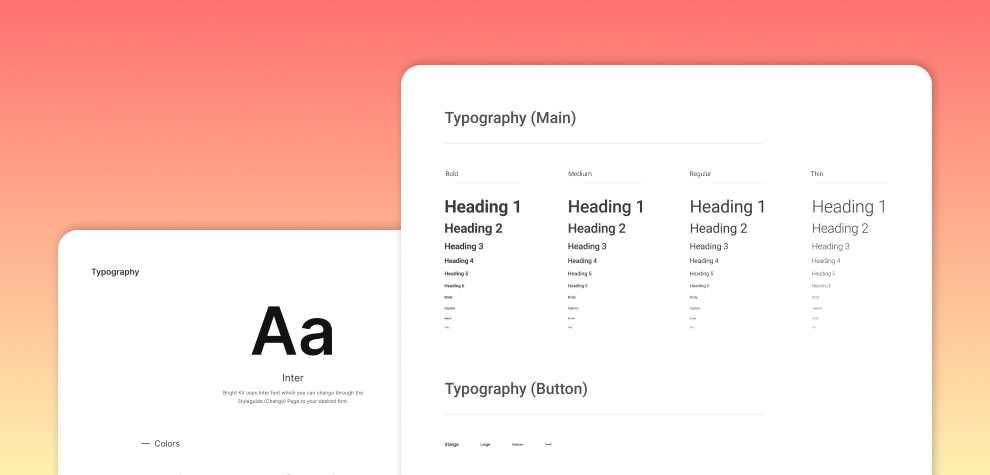
2. Good Fonts Comes With Four to Five Variants of Weight
The right font should contain at least four weight variants. This is important because it helps you consider hierarchy. Also, there are four to five variants of weight when it comes to fonts, and each one has its unique properties that can improve the readability or impact of your text.
Furthermore, there are four main weights: Thin, Regular, Bold, and Heavy. Thin fonts are the easiest to read and are used for headlines and short text passages. Regular fonts are slightly heavier than thin fonts and are used for body text and most web pages. Bold fonts are the heaviest and are used mainly for headings and titles.Heavy fonts are almost twice as thick as regular fonts and are only used sparingly due to their increased difficulty in reading. There is also a fifth weight called Extra Light, which is less than Thin but more than Regular. It’s typically used for elements that don’t require a lot of emphasis or legibility, like navigation menus or footers.
3. Look for Fonts That Are Related to Your Service, Product, or Industry
It is important to consider the overall tone of your project when choosing which font to use. For example, if you’re designing an informational website, then using a font with a heavier weight would be appropriate. However, if you’re designing something more aesthetic or entertainment-related, opting for a lighter font may be better suited.
4. Find the Fonts by Rounded, Cursive, Flat, and Script, typeface
Are you still unsure of the right font to use? To help you with this decision, here are some typeface tips to follow:
- When choosing a font for an interface or user interface (UI), be sure it’s round or cursive to look professional and attractive.
- For headlines and other text meant to be read quickly, go for a lighter font like a script or flat font.
- For headers and titles that will feature throughout the entire site or app, selecting a heavier typeface like a bold or classic script font is ideal.
- When choosing a web font for your project, ensure it’s optimized for web usage by checking its compatibility with web browsers and devices. You can also try using online tools like Font Explorer to see how different types of fonts look on different websites.
5. Seek Inspiration
When choosing the right fonts for your project, you should always look for inspiration. This means taking a look at other designs that have typography similar to the kind you want to have for your project.
One way to find inspiration is by exploring popular content on the internet. You can search for specific font styles or even specific fonts in specific projects. Another way to find inspiration is by looking through different font collections that are available online. Finally, you can also take a look at some of the more famous typefaces and how they’ve been used in different projects.
No matter which route you choose, research and test out different options before settling on a final choice. By doing this, you’ll be able to create a unique and stylish project that will reflect your style perfectly.
6. Choose Between One to Three Fonts
So, to start with, choose a few fonts that you think will look good together and compare how your project looks in each of them. Once you’ve decided on a few font pairs, it’s time to start thinking about the concepts. Ask yourself, do you want your logo to be in a specific font? Do you want all the text on your website to be in the same font? Or are you happy with a mix of different fonts throughout?
Once you’ve decided on these details, it’s time to start designating specific roles for each font within the project. This will help ensure that everything looks consistent and coordinated from start to finish.
The Best Free Fonts for Modern UI Design
Now that you’ve learned how to choose the right fonts for your project, what next? You need to decide what you want your fonts to look like. Many font options are available, but not all will be suitable for your project. So, here’s a list of the most popular free fonts for modern UI design:
- Inter (free)
Inter is a great choice for user interface (UI) design because its large x-height makes it suitable for screens and print. It’s available in nine weights with matching italics, making it perfect for any project. Plus, the variable font version ensures you can always get the font size and style you need. So, whether you need regular or bold fonts, this is your best bet.
- DM Sans (free)
If you’re looking for a versatile, low-contrast font specifically designed for small text sizes, then you should try out DM Sans. This free font is available on IDM and can be used in various projects, including websites, apps, and manuals. DM Sans supports Latin Extended glyphs and is perfect if you must typeset English texts.
- Poppins (free)
This is a beautiful and eye-catching geometric sans-serif typeface. In this typeface, you will find aesthetically pleasing curves. It’s perfect for projects that need a modern and sleek look and can be used in any language or genre. It does not only have an elegant look, it’s one of the most popular fonts on the web today.
- Work Sans (free)
Work Sans is a great choice for projects that need a modern and stylish look. It’s inspired by early Grotesque faces, which makes it perfect for projects that need a classic look with a contemporary edge. Its recent update added an italic style and made it even more versatile. This makes it perfect if you want to make sure your message stays consistent across all channels that use your logo or brand imagery!
Few Resources to Find the Right Fonts
One great resource for finding the right fonts is Typewolf. They have a wide range of fonts available, and you can preview them before buying them. Additionally, they have a font search feature that allows you to find specific types of fonts that you’re looking for.
Google is also a great source for finding fonts. Just type in the name of the font you’re looking for, and it will display a list of results that include both free and paid versions.
Adobe also has a comprehensive font library that contains many different fonts. One thing to keep in mind is that most of the fonts on Adobe Fonts are licensed under the SIL Open Font License, which means that you can use them in commercial applications as long as you include a link to the license file. Just be sure to get an Adobe CC subscription so you can use all of the amazing free fonts they have available!
One of the best things about Fontsinuse is that it includes both traditional and contemporary fonts. This means that you can find the perfect font for any project you have in mind. Additionally, it also has a wide range of typographic styles, so you can find the right font for any project you have in mind.Finally, MyFonts is a good place to find custom-made fonts that suit your needs. MyFonts is a good resource if you’re looking for a huge collection of more than 130,000 fonts. However, you may want to consider other options if you need quality fonts that will look great in your final product.
Final Verdict
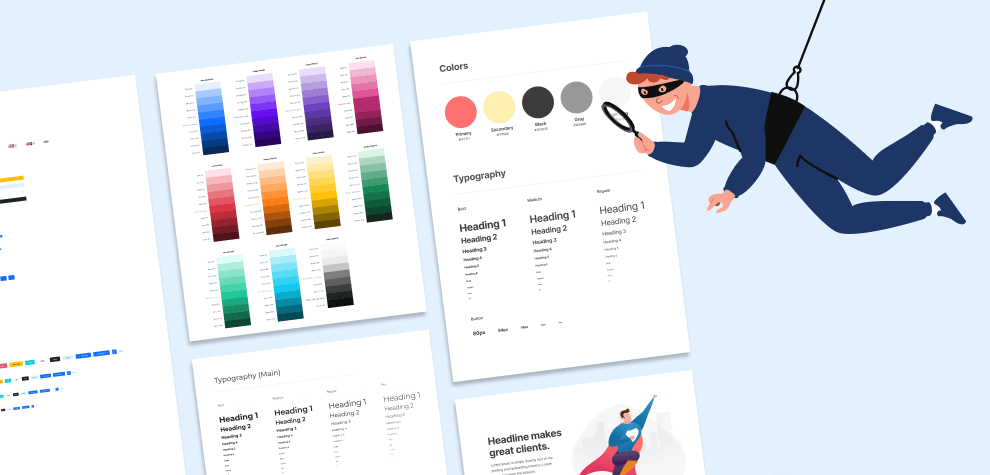
Whatever you do, be sure to test the fonts out on a copy of your design before you go ahead and use them in your final project. This way, you can make sure that they look good and are appropriate for the type of design you’re working on.
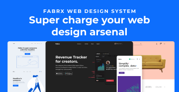
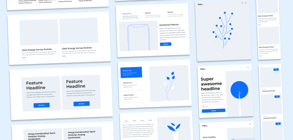
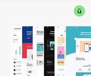
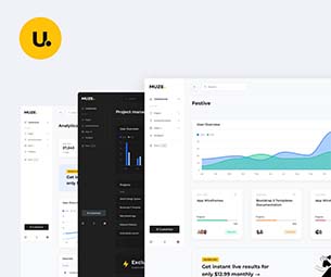
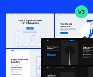
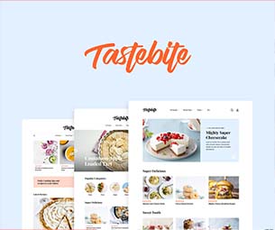
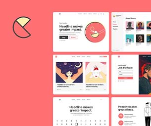
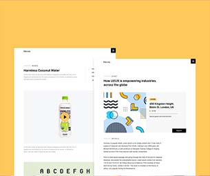
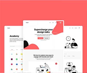
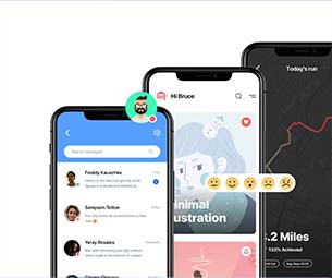
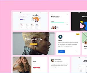
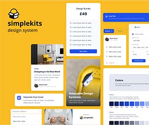
But you know, there is a quicker way to enhance your workflow and complete that project. At Fabrx Designs, you get colorful elements for your next project—all carefully crafted and ready to go.
So whether it’s the perfect font or an effective design structure, our UI kits have got you covered. What’s more, you get a full preview of the design kit before purchasing. Check out our Super Bundle of UI products.