Have you ever visited a non-user-friendly website and experienced a feeling of confusion, frustration, or disappointment? There is a high possibility that you might have; it is because we expect that the site we visit should entertain, educate, or inspire us, and provide a great experience. However, the site even fails to answer some of the most essential questions like what it is, how to access it, or why you should care.
There are many reasons behind this, such as the navigation not being good, the loading speed being terrible, etc. What can you do for the same?
Let’s say that you are starting a website or modifying an existing one; ask yourself these questions as if you are a user visiting your website. Does it provide you with a clear understanding of the website content? Do you understand how to navigate from that page? If your site meets this criteria, then it is user-friendly and self-explanatory.
Besides this, a self-explanatory and user-friendly website helps you gauge the audience’s attention, and retain and urge them to take action, allowing you to achieve business goals & objectives.
Whether you are building a new website or updating an existing one, here we will walk you through some of the best ways to make a user-friendly website.
Without waiting much, let’s get started.
8 Ways to Make Your Website Super User-Friendly
Here, we have researched and shortlisted some of the best ways to make your website super user-friendly.
1. Choose an Appropriate Theme
The first and foremost thing to consider when making your website user-friendly is choosing the proper theme. You might have a question: what does an appropriate theme consist of? Here are a few things to consider while choosing a theme for your site
Nature of Content & Target Audience
If you want to share information through a blog, choose a theme that offers the best readability. For building an eCommerce website, consider a theme that offers seamless navigation, and helps you showcase products effectively.
Aesthetics
The theme’s design reflects well with brand identity, colors, fonts, and imagery.
Technical Functionality & Creative Appeal
The technical functionality of a theme generally includes the overall layout, navigation, style, and integration with other plugins. While, the creative appeal is the theme’s ability to attract users, and keep them hooked.
Cross-Browser compatibility
Ensure your chosen theme works well on multiple browsers, such as Chrome, Firefox, Edge, etc.
Plugin Compatibility
The theme you choose should enable you to enhance the functionality by integrating various plugins.
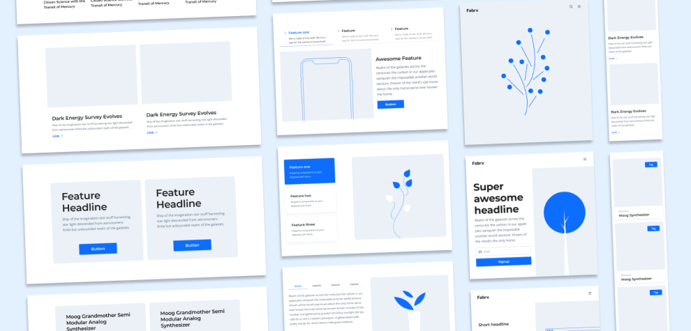
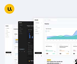
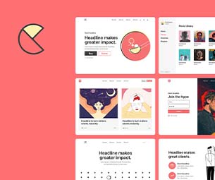
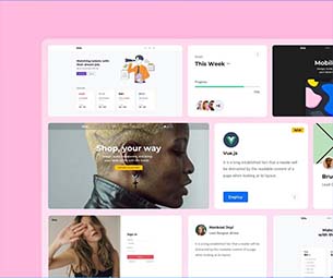
Now, you might wonder how and where I will find themes that meet this criterion. Do you want me to provide you with one example? Check the Muze Multi-Purpose template. It comes with 35+ unique designs and 350+ components to make a website stand out. There are designs available for education, healthcare, travel, and more. Moreover, they are cross-browser compatible and super easy to customize.
2. Select the Right Set of Colors
There is a lot of psychology involved in the color section. The human brain has been trained to associate with color hues at both the conscious and the subconscious levels. For instance, warm colors such as red and yellow have feelings of energy, passion, and urgency.
On the other hand, blue & green evoke feelings of calmness, trust, and readability. Therefore, you should aim at choosing color combinations that associate well with your brand. Moreover, ensure that the colors strike a balance of beauty and clarity. The color palette should help users to read the content easily.
Ultimately, the right set of colors helps you to make your website aesthetically pleasing for the eyes and effectively communicative.
3. Keep Navigation Intuitive
Another thing that you should consider to make your website user-friendly is navigation. Here, you need to focus on loading times, interactive elements, and responsiveness. To improve the loading speed of your site, you should choose proper hosting and caching plugins.
To improve the interactiveness of your site, you should focus on keeping your navigation logical enough to make the entire user’s journey on their website frictionless.
To achieve the same, focus on adding different types of navigation, such as the Horizontal Navigation Bar, Dropdown Navigation Menu, Hamburger Navigation Menu, Vertical Sidebar Navigation Menu, and Footer Navigation Menu.
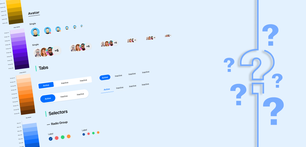
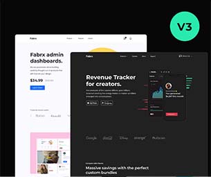
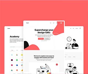
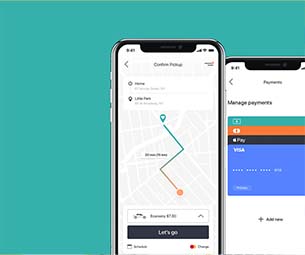
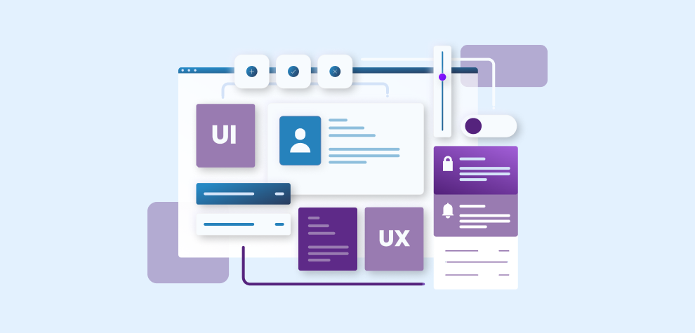
You might find it challenging to modify the navigation for your site. To simplify your task, we recommend a bundle called Fabrx UI Kit Pro. The bundle has a set of wireframes, a design system, UI Components, responsive templates, icons, etc., that can improve your website’s navigation.
4. Improve Site Layout
With each passing year, people are relying more and more on smartphones and tablets for accessing websites online. This is due to unlimited data and easy accessibility of devices.
Hence, having a responsive layout for your website has become a need of an hour.
It doesn’t mean that your website should look identical on the desktop and mobile. It only means that users can view your website without Zoom and have seamless navigation. To achieve the same, check out the current architecture of your site, and update the technology and functionality of your site in such a way that it works well regardless of the device.
5. Pay Close Attention to CTAs
Call to action plays a very crucial role in making the entire user journey from start to finish super efficient. The call to action on your website should be user-friendly. They should share relevant information and urge users to take action. Here are some of the best practices for integrating CTAs on your website.
- The CTAs should be placed on the website at locations that make sense, such as in the sidebar, featured section, etc.
- The CTAs should be strong and clear enough so users can easily understand what’s behind the click. A CTA for registration should not guide users to any other irrelevant page.
- It should be readable and have the right set of contrasting colors.
- Ensure not to include a lot of CTAs on the page.
6. Ensure it is Mobile-Friendly
Mobile-friendliness is yet another crucial thing you should consider while building a new website or updating an existing one. Some of the things we have already discussed, such as using a responsive layout, and having fluid navigation. Here are some other things you should focus on for making your site mobile-friendly.
- Optimize the speed of your website. If a website takes a lot of time to load, users will abandon it. Ensure that your site loads quickly.
- Compress the size of the images. It increases the site’s speed. You can use different tools for the same. Another good option is implementing lazy loading, which means images get loaded on the site when needed.
- Use big and readable fonts. Users should be able to view and read the information on your site effortlessly.
- Don’t show any kind of popups on the mobile devices.
- Ensure testing your website on multiple devices. It helps you understand what works well and what does not, and make changes accordingly.
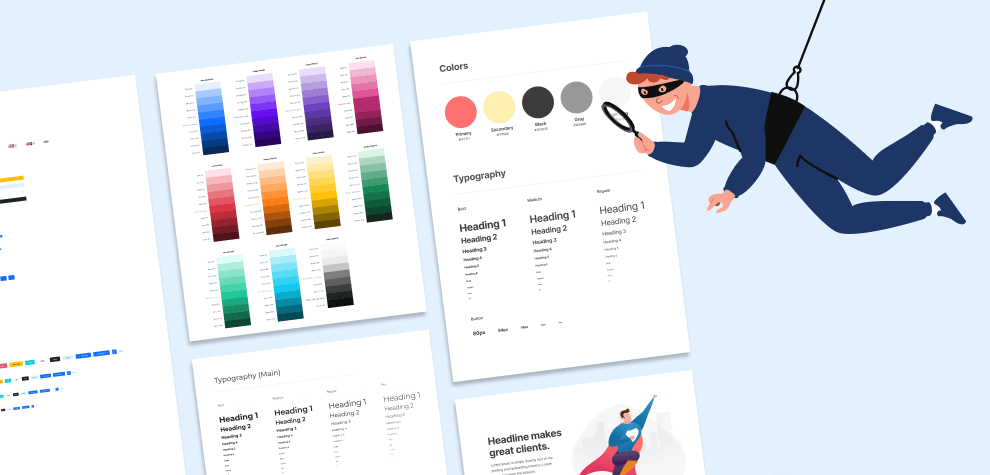
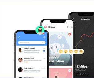
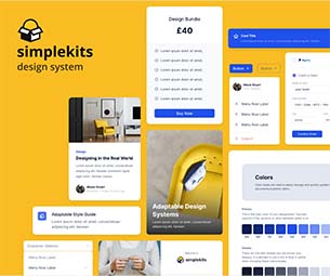
Now, if you have questions, how do you make your site mobile-friendly? Don’t worry; we have researched and found a solution for you. The mobile design system by Fabrx helps you achieve your goals. It comes with a wide range of design templates, components, icons, and more to help you make a user-friendly website.
7. Enhance Your Contact Page
If your contact page doesn’t have the proper information, visitors won’t be able to contact you, and they will lose trust. If you have incorporated a contact form and an email, it’s not enough. Why? People like to reach out to a business or a brand in different ways.
Therefore, you should integrate as many ways as possible to help users reach out to you. It could be anything like a contact form, live chat, chatbot, phone number, and a forum.
The primary purpose here is to make it user-friendly enough that visitors consider this as a friendly chat and not like a task. Include a touch of personality by adding a smiley, phrase or an emoji, so that users contact you quickly, and you can convert the transaction into a genuine connection.
8. Link to Social Media Handles
Social media helps you to build your brand awareness online. Therefore, it has become really important to insert the link of your social media handles on the contact page, as well as, the header or footer of every page.
Moreover, social media has now become the most vital channel of communication between the customers and the business. Therefore, it is essential to showcase all of your social media handles on the website. Ultimately, it enables the users to find your social media and connect with your business without any hindrance.
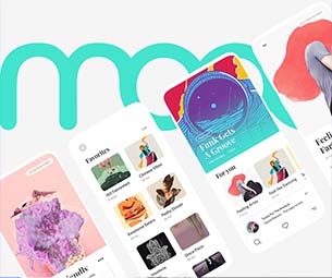
You might be thinking, can I represent the social media handles differently? Absolutely! How? We researched and found a bundle known as Fluff 3D icons. It lets you include 3D social media icons and other elements on your website to represent everything beautifully. The best thing is, they are free to use.
Conclusion
In the end, creating a user-friendly website that speaks for itself is one of the most important elements behind its success. By implementing all the essential factors mentioned in this blog, you can make a user-friendly and self-explanatory website.
Different websites have different needs. However, your ultimate goal should be to design a website that provides a next-gen experience to the visitors. Get constant feedback from the users and modify your website accordingly to satisfy the needs of your audience. With a user-friendly site, you will attract more users, and increase engagement and conversions.